Benjamin Moore Stratton Blue (HC-142) is a versatile and serene paint color that effortlessly captures the essence of calmness and sophistication. Part of the Historical Collection, Stratton Blue is a mid-tone blue-green shade that offers a timeless appeal, making it a favorite among interior designers and homeowners alike. Its balanced blend of blue and green evokes a sense of tranquility while remaining grounded and refined.
Stratton Blue features subtle gray undertones that give it a muted and sophisticated vibe. These undertones prevent the color from feeling too bright or overpowering, allowing it to maintain a soothing presence. The addition of gray also makes this shade incredibly versatile, enabling it to adapt to various lighting conditions. In rooms with ample natural light, Stratton Blue can lean slightly more blue, while in dimmer spaces, its green undertones may become more pronounced.
Stratton Blue pairs beautifully with a range of complementary shades, whether you’re aiming for a harmonious monochromatic palette or a striking contrast. Here are some coordinating colors to consider:
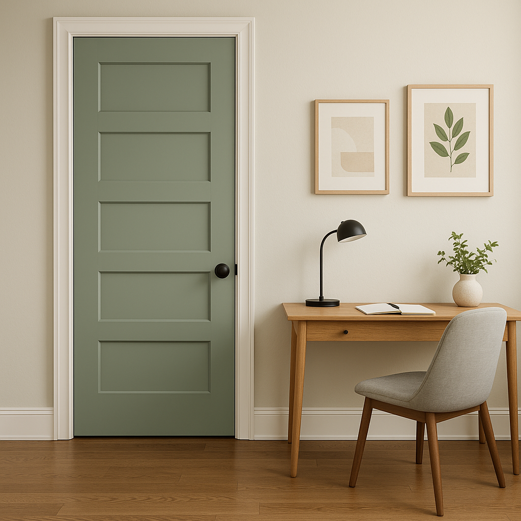
Stratton Blue’s calming qualities make it an ideal choice for a wide variety of spaces. Whether used as a primary color or an accent, its versatility shines through in any design style, from coastal to modern farmhouse to traditional.
Stratton Blue creates a serene ambiance in living spaces, making it a great choice for walls. Pair it with white or cream-colored furniture and natural textures such as wood or jute to enhance its organic feel. Add metallic accents like brushed brass or polished chrome for a touch of elegance.
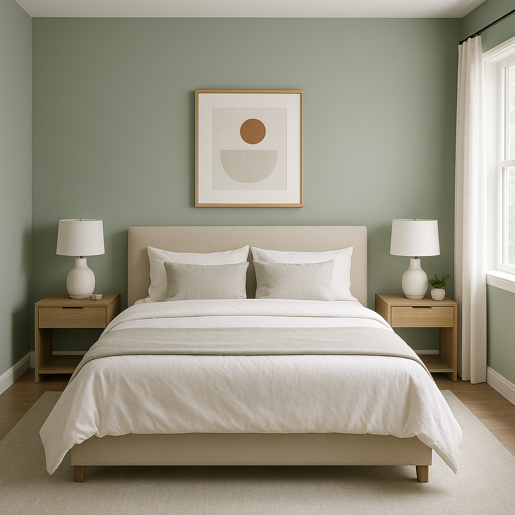
This soothing shade is perfect for bedrooms, offering a peaceful environment to unwind. Use it on walls and pair it with soft linens in neutral tones or complementary blues and greens. Add touches of greenery or botanical prints to create an inviting retreat.
Stratton Blue works beautifully in bathrooms, evoking a spa-like atmosphere. Pair it with crisp white tiles, marble countertops, and polished nickel fixtures to achieve a fresh and timeless look.
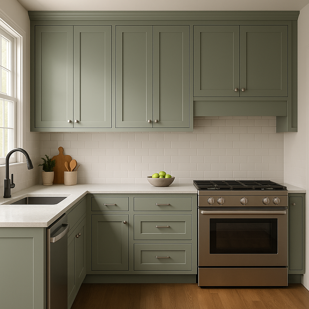
For a pop of color in kitchens or dining spaces, consider using Stratton Blue on cabinetry or an accent wall. It pairs wonderfully with warm wood finishes, white subway tile backsplashes, and industrial lighting for a balanced and stylish aesthetic.
Stratton Blue is also a fantastic option for exterior spaces. Use it on siding, shutters, or front doors to create an inviting curb appeal. Pair it with a classic white trim and darker accent colors for a polished look.
As with any paint color, lighting plays a crucial role in how Stratton Blue appears in your space. In rooms with abundant natural light, the color will feel brighter and more vibrant, highlighting its blue tones. In spaces with warmer artificial lighting, its gray-green undertones will emerge, lending a more subdued and cozy atmosphere.
Benjamin Moore Stratton Blue (HC-142) is a truly versatile and timeless shade that can transform any space into a tranquil haven. Whether you're designing a coastal-inspired retreat, a modern farmhouse, or a classic traditional interior, this color promises to deliver beauty and balance.
View Colors Only by Brand (No Imagery):
Sherwin-Williams
|
Benjamin-Moore
|
Behr
|
Valspar
Live on the Eastern Slope of Colorado and looking for a local painting professional, check out all our painting services and reach out for a free estimate.
Copyright © 2026 : Wild Fox Painting Inc. : 12435 Mead Way, Littleton, CO 80125


