Benjamin Moore Van (HC-145) is a refined and timeless hue that effortlessly blends elegance with versatility. This mid-tone green from the Historic Color collection exudes a sense of calm and understated luxury, making it an excellent choice for both modern and traditional interiors. Its classic appeal and balanced depth lend sophistication to any space, while its subtle vibrancy ensures a fresh and inviting atmosphere.
Van (HC-145) has soft gray undertones that temper its green character, creating a subdued yet rich color. These gray nuances allow it to lean cooler in certain light conditions, making it a versatile option for various design styles. While predominantly green, Van is not overly saturated, which makes it ideal for spaces where you want color without overwhelming the room.
Benjamin Moore Van pairs beautifully with a range of complementary shades, enhancing its usability across different palettes:
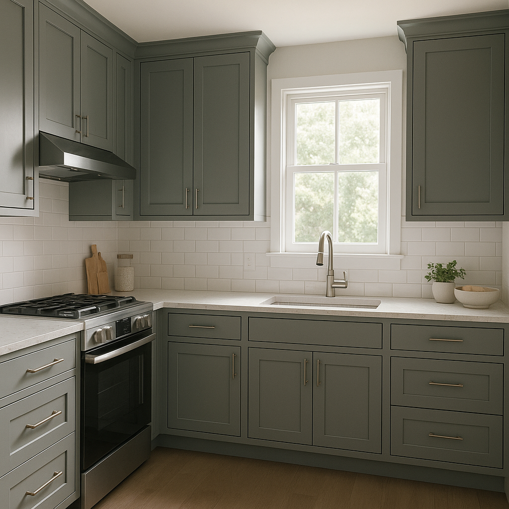
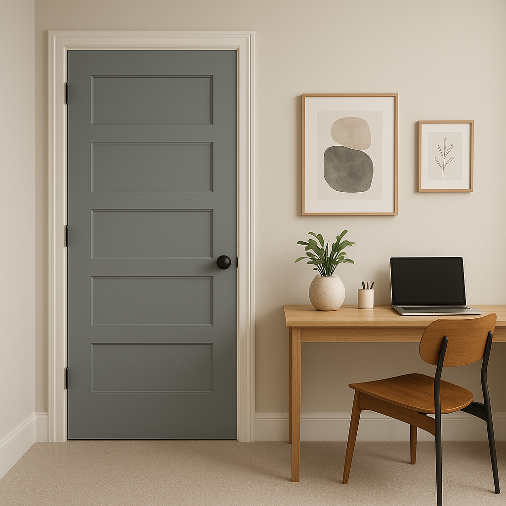
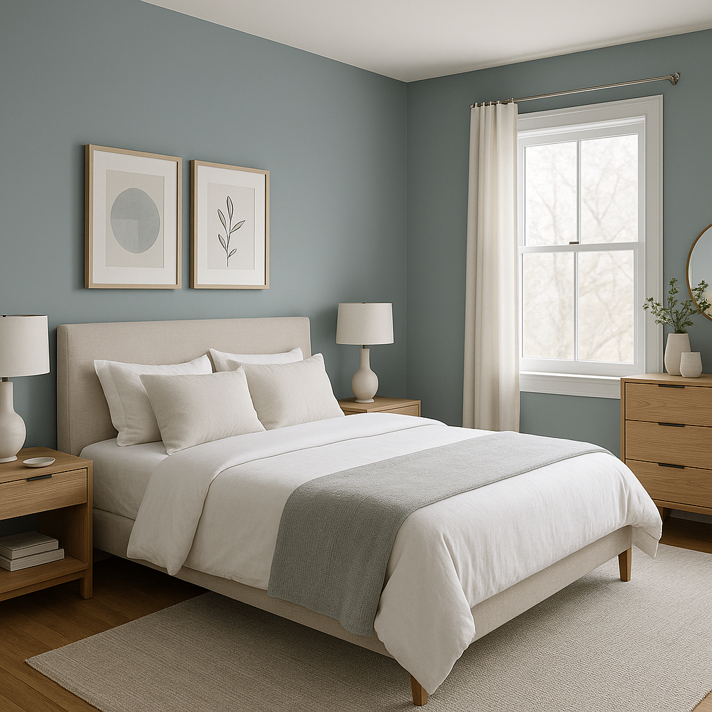
Van (HC-145) is an incredibly versatile green that works well in a variety of spaces, from cozy corners to expansive rooms. Here are some ways to incorporate it into your interiors:
Benjamin Moore Van (HC-145) interacts beautifully with different lighting conditions. In spaces with ample natural light, its green qualities take center stage, creating a vibrant yet soothing atmosphere. In dimmer settings, its gray undertones become more pronounced, lending a cozy and sophisticated feel. Be sure to test the color in your specific environment to see how it shifts throughout the day.
Benjamin Moore Van (HC-145) is a classic yet versatile green that strikes a perfect balance between boldness and subtlety. Its gray undertones and timeless appeal make it suitable for a wide range of design styles and applications. Whether you’re revitalizing a single accent wall or transforming an entire room, Van promises to deliver a polished and harmonious aesthetic.
Elevate your interiors with this enduring hue and discover how effortlessly it can enhance your spaces with grace and sophistication.
View Colors Only by Brand (No Imagery):
Sherwin-Williams
|
Benjamin-Moore
|
Behr
|
Valspar
Live on the Eastern Slope of Colorado and looking for a local painting professional, check out all our painting services and reach out for a free estimate.
Copyright © 2026 : Wild Fox Painting Inc. : 12435 Mead Way, Littleton, CO 80125


