Benjamin Moore Jamestown (HC-148) is a sophisticated and versatile hue that perfectly blends classic charm with understated elegance. This earthy green offers a refined balance between warmth and coolness, making it an excellent choice for a wide range of interior and exterior spaces. With its heritage-inspired roots and timeless appeal, Jamestown brings a sense of calm and groundedness to any environment.
Jamestown features subtle gray undertones that add depth and softness to its mossy green base. These neutral undertones give the color a muted quality, ensuring it doesn’t overpower a space. This makes Jamestown an adaptable choice for creating serene and harmonious environments. Its gray-green profile allows it to complement both traditional and modern aesthetics effortlessly, offering a bridge between natural inspiration and contemporary design.
Pairing Jamestown with the right coordinating colors can elevate its beauty and create a cohesive palette for your home. Here are a few options to consider:
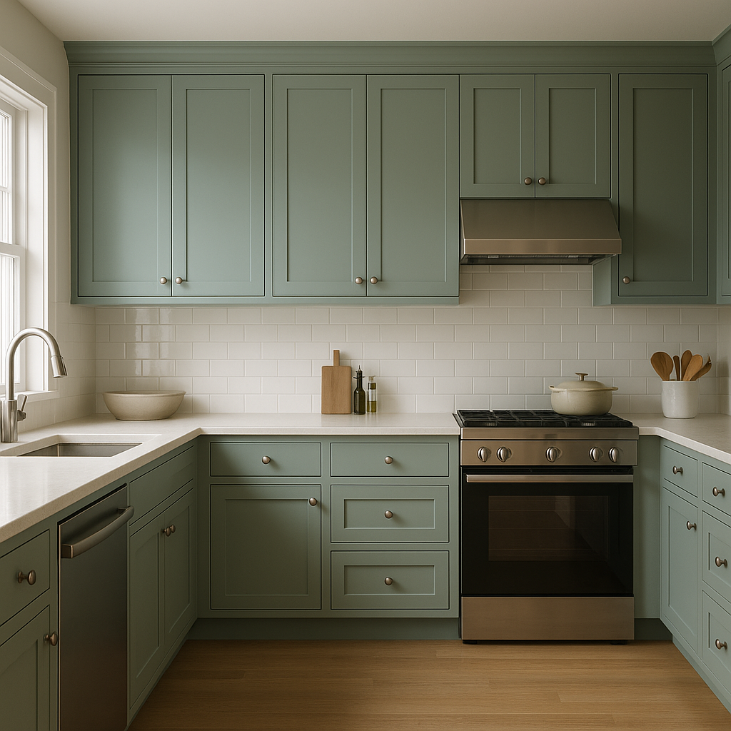
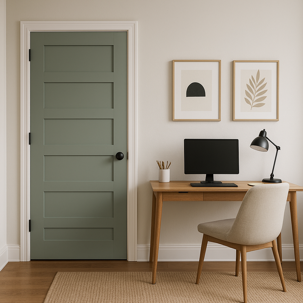
Jamestown’s versatility makes it a fantastic choice for a variety of interior and exterior applications. Whether you’re looking to create a cozy retreat or bring natural inspiration into your space, this color delivers.
Benjamin Moore Jamestown (HC-148) is more than just a paint color; it’s a statement of timeless elegance and natural inspiration. Its gray-green undertones offer versatility, making it suitable for spaces that demand subtle sophistication. Whether you’re refreshing your interiors or enhancing your home’s curb appeal, Jamestown provides an enduring charm that complements both traditional and contemporary designs.
Explore the possibilities with Jamestown and transform your home with this timeless hue. Its ability to balance depth, softness, and adaptability ensures it will remain a favorite for years to come.
View Colors Only by Brand (No Imagery):
Sherwin-Williams
|
Benjamin-Moore
|
Behr
|
Valspar
Live on the Eastern Slope of Colorado and looking for a local painting professional, check out all our painting services and reach out for a free estimate.
Copyright © 2026 : Wild Fox Painting Inc. : 12435 Mead Way, Littleton, CO 80125


