Benjamin Moore Buxton Blue (HC-149) is a sophisticated and serene shade from the Historical Collection that effortlessly blends classic charm with modern versatility. This medium-light blue carries a refined balance of cool and warm undertones, making it an adaptable choice for a wide range of interior styles. Whether you're designing a tranquil bedroom retreat or adding a pop of color to a neutral living space, Buxton Blue delivers understated elegance that feels fresh yet timeless.
Buxton Blue is celebrated for its complex undertones, which contribute to its versatility. It features a soft gray base that tempers the vibrancy of the blue, lending it a muted, calming quality. This gray undertone makes Buxton Blue a perfect choice for spaces where you want to avoid overly bright or saturated blues. Additionally, it carries subtle green undertones that add warmth and depth without overpowering the room. These green undertones make Buxton Blue feel more grounded and natural, ensuring it pairs beautifully with both cool and warm color schemes.
Benjamin Moore Buxton Blue pairs harmoniously with a variety of complementary shades, making it easy to create cohesive and balanced interiors. Here are a few suggestions for coordinating colors:
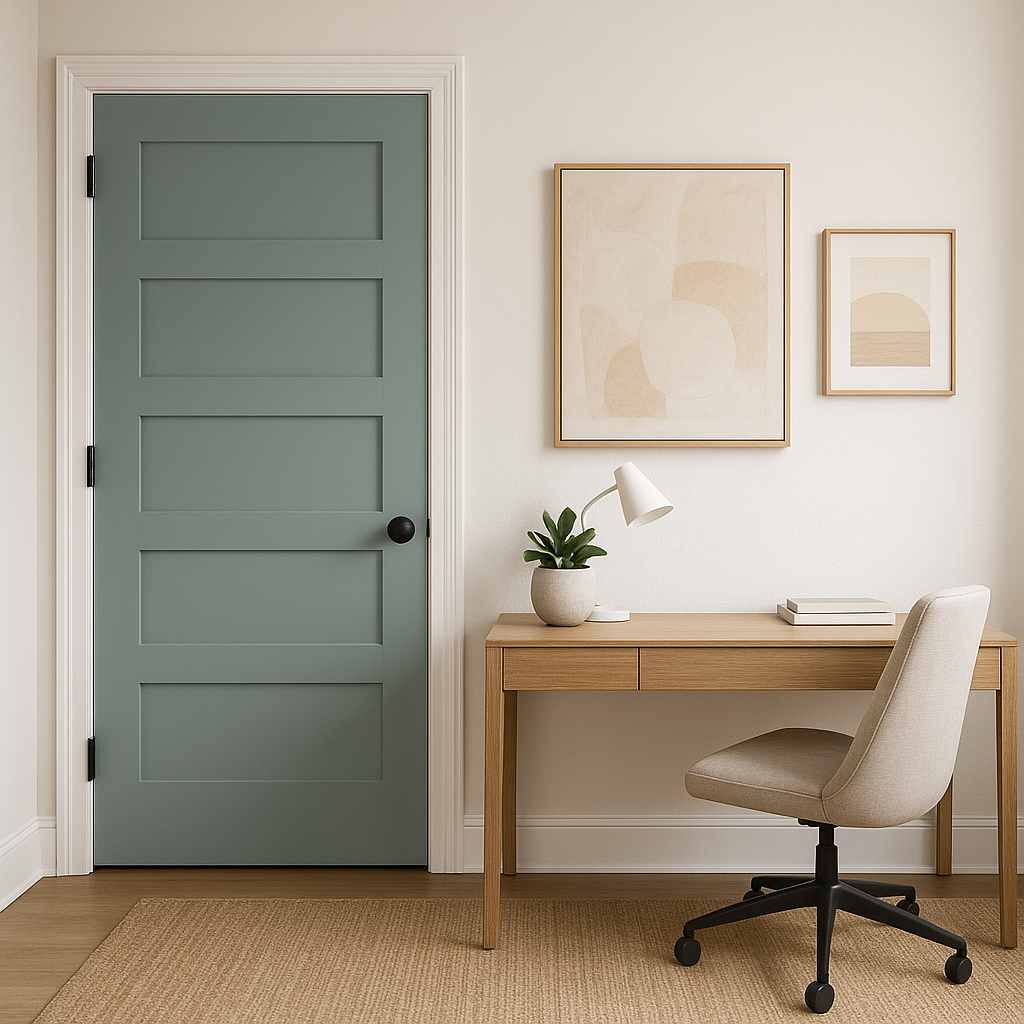
Buxton Blue’s versatility allows it to shine in a variety of applications and spaces throughout the home. Its serene, muted quality ensures it remains timeless and easy to live with, whether you're designing a coastal-inspired home or a traditional living space.
Buxton Blue works wonderfully as a wall color in living rooms, creating an inviting and relaxed atmosphere. Pair it with crisp white trim and natural wood accents for a balanced look that feels both refined and cozy.
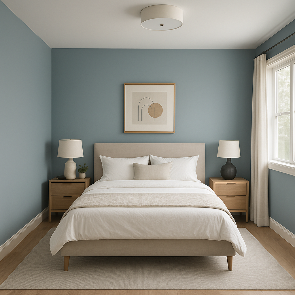
For a calming retreat, Buxton Blue is a perfect choice in bedrooms. Its soothing tones promote relaxation and tranquility. Layer it with plush white bedding, soft gray accents, and natural textures like jute or linen for a serene sanctuary.
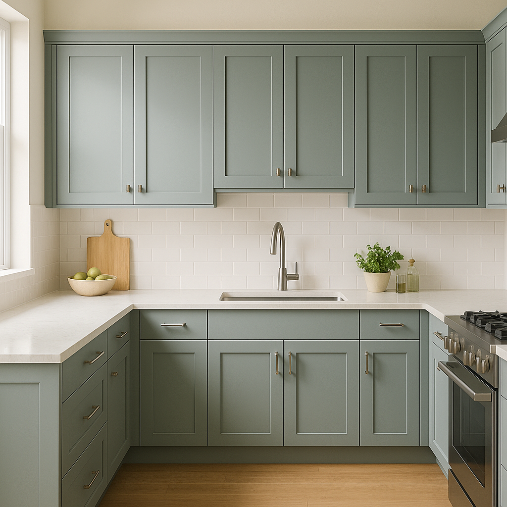
This hue adds character to kitchen cabinetry or walls without overwhelming the space. For a modern farmhouse aesthetic, pair Buxton Blue with subway tile backsplashes, brushed nickel hardware, and warm wood flooring.
Buxton Blue is an ideal choice for bathrooms, as its soft tones evoke a spa-like ambiance. Pair it with marble countertops, polished chrome fixtures, and white wainscoting for a clean yet elegant look.
Create a memorable first impression in your home by using Buxton Blue in the entryway or foyer. Its welcoming nature sets the tone for the rest of the space, especially when paired with classic white trim and a dark-stained wood door.
Benjamin Moore Buxton Blue (HC-149) strikes a perfect balance between sophistication and approachability. Its subtle gray and green undertones, combined with its versatile pairing options, make it suitable for nearly any room in your home. Whether used as a primary wall color, an accent shade, or for cabinetry, Buxton Blue offers a timeless look that enhances both traditional and modern interiors. Its ability to adapt to different lighting conditions ensures that your space will feel bright and beautiful throughout the day.
For homeowners and designers seeking a peaceful yet stylish color that stands the test of time, Buxton Blue is a standout choice that brings character, charm, and a touch of refinement to any space.
View Colors Only by Brand (No Imagery):
Sherwin-Williams
|
Benjamin-Moore
|
Behr
|
Valspar
Live on the Eastern Slope of Colorado and looking for a local painting professional, check out all our painting services and reach out for a free estimate.
Copyright © 2026 : Wild Fox Painting Inc. : 12435 Mead Way, Littleton, CO 80125


