Benjamin Moore Buckland (HC-151) is a sophisticated and versatile sage green from the Historical Collection, steeped in timeless appeal. With its soft, muted tones and understated elegance, Buckland is the perfect choice for creating a serene and harmonious environment in both modern and traditional spaces. This color exudes a subtle charm that feels grounded, making it ideal for homeowners and designers looking to cultivate a refined yet welcoming atmosphere.
Buckland is a perfectly balanced sage green with subtle warm undertones. These warm undertones give the shade a slightly earthy quality, preventing it from feeling overly cool or sterile. The delicate hints of gold and gray within Buckland add depth and complexity to the color, ensuring it complements a wide range of design styles and palettes. The nuanced undertones make it particularly effective in spaces with natural light, as it shifts beautifully throughout the day—appearing greener in bright sunlight and more subdued in dimmer conditions.
Buckland pairs effortlessly with a variety of complementary shades, enabling you to craft cohesive and curated spaces. Here are some standout coordinating colors:
Neutral Pairings:
Accent Colors:
Bold Contrasts:
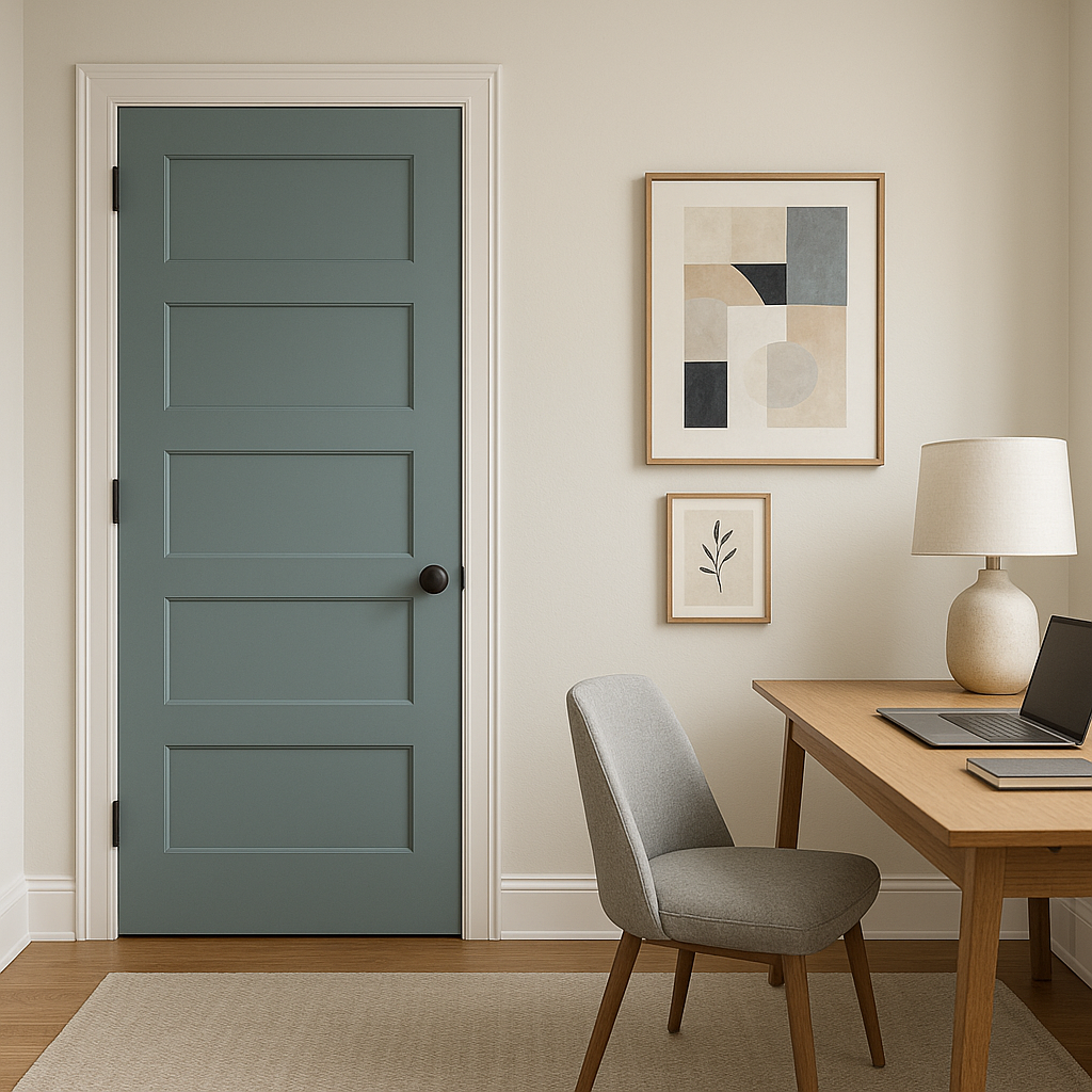
Buckland's versatility makes it suitable for a wide range of applications, from walls to cabinetry and even exterior finishes. Its muted elegance ensures it works well as both a main color and as part of a layered palette:
Living Rooms: Buckland creates a calming backdrop that pairs beautifully with natural wood furniture, woven textures, and traditional decor elements. Use it on walls to evoke a sense of timeless sophistication.
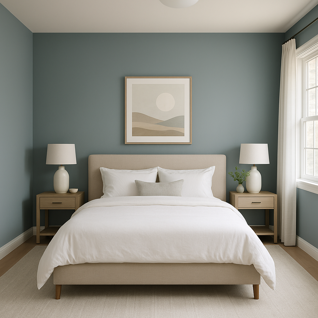
Bedrooms: As a restful and grounding shade, Buckland is an excellent choice for bedrooms. Pair it with crisp white linens and soft accent colors like blush or taupe for a tranquil retreat.
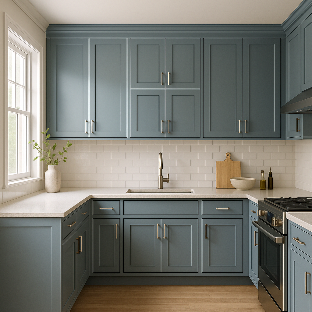
Kitchens: Buckland is a fantastic option for cabinetry, offering a fresh take on neutral greens. Coordinate it with brass or matte black hardware and marble countertops for a refined yet modern kitchen.
Bathrooms: Use Buckland on walls or vanity cabinets for a spa-like atmosphere. Pair it with light gray tiles and polished chrome fixtures for a clean and serene design.
Exteriors: Buckland shines as an exterior color, lending a stately yet welcoming feel to homes. Pair it with off-white trim and a deep navy door for a classic look that stands out.
Benjamin Moore Buckland (HC-151) is more than just a paint color—it's a design statement. Its timeless quality, nuanced undertones, and effortless versatility make it a favorite among interior designers and homeowners alike. Whether you're looking to create a cozy living space, a polished kitchen, or a charming exterior, Buckland offers endless possibilities for elevating your home with elegance and style.
View Colors Only by Brand (No Imagery):
Sherwin-Williams
|
Benjamin-Moore
|
Behr
|
Valspar
Live on the Eastern Slope of Colorado and looking for a local painting professional, check out all our painting services and reach out for a free estimate.
Copyright © 2026 : Wild Fox Painting Inc. : 12435 Mead Way, Littleton, CO 80125


