Benjamin Moore Whipple (HC-152) is a refined medium green that exudes sophistication and charm. Part of the Historical Collection, this color is steeped in tradition yet versatile enough to complement modern spaces. Whether you're designing a serene bedroom retreat, an inviting living room, or a statement-making exterior, Whipple offers a harmonious balance of depth and vibrancy.
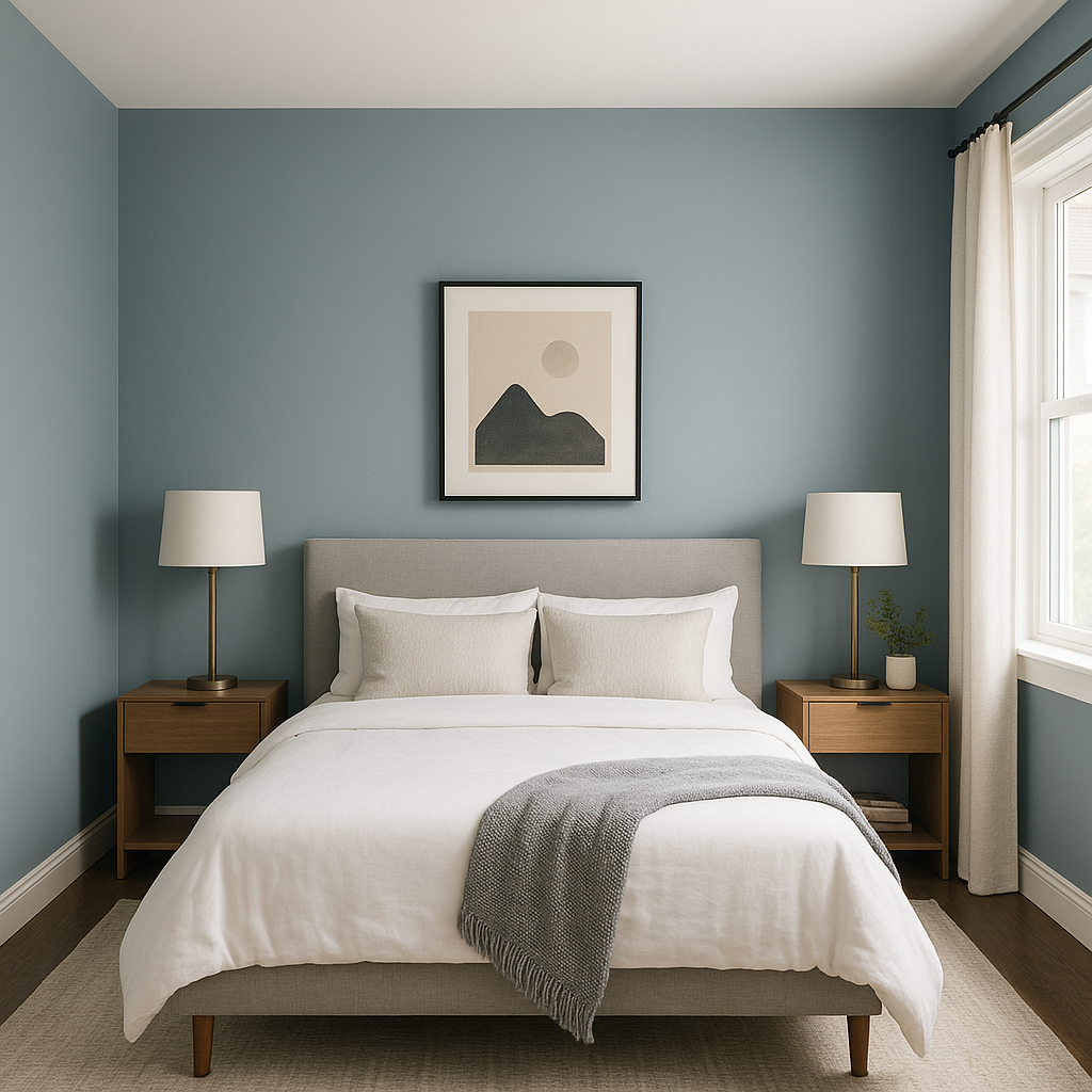
Whipple features subtle yellow undertones that give it warmth and earthiness, steering it away from cooler greens. These yellow undertones ensure the color feels welcoming and approachable rather than stark or overly bold. Depending on the lighting, Whipple can shift slightly—appearing richer in natural sunlight and softer under artificial light. This adaptability makes it a favorite among designers looking for a green hue that feels timeless yet dynamic.
Benjamin Moore Whipple pairs beautifully with a range of complementary colors, making it an ideal choice for both monochromatic schemes and contrasting palettes. Here are a few suggestions for perfectly coordinating colors:
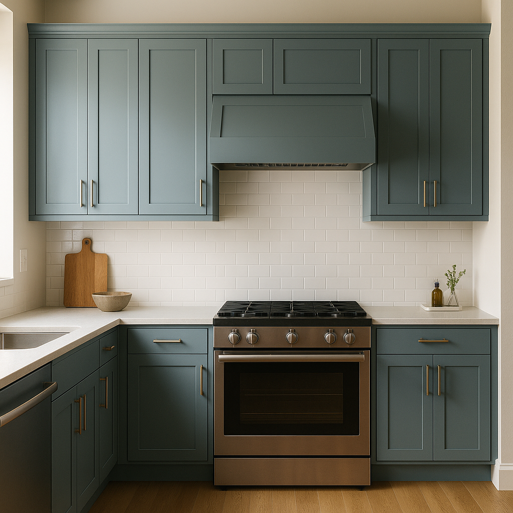
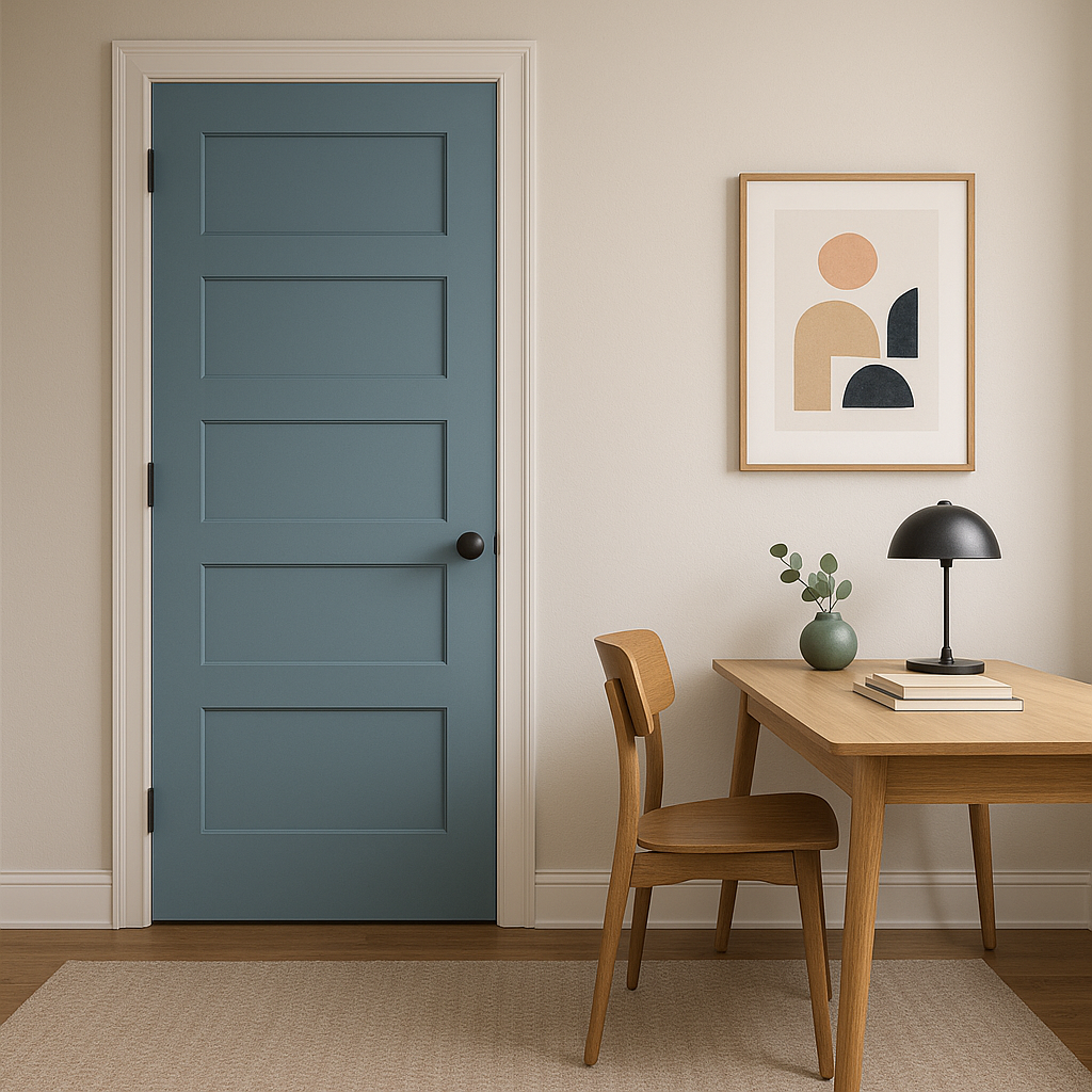
Whipple is a versatile shade that works beautifully in a variety of interior spaces. Its medium green tone can evoke feelings of calm and connection to nature, making it a popular choice for spaces like:
On the exterior, Whipple shines with its timeless appeal. Whether used as a main siding color or as an accent for shutters and doors, it offers a classic aesthetic that complements both traditional and modern architectural styles. Pair it with creamy whites for trim work, such as Simply White (OC-117), to highlight its richness and depth.
As with any paint color, lighting plays a crucial role in how Whipple appears in your space. In rooms with ample natural light, Whipple leans toward its vibrant green side, while in dimly lit areas, its yellow undertones become more pronounced, creating a warmer and cozier feel. Testing Whipple in your space with swatches or sample paints is highly recommended to see how it interacts with your specific lighting conditions.
Benjamin Moore Whipple (HC-152) is more than just a paint color—it's a statement of timeless style. Its ability to bridge traditional and contemporary design elements makes it a versatile choice for any home. Whether you're looking to create an inviting interior or enhance your curb appeal, Whipple delivers a balanced green tone that feels both grounded and uplifting.
Let Benjamin Moore Whipple transform your space into an elegant haven that reflects nature's beauty and enduring sophistication.
View Colors Only by Brand (No Imagery):
Sherwin-Williams
|
Benjamin-Moore
|
Behr
|
Valspar
Live on the Eastern Slope of Colorado and looking for a local painting professional, check out all our painting services and reach out for a free estimate.
Copyright © 2026 : Wild Fox Painting Inc. : 12435 Mead Way, Littleton, CO 80125


