Benjamin Moore Philipsburg Blue (HC-159) is a gorgeously rich and refined paint color that blends tradition with versatility. As part of the esteemed Historic Color collection, this shade draws inspiration from classic American design, making it a perfect choice for both timeless interiors and modern spaces seeking a touch of sophistication. Whether you're aiming to create a serene retreat or a bold statement, Philipsburg Blue delivers effortlessly.
Philipsburg Blue is a deeply saturated blue with subtle gray undertones, which lend it a muted and grounding quality. The gray component softens the vibrancy of the blue, ensuring it feels balanced rather than overly bright or overwhelming. This interplay between blue and gray makes Philipsburg Blue an adaptable color, capable of exuding elegance, calmness, or drama depending on its application and lighting conditions.
Under natural daylight, the shade reads as a crisp yet comforting blue that feels fresh and traditional. In dim or artificial lighting, the gray undertones become more pronounced, adding depth and sophistication to the space. This versatility makes Philipsburg Blue a popular choice for a variety of design styles, from coastal to classic, modern to transitional.
Benjamin Moore Philipsburg Blue can be beautifully paired with a range of coordinating colors to create harmonious palettes. Here are some top recommendations:
Neutral Pairings:
Accent Colors:
Earthy Complements:
These pairings allow Philipsburg Blue to shine in various design schemes, whether you're aiming for subtle elegance or bold visual interest.
Philipsburg Blue is a versatile shade that works beautifully across numerous spaces. Here’s how to make the most of its character and charm:
Philipsburg Blue can anchor a living space with its timeless appeal. Pair it with crisp white trim and neutral furnishings for a classic look, or introduce metallic accents like brass or gold for added sophistication.
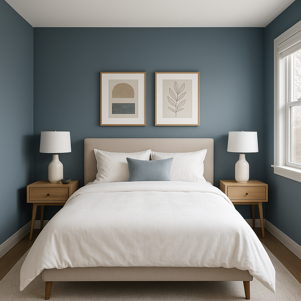
This shade is perfect for bedrooms, creating a serene and cocoon-like atmosphere that promotes relaxation. Layer in soft linens in whites, grays, or muted greens to complement its calming essence.
For a bold, traditional dining room, Philipsburg Blue offers a dramatic backdrop to wood furniture and warm lighting. It pairs beautifully with antique or vintage pieces, enhancing the sense of history and charm.
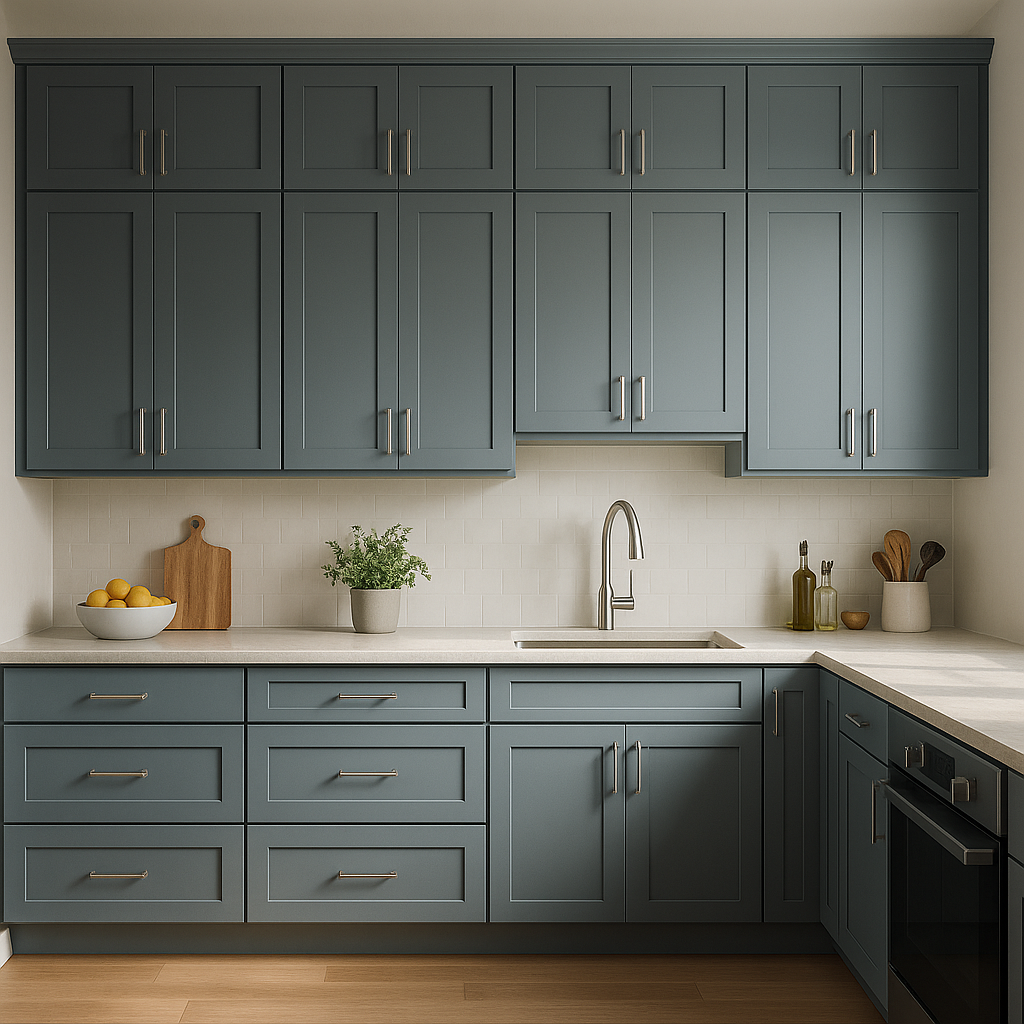
When used on cabinetry, Philipsburg Blue brings a sense of understated elegance to the heart of the home. Pair it with marble countertops and polished nickel hardware for a clean yet luxurious aesthetic.
In bathrooms, Philipsburg Blue evokes a spa-like atmosphere, especially when paired with white subway tiles and chrome fixtures. Add pops of greenery or natural wood accents to complete the tranquil vibe.
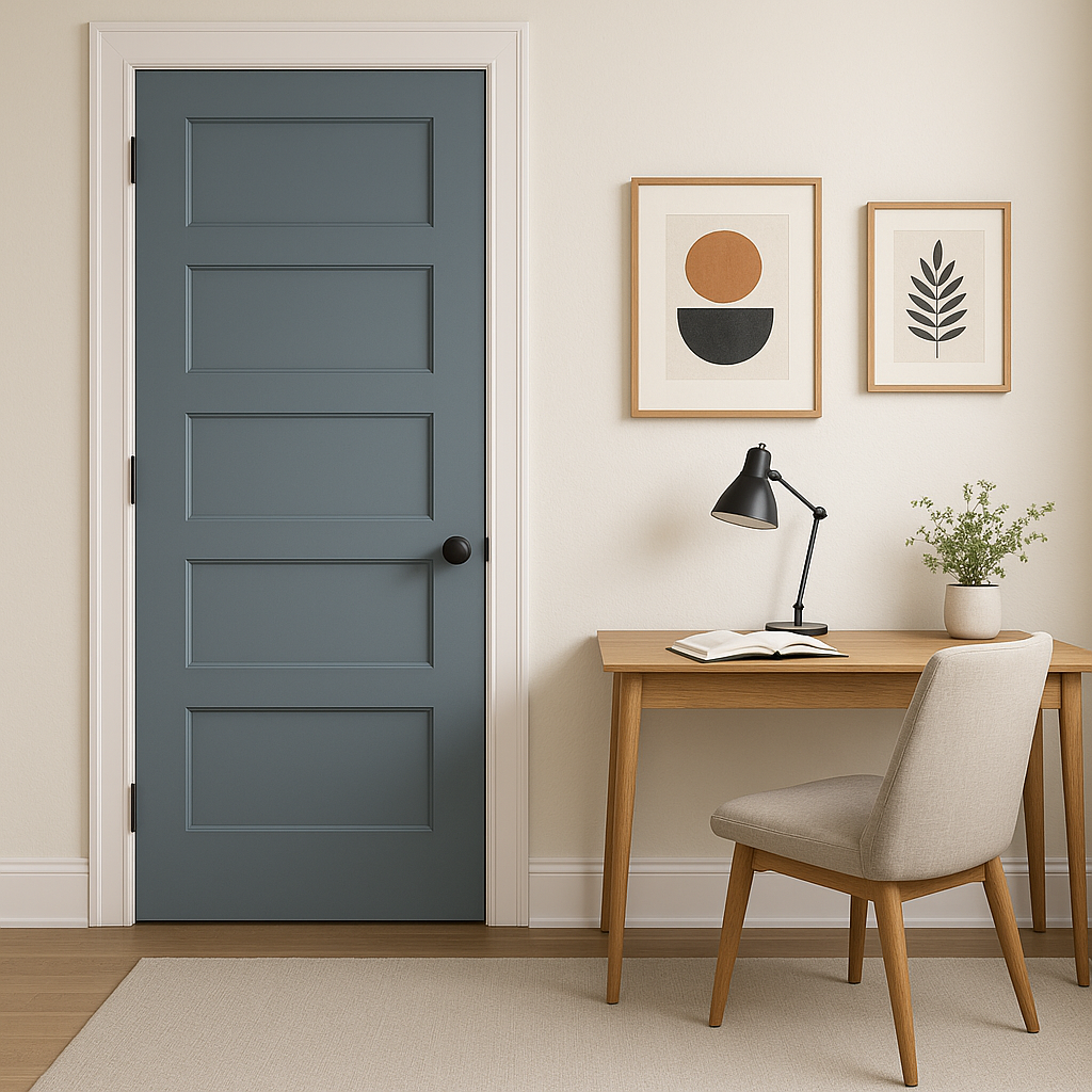
Philipsburg Blue isn’t limited to interiors—it’s a striking choice for front doors, shutters, or even siding. Its muted undertones ensure it looks stunning against natural landscapes and architectural details.
To optimize content surrounding Benjamin Moore Philipsburg Blue, consider integrating these keywords naturally:
Benjamin Moore Philipsburg Blue (HC-159) is a masterful choice for those seeking a paint color that balances timeless charm with modern adaptability. Whether used as an accent or as the dominant hue, its versatility and depth make it a designer favorite for creating spaces that feel both grounded and elevated.
View Colors Only by Brand (No Imagery):
Sherwin-Williams
|
Benjamin-Moore
|
Behr
|
Valspar
Live on the Eastern Slope of Colorado and looking for a local painting professional, check out all our painting services and reach out for a free estimate.
Copyright © 2026 : Wild Fox Painting Inc. : 12435 Mead Way, Littleton, CO 80125


