Benjamin Moore Platinum (HC-179) is a timeless neutral gray that exudes sophistication and versatility. Part of the esteemed Historical Collection, this shade is celebrated for its ability to complement a wide range of interior styles while maintaining a modern, refined aesthetic. Whether you're designing a cozy living space, a professional office, or a serene bedroom, Platinum provides an understated yet impactful backdrop that enhances the overall ambiance.
Platinum (HC-179) is a medium-tone gray with subtle undertones that lean cool. It has faint hints of blue and violet, which give it a soft, crisp edge without feeling overly cold or sterile. These undertones make Platinum a balanced neutral, capable of adding depth and dimension to spaces while harmonizing effortlessly with other shades. Its cool undertones are particularly suitable for rooms with ample natural light, as they help maintain a fresh and airy feel.
Benjamin Moore Platinum pairs beautifully with a variety of colors, allowing you to craft a cohesive and stylish palette. Here are some recommended coordinating colors:
Benjamin Moore Platinum is a versatile color that works well in a variety of spaces. Its neutral nature makes it a popular choice for both residential and commercial interiors. Below are some ideas for incorporating Platinum into your design projects:
Platinum creates a calming and stylish foundation for living spaces. Pair it with plush textiles and metallic accents to achieve a modern yet cozy aesthetic. It works beautifully with wood furniture and floors, highlighting their natural beauty without overpowering the room.
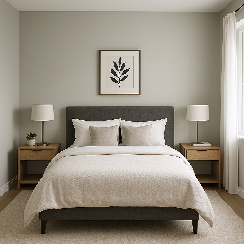
In bedrooms, Platinum's subtle cool undertones evoke a sense of relaxation and tranquility. Combine it with soft white bedding and pastel accents for a serene retreat, or layer it with darker hues for a more dramatic effect.
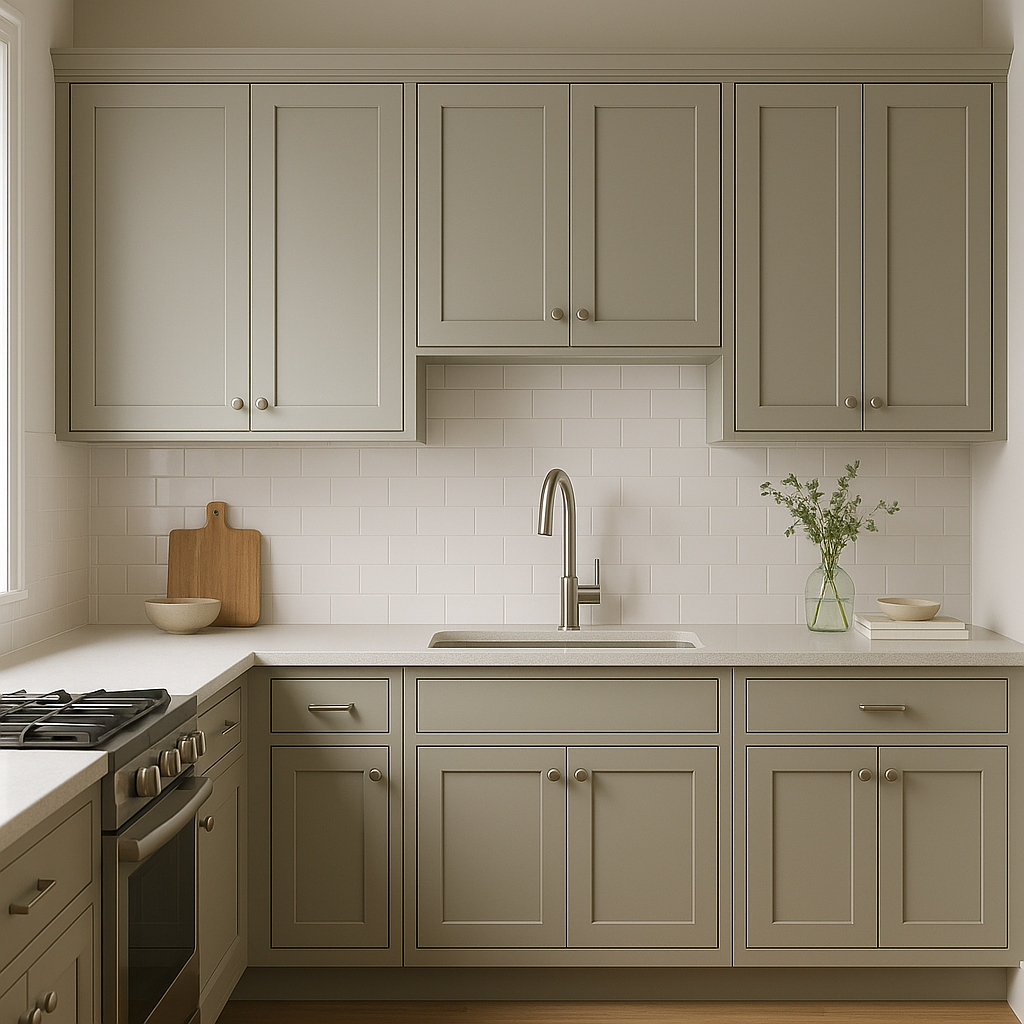
Platinum is an excellent choice for kitchens and bathrooms, especially in spaces with ample light. Use it on walls or cabinetry to achieve a clean and polished look. Pair it with white countertops and sleek hardware for a contemporary vibe.
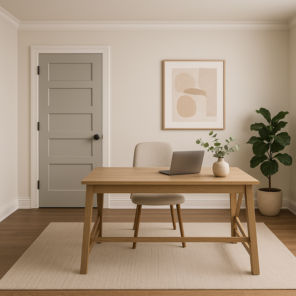
For home offices, Platinum offers a sophisticated and professional backdrop. Its cool undertones help maintain focus, while coordinating accents like deep blues or greens can add depth and personality to the space.
In transitional spaces like hallways and entryways, Platinum provides a neutral foundation that connects different rooms seamlessly. Highlight it with bold artwork or colorful rugs to create visual interest without overwhelming the space.
Benjamin Moore Platinum (HC-179) is a designer-favorite gray that balances elegance and adaptability. Its understated cool undertones complement a wide range of colors and materials, making it a reliable choice for any interior design project. Whether you're aiming for a minimalist aesthetic or a richly layered look, Platinum offers the perfect canvas to bring your vision to life.
View Colors Only by Brand (No Imagery):
Sherwin-Williams
|
Benjamin-Moore
|
Behr
|
Valspar
Live on the Eastern Slope of Colorado and looking for a local painting professional, check out all our painting services and reach out for a free estimate.
Copyright © 2026 : Wild Fox Painting Inc. : 12435 Mead Way, Littleton, CO 80125


