Benjamin Moore Charleston (HC-186) is a versatile and timeless neutral that effortlessly balances sophistication and warmth. Part of Benjamin Moore’s Historical Collection, this shade is inspired by the rich heritage of Charleston, South Carolina, capturing the essence of classic architecture and Southern charm. Its understated elegance makes it a popular choice for designers and homeowners seeking a neutral paint color with subtle complexity.
Charleston is a warm beige with gentle taupe undertones, making it more than just a conventional neutral. The taupe adds depth and richness to the color, preventing it from looking flat or overly basic. These undertones also contribute to its chameleon-like ability to adapt to various lighting conditions. In spaces with ample natural light, Charleston may appear lighter and airier, while in dimly lit rooms, its warmth becomes more pronounced, creating a cozy and inviting atmosphere.
One of the greatest strengths of Benjamin Moore Charleston (HC-186) is its versatility when paired with other colors. It works beautifully with a range of hues, from soft pastels to deep, dramatic tones. Here are some suggested coordinating colors:
Additionally, Charleston pairs beautifully with natural wood tones, metallic finishes, and organic textures, making it a versatile backdrop for various design styles.
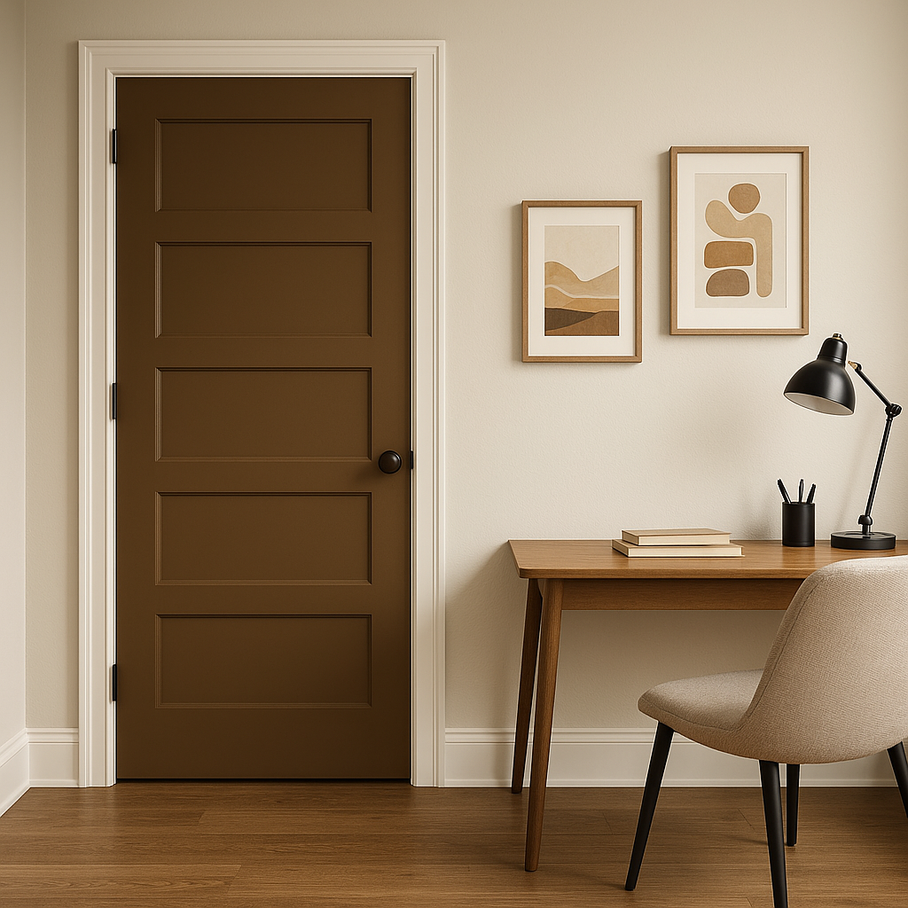
Charleston is a highly adaptable color suitable for nearly every room in your home. Its neutral yet warm nature makes it a perfect choice for creating spaces that feel inviting and timeless. Below are some ideas for incorporating Charleston into your interiors:
Use Charleston on the walls to create a cozy yet elegant living room. Pair it with creamy whites, deep charcoal grays, or navy accents for a sophisticated look. Incorporate plush textiles like velvet or linen in complementary tones to enhance the space's warmth.
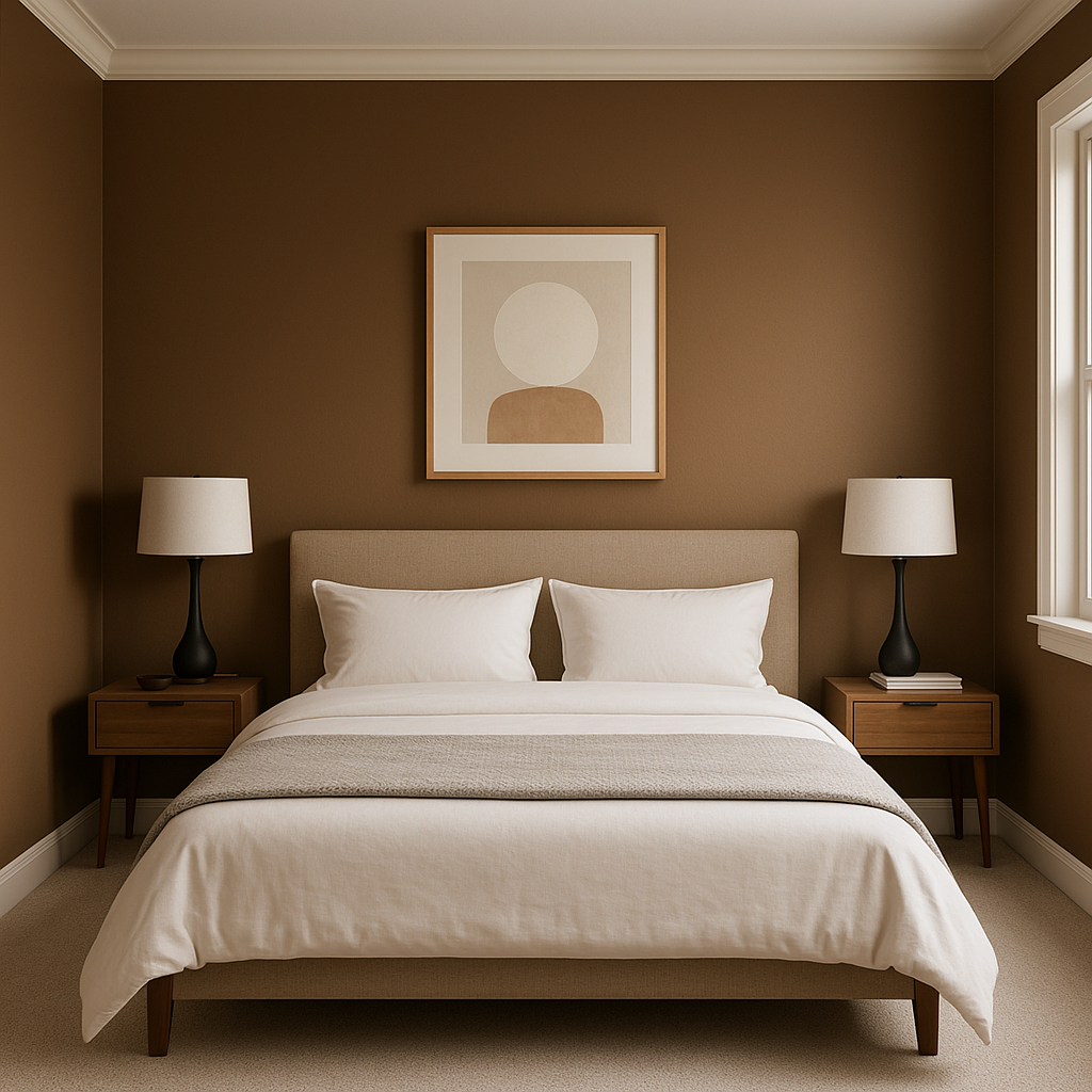
Charleston’s soothing qualities make it an excellent choice for bedrooms. It creates a restful atmosphere when paired with soft blues, greens, or blush pinks. Add natural wood furniture and soft lighting to complete a tranquil retreat.
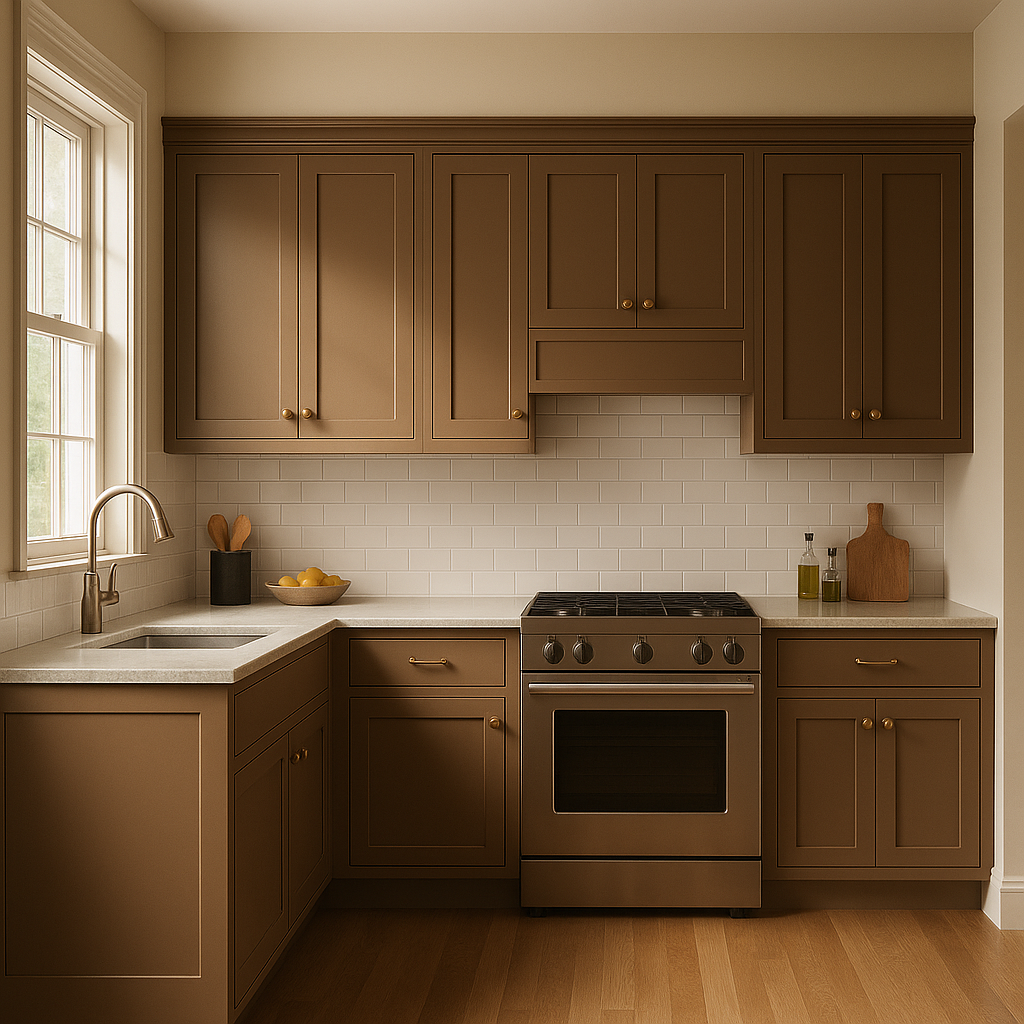
For kitchens, Charleston works beautifully on walls or cabinetry. Pair it with crisp white countertops and backsplashes for a clean and modern look, or add brass hardware and fixtures for a touch of vintage charm.
Charleston lends itself well to bathrooms, offering a neutral backdrop for tile work and fixtures. Pair it with polished chrome finishes, marble accents, or soft gray tones to evoke a spa-like feel.
In dining rooms, Charleston creates an elegant ambiance that works with both traditional and modern styles. Pair it with deep jewel tones like emerald green or burgundy for a dramatic flair, or keep it light and airy with white trim and delicate pastel accents.
Charleston stands out for its ability to bridge the gap between traditional and contemporary design with ease. Its warm undertones make it universally appealing, while its adaptability ensures it complements a wide range of spaces and styles. Whether you’re creating a cozy family room, a serene bedroom, or a polished dining area, Benjamin Moore Charleston (HC-186) delivers timeless sophistication with a touch of Southern charm.
This refined neutral is an excellent choice for homeowners and designers seeking a warm, versatile paint color that remains effortlessly stylish over time.
View Colors Only by Brand (No Imagery):
Sherwin-Williams
|
Benjamin-Moore
|
Behr
|
Valspar
Live on the Eastern Slope of Colorado and looking for a local painting professional, check out all our painting services and reach out for a free estimate.
Copyright © 2026 : Wild Fox Painting Inc. : 12435 Mead Way, Littleton, CO 80125


