Benjamin Moore Pittsfield Buff (HC-24) is a versatile and inviting hue that belongs to the brand's esteemed Historic Collection, known for its timeless, heritage-inspired palette. This warm neutral effortlessly combines sophistication and comfort, making it ideal for a wide range of interior design styles, from traditional to contemporary. Its classic appeal and understated elegance have made Pittsfield Buff a go-to choice for homeowners and designers alike.
Pittsfield Buff is characterized by its warm golden undertones, which infuse spaces with a cozy, welcoming atmosphere. While it reads as a soft beige at first glance, its subtle yellow and tan undertones add depth, making it feel more vibrant than a flat neutral. These undertones ensure that the color never feels cold or stark, creating a harmonious environment that's perfect for living spaces, bedrooms, and dining rooms.
Depending on the lighting conditions, Pittsfield Buff can range from a light creamy beige in bright natural sunlight to a richer, warmer buff tone under artificial or dim lighting. This chameleon-like quality makes it a highly adaptable color that works beautifully with both traditional and modern aesthetics.
Pittsfield Buff pairs effortlessly with a variety of complementary shades, thanks to its neutral base and warm undertones. Whether you're aiming for a monochromatic look or a high-contrast design, this versatile hue can anchor your palette or serve as a complementary accent. Below are some suggestions for coordinating colors:
Trim and Accents: For crisp, clean contrast, pair Pittsfield Buff with a bright white such as Benjamin Moore Simply White (OC-117) or Super White (OC-152). These whites add definition and enhance the warmth of the buff tone.
Deep Contrast: If you're looking for a dramatic pairing, consider darker shades like Benjamin Moore Kendall Charcoal (HC-166), a rich gray, or Iron Mountain (2134-30), a bold, deep charcoal. These add depth and sophistication to a room.
Soft Complementary Neutrals: For a seamless and serene look, coordinate Pittsfield Buff with muted tones like Edgecomb Gray (HC-173) or Revere Pewter (HC-172). These soft grays provide a subtle backdrop without overpowering the warmth of Pittsfield Buff.
Earthy Greens: The warm golden undertones of Pittsfield Buff pair beautifully with earthy greens like Saybrook Sage (HC-114) or Timson Green (HC-125) for a nature-inspired palette.
Warm Reds and Terracottas: For a cozy, inviting ambiance, complement Pittsfield Buff with shades like Adobe Orange (2172-30) or Rustic Brick (2175-30). These warm tones create a cohesive and grounded look.
Pittsfield Buff's versatility makes it a fantastic choice for a wide range of applications throughout your home. Its subtle warmth and neutral character allow it to act as either a backdrop or a focal point, depending on your design goals.
Pittsfield Buff is perfect for living spaces where comfort and style are paramount. Its warm undertones make these areas feel inviting, while its neutral quality ensures that furniture and décor in a variety of colors will pair seamlessly. Use Pittsfield Buff as the main wall color, complemented by crisp white trim, or incorporate it as an accent on feature walls alongside darker coordinating shades.
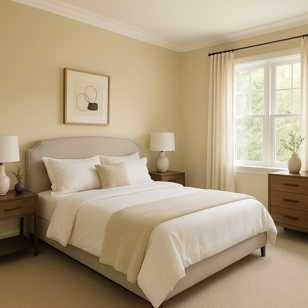
For bedrooms, Pittsfield Buff creates a serene and soothing environment. Pair it with soft bedding in creams, whites, or muted greens for a tranquil retreat. Its warm undertones ensure the space feels cozy without being overly dark, making it ideal for both master bedrooms and guest rooms.
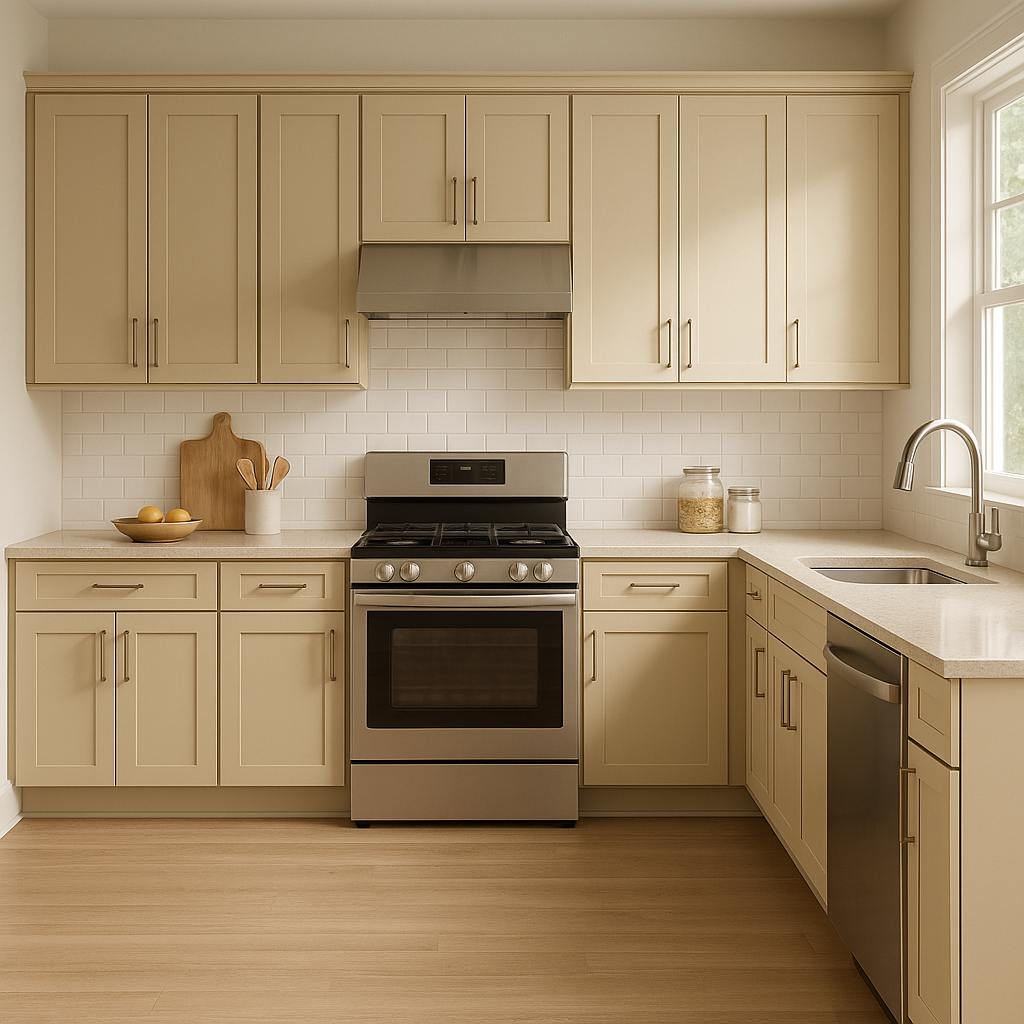
In kitchens and dining spaces, Pittsfield Buff adds a touch of sophistication while maintaining an approachable feel. It pairs beautifully with natural wood tones, whether in cabinetry or furniture. Add coordinating colors like whites and greens for a fresh, balanced look.
The understated elegance of Pittsfield Buff makes it a great choice for transitional spaces like hallways and entryways. It sets the stage for the rest of your home, offering a warm welcome to guests. Pair it with clean white trim or darker doors for visual interest.
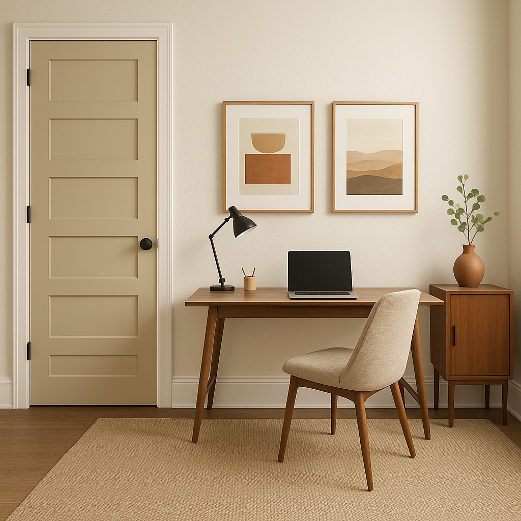
Pittsfield Buff's neutral yet warm presence is perfect for creating focus and calm in home offices or studies. Pair it with darker accent colors, like deep greens or grays, to create a space that feels grounded and professional.
Benjamin Moore Pittsfield Buff (HC-24) is a timeless neutral that balances warmth, versatility, and sophistication. Its ability to adapt to different lighting and décor makes it a reliable choice for any room in your home. Whether you're aiming for a cozy traditional feel or a sleek modern aesthetic, Pittsfield Buff provides the perfect foundation for a well-designed space.
View Colors Only by Brand (No Imagery):
Sherwin-Williams
|
Benjamin-Moore
|
Behr
|
Valspar
Live on the Eastern Slope of Colorado and looking for a local painting professional, check out all our painting services and reach out for a free estimate.
Copyright © 2026 : Wild Fox Painting Inc. : 12435 Mead Way, Littleton, CO 80125


