Benjamin Moore Powell (HC-35) is a beautifully balanced shade that seamlessly bridges the gap between warm and cool neutrals. Part of the Historic Color collection, Powell is a muted taupe with subtle gray undertones that exudes sophistication and versatility. Its classic appeal makes it an excellent choice for both traditional and contemporary interiors, offering a refined backdrop that can ground any design scheme.
Powell (HC-35) carries understated gray undertones that soften its taupe base, giving it a timeless and adaptable quality. These undertones ensure that Powell doesn’t skew too warm or too cool, making it an ideal middle-ground neutral. Depending on the lighting in your space, Powell may lean slightly warmer with a beige cast or cooler with a hint of gray. This chameleon-like nature allows Powell to harmonize effortlessly with a wide range of palettes, from earthy tones to crisp whites.
Benjamin Moore Powell (HC-35) pairs beautifully with other hues, allowing you to create a cohesive and harmonious interior design. Here are some coordinating color suggestions:
Trim Colors:
Accent Colors:
Wall Pairings:
These complementary colors allow Powell to shine as either a main color or a supporting player in your design palette.
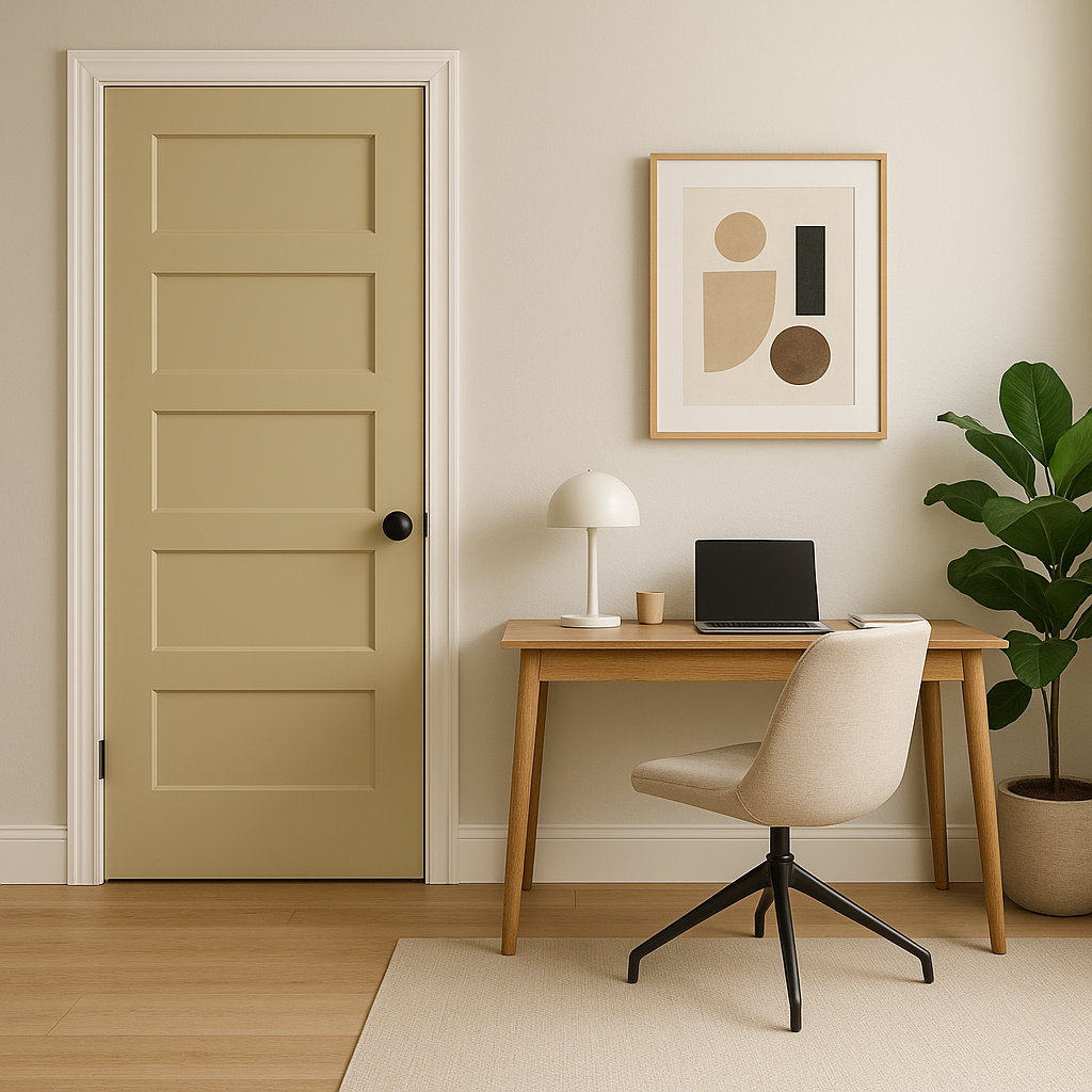
Benjamin Moore Powell (HC-35) is incredibly versatile, making it suitable for a wide range of applications. Its balanced tone offers a polished yet inviting aesthetic, whether you’re designing a cozy living room or a sleek office space.
Powell creates a warm, welcoming environment without overwhelming the space. Pair it with plush furniture in neutral tones or add pops of color through accent pieces like pillows and rugs. Its understated elegance allows it to act as a grounding layer for bolder design elements.
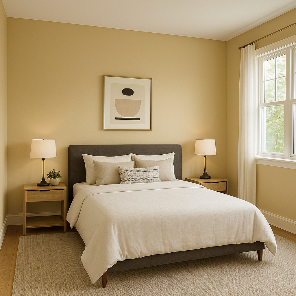
In bedrooms, Powell’s soothing tone promotes relaxation and calm. Use it as a wall color and pair with soft blues, greens, or creamy whites for a serene retreat. It also works beautifully with natural wood furniture and textured textiles for a cozy yet elevated look.
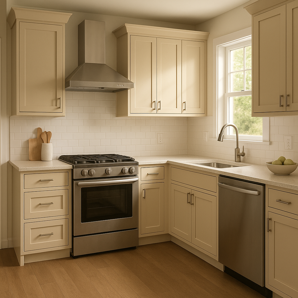
Powell (HC-35) is an excellent choice for kitchens and bathrooms, where its neutral tone can balance the crispness of white cabinetry and countertops. Combine it with brushed nickel or matte black hardware for a modern touch, or opt for brass accents to highlight its warm undertones.
For workspaces, Powell offers a professional and polished backdrop that isn’t distracting. Pair it with deep blues or charcoals for a sophisticated, focused environment that inspires productivity.
Powell also shines outdoors, where its neutral tone blends effortlessly with natural surroundings. Use it as a primary exterior color and pair it with crisp white trim or darker accents like Kendall Charcoal (HC-166) for a timeless curb appeal.
As with any paint color, lighting plays a crucial role in how Powell (HC-35) will appear in your space. In rooms with ample natural light, Powell tends to lean slightly warmer, showcasing its taupe undertones. In spaces with cooler artificial lighting, its gray undertones become more prominent, offering a cooler, more contemporary vibe. Always test Powell in your space to see how it interacts with your light sources before finalizing your choice.
Benjamin Moore Powell (HC-35) is a masterfully curated neutral that adapts to both modern and classic aesthetics. Its understated elegance and balanced undertones make it a go-to choice for achieving timeless interiors. Whether you’re designing a cozy family space or a sophisticated office, Powell provides a versatile foundation that enhances your overall design vision.
With its ability to pair beautifully with a wide range of coordinating colors and its suitability for nearly every application, Benjamin Moore Powell (HC-35) is a neutral worth considering for your next project.
View Colors Only by Brand (No Imagery):
Sherwin-Williams
|
Benjamin-Moore
|
Behr
|
Valspar
Live on the Eastern Slope of Colorado and looking for a local painting professional, check out all our painting services and reach out for a free estimate.
Copyright © 2026 : Wild Fox Painting Inc. : 12435 Mead Way, Littleton, CO 80125


