Benjamin Moore Putnam (HC-39) is a classic, versatile paint color from the Historic Color palette. This refined shade of green-gray strikes the perfect balance between muted elegance and understated warmth, making it an excellent choice for creating timeless interiors. Whether you're designing a cozy living room, a serene bedroom, or a polished office space, Putnam’s sophisticated charm brings depth and character to any environment.
Putnam HC-39 features subtle green undertones softened by a touch of gray, giving it an earthy yet refined appearance. These undertones keep the color grounded, making it adaptable for both modern and traditional interiors. The muted green-gray combination evokes a sense of calm and tranquility, making it especially suited for spaces that benefit from a soothing and restorative atmosphere. The gray undertones ensure it doesn’t overwhelm the room, while the green adds a touch of organic warmth.
Benjamin Moore Putnam HC-39 pairs beautifully with a variety of complementary colors, allowing you to create cohesive and layered designs. Here are some coordinating colors that work exceptionally well with this hue:
These coordinating colors allow you to craft stunning monochromatic schemes or introduce complementary contrasts, depending on your design goals.
Benjamin Moore Putnam HC-39 is an incredibly versatile shade, suitable for a variety of applications and design styles. Its earthy, subdued charm makes it ideal for spaces where you want to foster a sense of calm, elegance, or intimacy. Here are some popular ways to use this timeless color:
Putnam HC-39 shines in living rooms, where its green undertones create a relaxing and inviting ambiance. Pair it with soft neutral furniture and natural textures like linen or jute rugs for a sophisticated yet casual vibe. Add brass or gold accents for a touch of glamour.
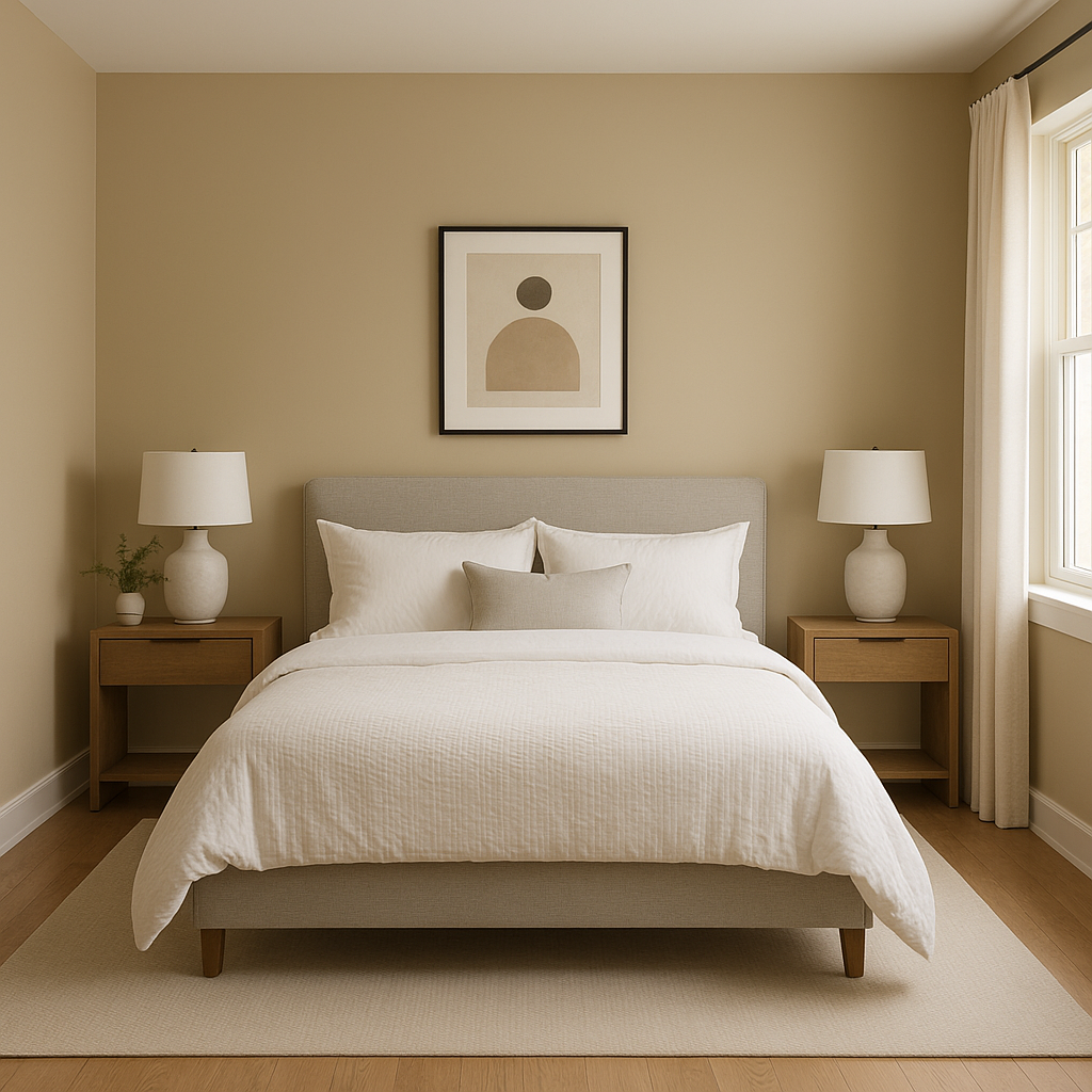
This muted hue is perfect for bedrooms, offering a serene backdrop for restful evenings. Use it on walls and complement it with crisp white bedding and warm wood furnishings. Layer in soft gray or beige accents for a cohesive, tranquil retreat.
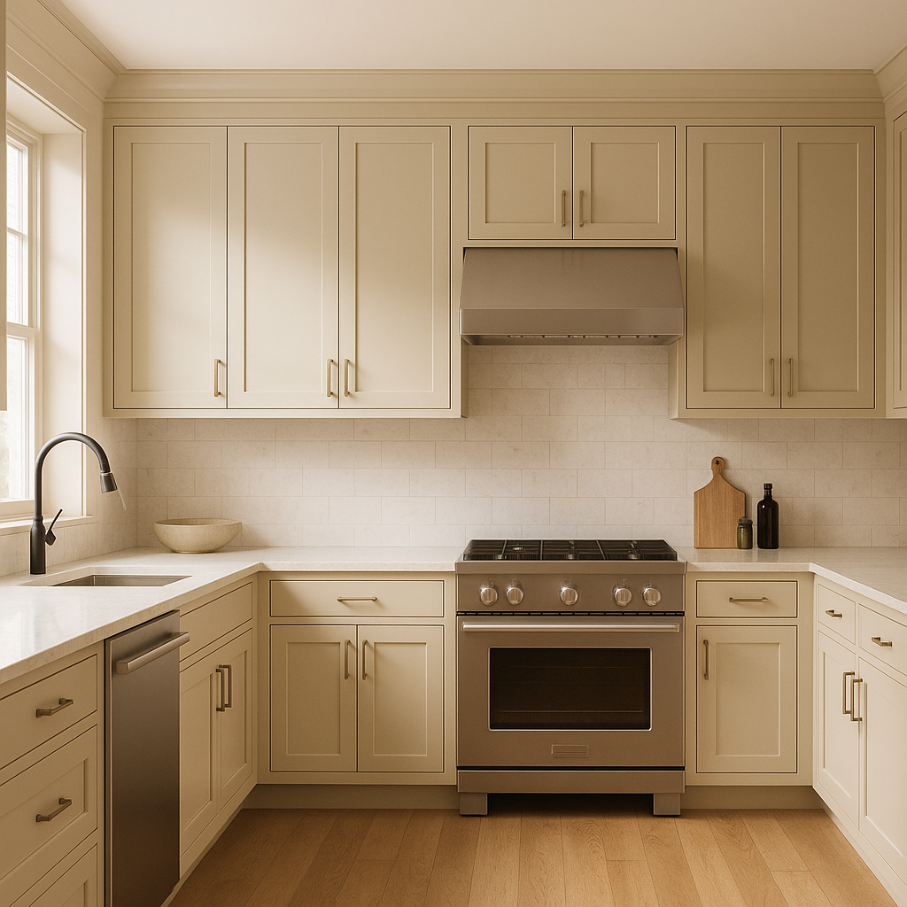
Putnam HC-39 brings an earthy elegance to kitchen spaces, especially when used on cabinets or an island. Pair it with marble countertops and white subway tiles for a sophisticated, timeless look. Add touches of greenery to echo the color’s natural inspiration.
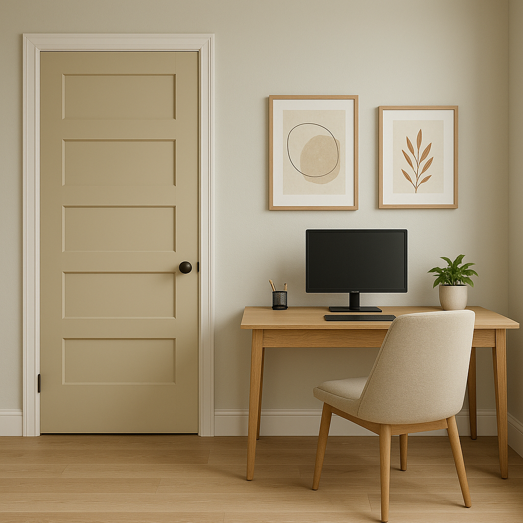
Infuse focus and calm into your workspace by using Putnam HC-39 as the primary wall color. Its subtle green undertones promote concentration, while its gray base keeps the room feeling composed and professional.
Putnam HC-39 is equally stunning on home exteriors. Use it for siding or shutters to create a timeless curb appeal. Pair it with warm whites or deep browns for a polished finish.
Putnam HC-39 has a chameleon-like quality and can shift slightly depending on lighting conditions. In spaces with ample natural light, its green undertones become more pronounced, creating a fresh and airy feel. In dimly lit rooms or spaces with artificial lighting, the gray tones take center stage, giving the color a moodier, more sophisticated look. Test it in your space at different times of day to see how the color interacts with the light.
Benjamin Moore Putnam HC-39 offers a timeless blend of muted green and gray that adapts to a range of interior styles, from contemporary minimalism to traditional elegance. Its versatility, calming undertones, and ability to pair harmoniously with other colors make it a go-to choice for designers seeking a sophisticated yet approachable hue. Whether you’re revitalizing a single room or planning a whole-home palette, Putnam HC-39 delivers classic beauty and enduring charm.
View Colors Only by Brand (No Imagery):
Sherwin-Williams
|
Benjamin-Moore
|
Behr
|
Valspar
Live on the Eastern Slope of Colorado and looking for a local painting professional, check out all our painting services and reach out for a free estimate.
Copyright © 2026 : Wild Fox Painting Inc. : 12435 Mead Way, Littleton, CO 80125


