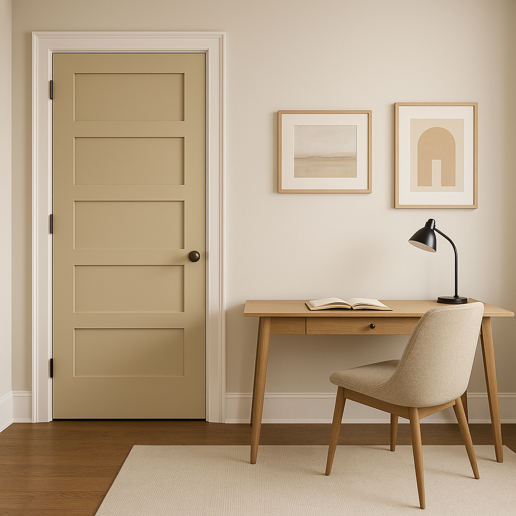
Benjamin Moore Shaker HC-45 is a classic, warm neutral that exudes sophistication and charm. Rooted in the Historical Collection, this shade represents timeless design and traditional elegance, making it a favorite among homeowners and designers alike. With its balanced undertones and versatile nature, Shaker HC-45 seamlessly adapts to a variety of interior and exterior spaces, offering warmth and character.
Shaker HC-45 is a rich taupe with subtle warm undertones. Its blend of beige and gray creates a perfect harmony, giving it a grounded yet inviting feel. The warm undertones lean slightly toward a brownish hue, making this color ideal for creating cozy and welcoming spaces. Its understated elegance ensures that it doesn’t overpower other design elements, allowing it to complement both traditional and contemporary aesthetics effortlessly.
When placed in different lighting conditions, the undertones of Shaker HC-45 may shift slightly. In natural light, it appears soft and neutral, while under artificial lighting, its warmth becomes more pronounced, adding depth and dimension to the room.
Benjamin Moore Shaker HC-45 is incredibly versatile and pairs beautifully with a wide range of colors. Whether you’re designing a monochromatic palette or seeking complementary shades, this hue offers endless possibilities. Here are some suggestions for coordinating colors:
Trim and Accents: Pair Shaker HC-45 with crisp whites like Benjamin Moore Chantilly Lace OC-65 or Simply White OC-117. These clean, bright whites provide a striking contrast, highlighting the warm neutrality of Shaker HC-45.
Complementary Colors: For a serene and balanced look, consider soft blues or greens, such as Benjamin Moore Wythe Blue HC-143 or Palladian Blue HC-144. These shades bring out the subtle warmth in Shaker HC-45, creating a soothing and harmonious space.
Darker Contrasts: If you want to add drama, pair Shaker HC-45 with deep, moody hues like Benjamin Moore Hale Navy HC-154 or Kendall Charcoal HC-166. These darker tones anchor the space and provide a bold yet sophisticated contrast.
Earthy Tones: For a warm, organic feel, combine Shaker HC-45 with muted earthy colors like Benjamin Moore Saybrook Sage HC-114 or Pewter Revere HC-172. These natural tones enhance the taupe’s earthy warmth, creating a cohesive and grounded design.
Shaker HC-45’s versatility makes it an excellent choice for a variety of applications in both residential and commercial spaces. Here are some of the best ways to incorporate this color into your home or office:
The warm, neutral quality of Shaker HC-45 makes it ideal for living rooms. It creates a comforting backdrop that works well with both traditional and modern furniture styles. Pair it with natural textures like wood or linen for a cozy, inviting atmosphere.
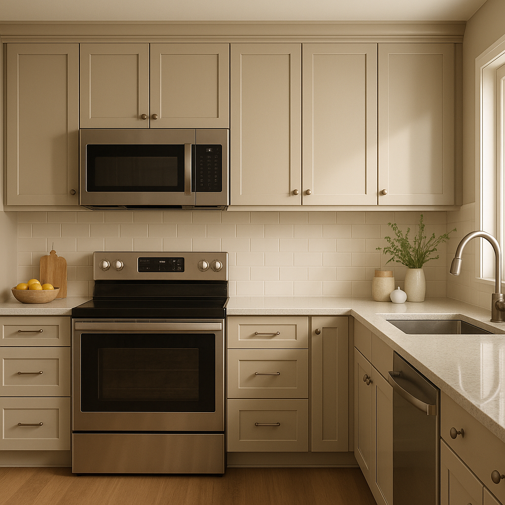
In kitchens, Shaker HC-45 can be used on cabinetry to achieve a timeless, classic look. It pairs beautifully with marble or quartz countertops and metal accents like brushed brass or stainless steel. Alternatively, use it on walls to complement white or cream cabinetry.
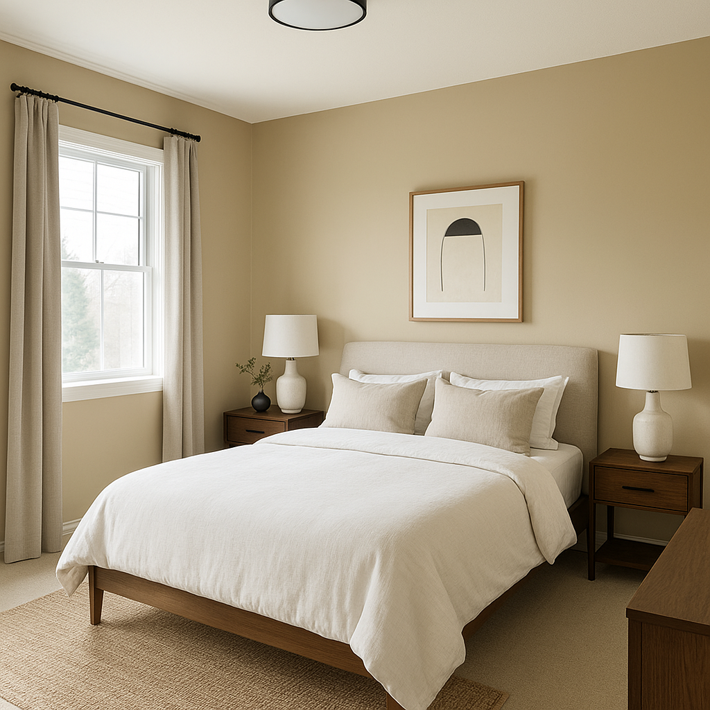
For a restful and serene bedroom retreat, Shaker HC-45 is the perfect wall color. Its warm undertones create a soothing ambiance, especially when paired with soft, plush textiles in neutral or pastel shades.
Elevate your dining space with the rich taupe of Shaker HC-45. It adds warmth and sophistication, especially when paired with elegant wooden furniture and metallic fixtures.
View Colors Only by Brand (No Imagery):
Sherwin-Williams
|
Benjamin-Moore
|
Behr
|
Valspar
Live on the Eastern Slope of Colorado and looking for a local painting professional, check out all our painting services and reach out for a free estimate.
Copyright © 2026 : Wild Fox Painting Inc. : 12435 Mead Way, Littleton, CO 80125


