Benjamin Moore Chippendale Rosetone (HC-58) is a rich and versatile shade that exudes timeless elegance. This warm, earthy hue belongs to Benjamin Moore’s Historical Collection, a range of colors inspired by American heritage and designed to create classic, sophisticated interiors. Chippendale Rosetone is the perfect blend of subtle warmth and understated refinement, making it a go-to choice for homeowners and designers seeking a color that feels both traditional and modern.
Chippendale Rosetone is a medium-toned, warm neutral with distinct reddish-brown undertones. These rosy undertones give the color a sense of depth and richness, while still maintaining its warmth and approachability. The subtle red notes add a soft, earthy quality to the paint, making it feel inviting and grounded without being overpowering. Depending on the lighting, Chippendale Rosetone can appear slightly more muted or take on a deeper, more vibrant tone, giving it an adaptable nature that suits a variety of spaces.
Chippendale Rosetone works beautifully with a range of complementary hues, allowing you to create a well-coordinated and harmonious color scheme. Below are some suggestions for coordinating colors that enhance its natural warmth and character:
Warm Neutrals: Pair Chippendale Rosetone with soft, creamy neutrals like Benjamin Moore’s White Dove (OC-17) or Cloud White (OC-130). These lighter shades provide a balanced contrast and keep the space feeling fresh and airy.
Earthy Greens: For a sophisticated, nature-inspired palette, consider combining it with muted greens like Saybrook Sage (HC-114) or Kittery Point Green (HC-119). These tones complement the rosy undertones while adding depth and character.
Deep Charcoals and Browns: For a more dramatic look, pair it with darker, grounding shades such as Kendall Charcoal (HC-166) or Branchport Brown (HC-72). These colors create a striking contrast that enhances the elegance of Chippendale Rosetone.
Dusty Blues: To add a subtle cool tone to balance the warmth, try pairing it with shades like Van Courtland Blue (HC-145) or Boothbay Gray (HC-165). This combination feels both timeless and serene.
Chippendale Rosetone’s versatility makes it an excellent choice for a variety of rooms and design styles. Whether you’re looking to create a cozy retreat or a more formal, polished aesthetic, this warm neutral adapts beautifully to its surroundings.
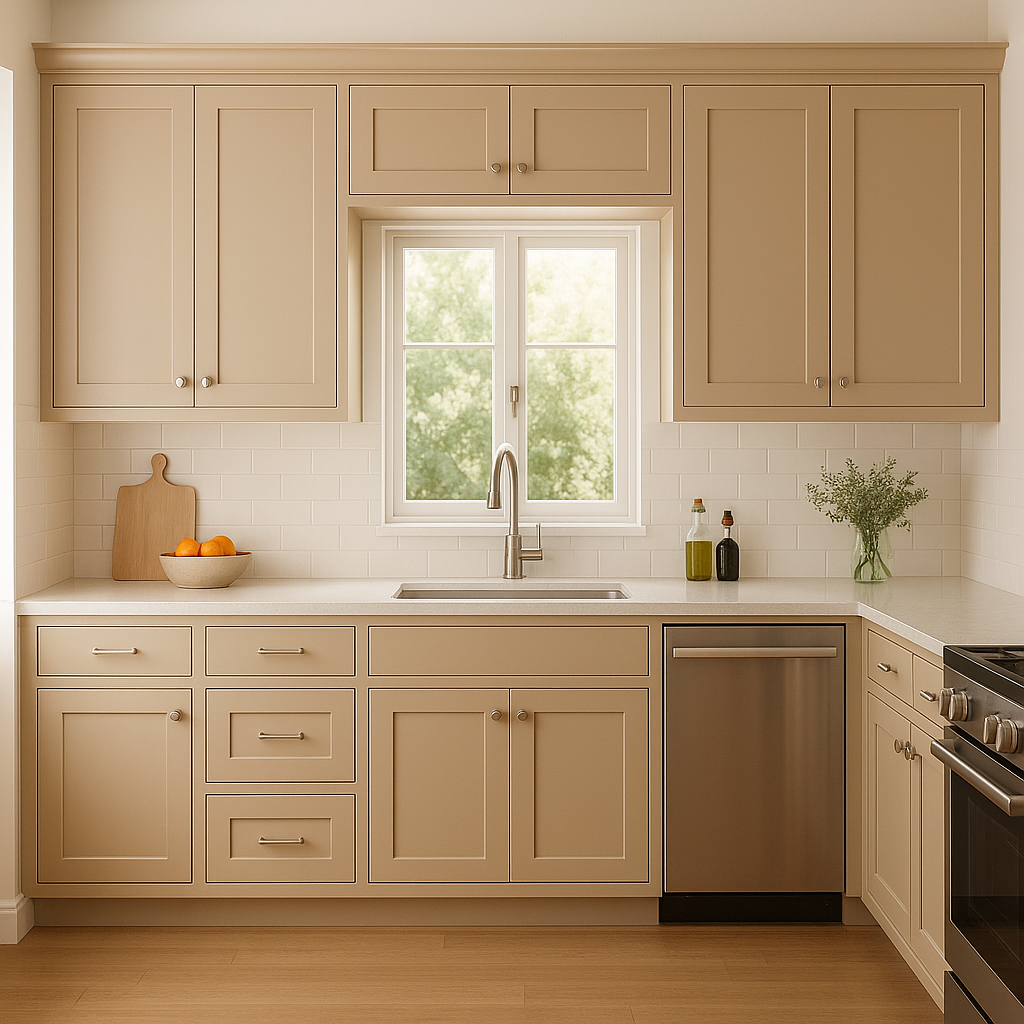
In living rooms, Chippendale Rosetone adds warmth and sophistication. Use it as a wall color to create an inviting, comfortable space where family and friends can gather. Pair it with wooden furniture, natural textures, and soft fabrics to enhance its earthy charm.
For dining rooms, this hue evokes a sense of tradition and elegance. It pairs well with classic wood finishes and metallic accents, making it perfect for formal dining spaces or transitional styles.
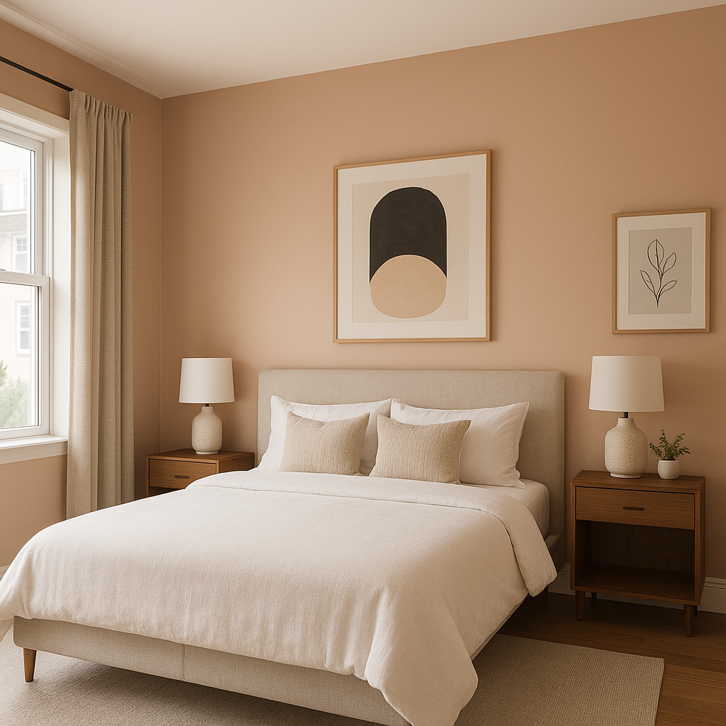
Chippendale Rosetone’s rosy undertones make it an excellent choice for bedrooms, where it can create a calming and cozy atmosphere. Pair it with crisp white bedding and soft, muted accent colors for a serene retreat.
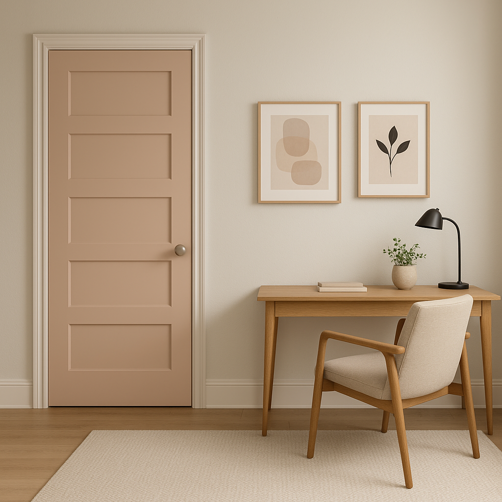
In home offices or libraries, Chippendale Rosetone brings a sense of warmth and intellectual sophistication. Combine it with leather furniture, dark wood shelving, and antique brass fixtures to create a timeless, professional space.
If you’re not ready to commit to an entire room, use Chippendale Rosetone as an accent color. It works beautifully behind a fireplace, as a backdrop for artwork, or on built-in shelving to add depth and interest.
Lighting plays a crucial role in how Chippendale Rosetone appears in your space. In rooms with ample natural light, the color’s warm undertones will feel more pronounced, giving the space a cozy glow. In dimmer or artificial lighting, the reddish-brown tones may deepen, lending a rich and dramatic quality. Always test a sample in your space and observe how it changes throughout the day to ensure it aligns with your vision.
Benjamin Moore Chippendale Rosetone (HC-58) is a warm, elegant neutral that combines historical charm with contemporary versatility. Its rosy undertones, adaptability, and ability to pair beautifully with a wide range of colors make it an excellent choice for any space. Whether used as a primary wall color, an accent, or a complement to other shades, Chippendale Rosetone delivers timeless sophistication and inviting warmth to your home.
View Colors Only by Brand (No Imagery):
Sherwin-Williams
|
Benjamin-Moore
|
Behr
|
Valspar
Live on the Eastern Slope of Colorado and looking for a local painting professional, check out all our painting services and reach out for a free estimate.
Copyright © 2026 : Wild Fox Painting Inc. : 12435 Mead Way, Littleton, CO 80125


