Benjamin Moore Clinton (HC-67) is a versatile and sophisticated mid-tone neutral that exudes timeless elegance. This refined gray-beige, often referred to as a "greige," strikes the perfect balance between warmth and coolness, making it an exceptional choice for a variety of interior styles. Whether you're designing a traditional, transitional, or modern space, Clinton provides a calm and grounding backdrop that enhances any room's aesthetic.
Clinton (HC-67) is defined by its subtle undertones that shift effortlessly between gray and beige. It carries a soft warm undertone, which prevents it from feeling too cool or stark, while its gray base adds a modern edge. These undertones allow it to adapt beautifully to surrounding colors, natural light, and artificial lighting conditions. In rooms with ample natural sunlight, Clinton leans more beige and warm, while in dimmer or north-facing spaces, its gray undertones become more prominent, lending a cozy, moody ambiance.
One of the standout qualities of Clinton is its versatility when it comes to pairing with other colors. It works seamlessly with both warm and cool tones, making it an excellent neutral to anchor a color palette. Here are some suggestions for coordinating colors:
Clinton’s adaptability makes it a fantastic choice for a wide variety of uses in both residential and commercial spaces. Whether you're looking to create a serene retreat or a polished, professional environment, this neutral gray-beige will rise to the occasion.
In living spaces, Clinton creates a sense of understated elegance. Pair it with plush furniture in soft fabrics like linen or velvet, and use metallic accents in gold or brushed nickel to enhance its sophistication. Layering textures—like a chunky knit throw or a sisal rug—can add warmth and depth to the overall design.
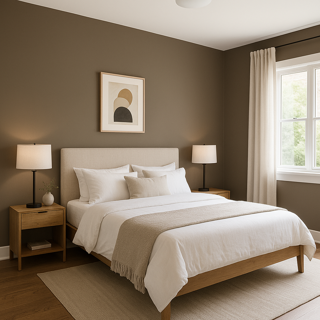
Clinton’s tranquil nature makes it an ideal choice for bedrooms. Use it on walls to establish a soothing foundation, and incorporate bedding in soft whites or muted blues for a serene sanctuary. Add task lighting with warm bulbs to highlight its subtle undertones.
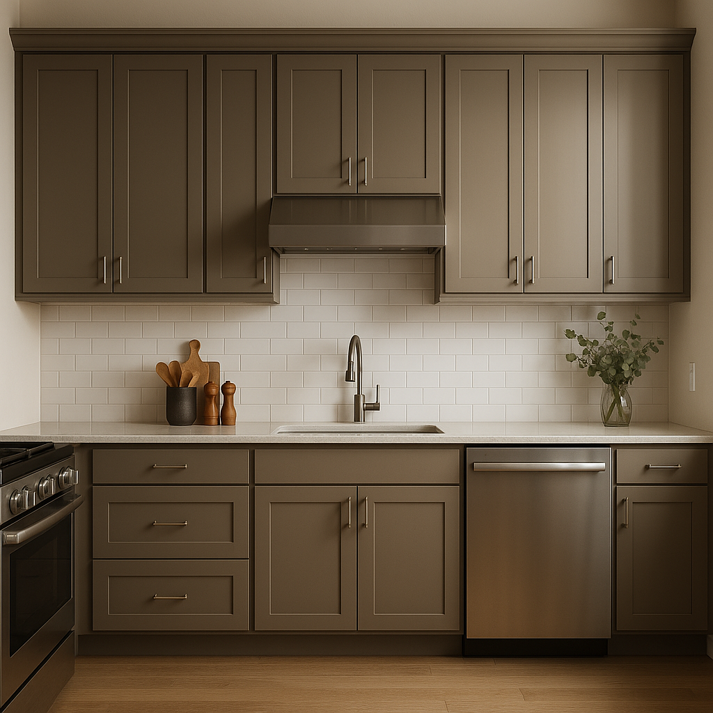
This shade shines in kitchens, especially when paired with white or cream cabinetry. For a more contemporary look, consider combining Clinton with darker cabinets in charcoal or navy. A backsplash in subway tiles or patterned ceramic can add visual interest without overpowering the neutral backdrop.
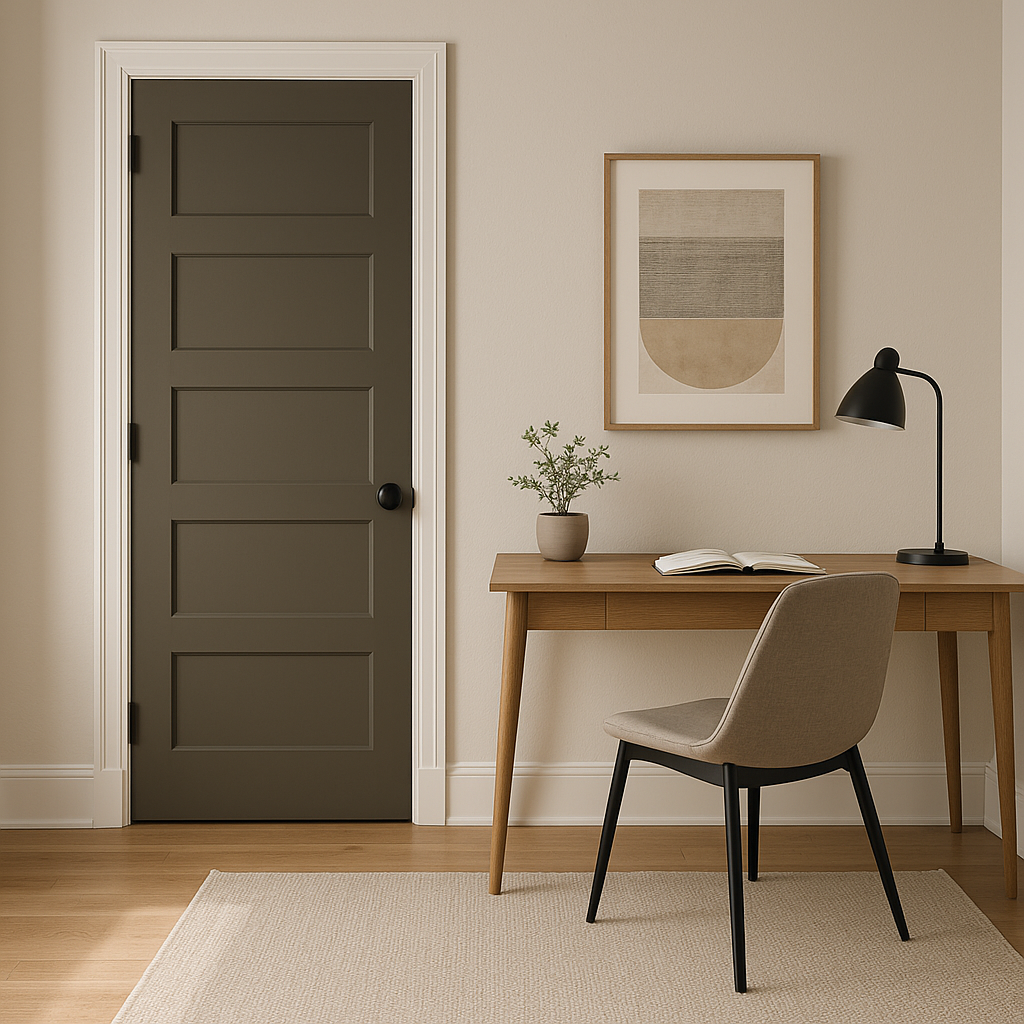
Create a focused and peaceful home office by using Clinton on the walls. Pair it with dark wood furniture for a traditional aesthetic or sleek, modern furniture in black or chrome for a more contemporary vibe. Add pops of color through artwork or desk accessories.
Clinton’s balanced tone translates beautifully to exteriors as well. Use it as a main siding color for a timeless look, pairing it with white trim for a crisp contrast or black shutters for a bold yet classic statement.
Benjamin Moore Clinton (HC-67) is more than just a neutral—it's a color that transforms spaces with its understated sophistication. Its delicate balance of gray and beige allows it to work effortlessly in both modern and traditional designs. Clinton’s ability to adapt to various lighting conditions and its compatibility with a wide range of coordinating colors make it a must-have for any interior or exterior project. Whether you're refreshing a single room or designing an entire home, Clinton delivers timeless charm and enduring versatility.
View Colors Only by Brand (No Imagery):
Sherwin-Williams
|
Benjamin-Moore
|
Behr
|
Valspar
Live on the Eastern Slope of Colorado and looking for a local painting professional, check out all our painting services and reach out for a free estimate.
Copyright © 2026 : Wild Fox Painting Inc. : 12435 Mead Way, Littleton, CO 80125


