Benjamin Moore Van Courtland Blue (HC-70) is a refined and versatile paint color that effortlessly blends classic charm with modern sensibility. This medium blue hue, part of the Historic Color collection, pays homage to traditional design while offering the flexibility to enhance contemporary spaces. Its ability to evoke tranquility and sophistication makes it a popular choice among interior designers and homeowners alike.
Van Courtland Blue is imbued with subtle gray undertones that soften its rich blue base. These undertones prevent the color from feeling overly bright or saturated, lending it a calming and understated quality. The gray influences also allow this shade to work beautifully in spaces where you want to create a serene atmosphere. It pairs well with both warm and cool tones, making it an adaptable choice for various design styles.
Benjamin Moore Van Courtland Blue harmonizes effortlessly with a range of coordinating colors, helping you create a cohesive and polished look. Here are some excellent pairings to consider:
Van Courtland Blue is a versatile color that can be used in a variety of spaces to evoke different moods and design aesthetics. Here are some of its best applications:
This color is perfect for spaces where you entertain or relax. Its calming nature creates a welcoming environment, while its sophistication adds a touch of elegance. Pair it with neutral furnishings and metallic accents for a polished, timeless look.
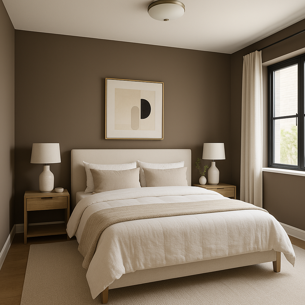
Van Courtland Blue is an excellent choice for bedrooms, where its soothing qualities can promote relaxation and restful sleep. Consider using it on walls paired with soft white bedding and natural wood furniture for a cozy retreat.
Bring a spa-like atmosphere to your bathroom with Van Courtland Blue. Its serene tone pairs beautifully with white subway tiles, polished chrome fixtures, and light gray towels for a clean and refreshing space.
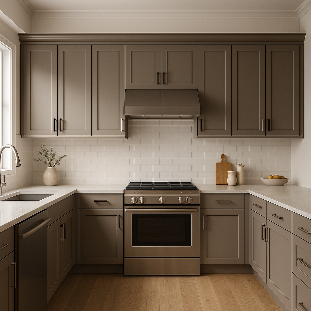
In kitchens, Van Courtland Blue can be used on cabinetry for a unique and stylish look. Pair it with marble countertops and brass hardware to create a modern yet classic aesthetic.
For spaces where you want to make a subtle statement, Van Courtland Blue works wonderfully as an accent wall color. Its depth draws the eye without overwhelming the room, making it perfect for focal points like fireplaces or behind shelving units.
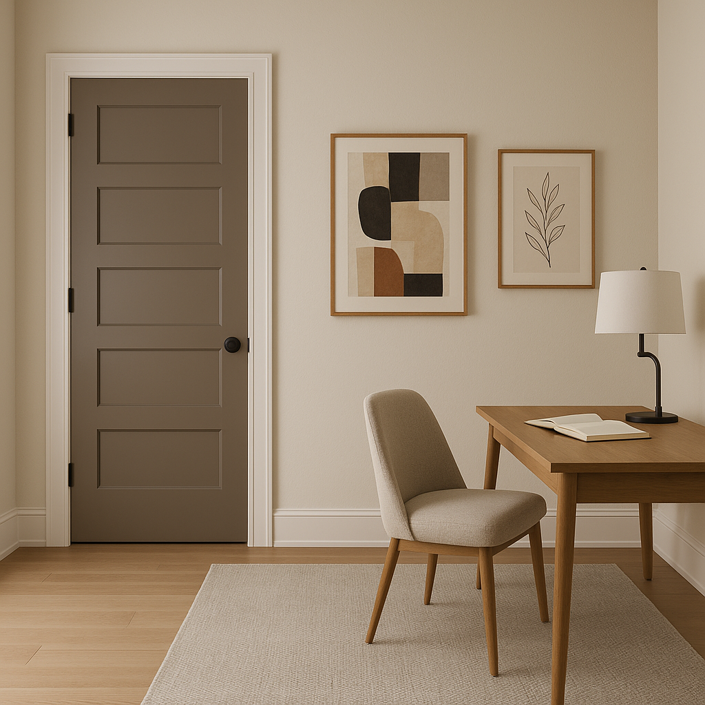
This shade’s calming and focused energy makes it an ideal candidate for home offices. Combine it with sleek furniture and minimalistic décor to create a productive yet stylish workspace.
Benjamin Moore Van Courtland Blue (HC-70) is more than just a color—it’s a mood enhancer and a design tool. Its versatility allows it to suit traditional, transitional, and modern interiors alike. Whether you’re looking to create a cozy sanctuary in your bedroom, add elegance to your living room, or bring a touch of sophistication to your kitchen, this timeless blue will deliver. Its ability to pair seamlessly with a variety of complementary colors ensures it will integrate beautifully into your overall design scheme.
By incorporating Van Courtland Blue into your home, you’re choosing a shade that offers both character and composure, making it a true designer favorite for creating spaces that feel both stylish and serene.
View Colors Only by Brand (No Imagery):
Sherwin-Williams
|
Benjamin-Moore
|
Behr
|
Valspar
Live on the Eastern Slope of Colorado and looking for a local painting professional, check out all our painting services and reach out for a free estimate.
Copyright © 2026 : Wild Fox Painting Inc. : 12435 Mead Way, Littleton, CO 80125


