Benjamin Moore Branchport (HC-72) is a rich, sophisticated shade that elegantly bridges the gap between deep blue and muted gray. Part of the revered Historical Collection, this color brings a sense of timeless charm to interiors, making it a popular choice for designers and homeowners seeking a grounding yet versatile hue. Its understated depth offers a sense of tranquility, while its refined character ensures that it feels polished and elevated in any room.
Branchport carries subtle green-gray undertones that soften its boldness, giving it a nuanced complexity. These undertones ensure the color doesn’t feel overly cold or stark, allowing it to work beautifully in spaces where warmth and balance are desired. While it predominantly leans toward a classic navy-inspired shade, the green-gray undertones provide versatility, making it adaptable to both traditional and contemporary design styles.
The versatility of Branchport (HC-72) makes it an excellent anchor color in a wide array of palettes. Whether you're aiming for a dramatic statement or a more subdued aesthetic, here are some suggestions for coordinating colors:
These coordinating shades allow Branchport to shine while ensuring the overall palette feels cohesive and intentional.
Branchport (HC-72) is an incredibly versatile color that can be used in a variety of settings to evoke different moods and aesthetics:
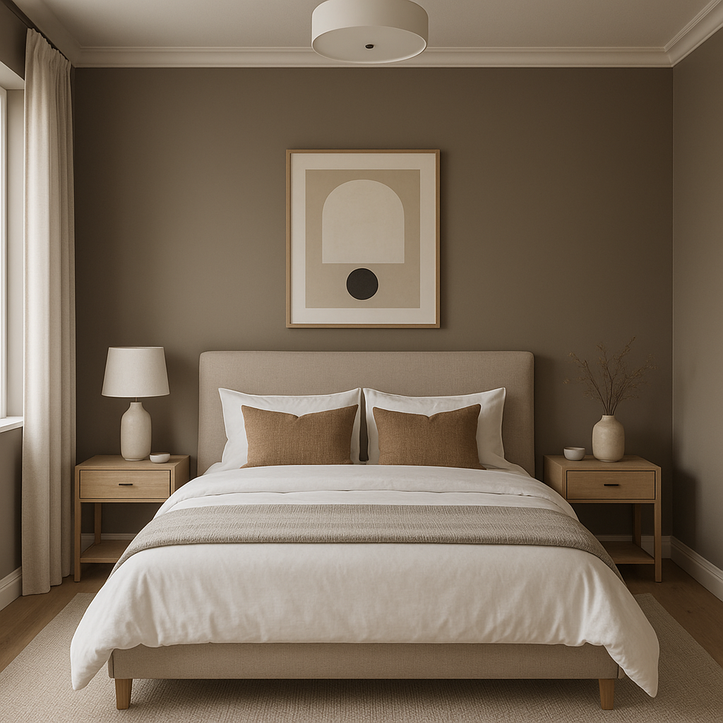
Branchport’s depth makes it an ideal choice for accent walls. Use it in living rooms or bedrooms to add a dramatic focal point that doesn’t overwhelm the space. Pair it with lighter, neutral tones to maintain balance and highlight its richness.
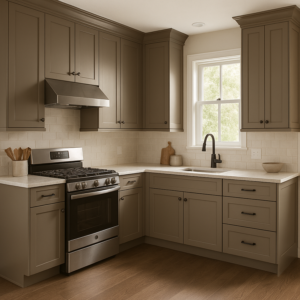
Transform kitchen or bathroom cabinetry with Branchport for a bold, elegant look. Its muted undertones ensure it doesn’t feel overpowering, even in small spaces. Consider pairing with brass or polished nickel hardware for a sophisticated finish.
For spaces where intimacy and coziness are key, Branchport delivers beautifully. The deep hue creates a sense of enclosure and warmth, making it perfect for formal dining rooms, studies, or libraries. Pair with rich wood tones to enhance its traditional charm.
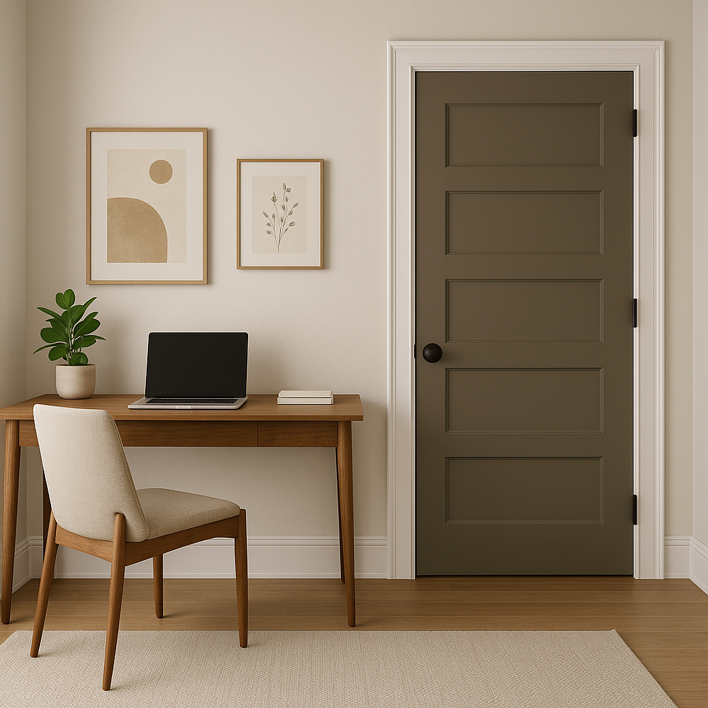
Branchport is equally stunning outside the home. As a front door color, it exudes classic elegance and curb appeal. On exterior siding, it offers a unique alternative to traditional navy or gray tones, especially when paired with crisp white trim.
Hallways, mudrooms, or entryways painted in Branchport make for striking yet welcoming transitional spaces. Enhance the look with complementary rugs, artwork, or lighting fixtures.
As with all deep hues, lighting plays a crucial role in how Branchport appears. In natural light, its blue-gray tones may feel brighter and more vibrant, while in artificial or dim lighting, its green undertones may become more pronounced. To optimize its visual impact, test the color in your space during different times of day to see how it interacts with your unique lighting conditions.
Benjamin Moore Branchport (HC-72) is a timeless, versatile choice for homeowners and designers looking to add depth and sophistication to their spaces. Its balanced blend of blue, gray, and green undertones ensures it works across various design styles, from classic to contemporary. Whether used on walls, cabinetry, or exteriors, this color delivers understated elegance, making it a standout choice for creating memorable and impactful interiors.
View Colors Only by Brand (No Imagery):
Sherwin-Williams
|
Benjamin-Moore
|
Behr
|
Valspar
Live on the Eastern Slope of Colorado and looking for a local painting professional, check out all our painting services and reach out for a free estimate.
Copyright © 2026 : Wild Fox Painting Inc. : 12435 Mead Way, Littleton, CO 80125


