Benjamin Moore Valley (HC-74) is a rich and refined neutral that exudes timeless sophistication. Nestled within Benjamin Moore's Historic Collection, this versatile hue strikes the perfect balance between warmth and depth, making it an ideal choice for both traditional and contemporary interiors. With its understated charm, Valley (HC-74) creates a welcoming ambiance that feels cozy yet polished.
Valley (HC-74) is a warm beige with subtle golden undertones. These warm undertones lend the color depth and richness without overpowering the overall neutrality of the shade. The golden undertones also help to reflect light beautifully, giving your space a soft glow. Whether paired with natural light or ambient lighting, Valley (HC-74) maintains its warmth and inviting character.
Valley (HC-74) is a versatile neutral that harmonizes effortlessly with a variety of colors. Here are some coordinating hues to consider:
When selecting coordinating colors, consider the overall mood and style you want to achieve in your space. Valley (HC-74) is incredibly adaptable, serving as the perfect backdrop for both soft, serene palettes and bold, statement-making combinations.
Valley (HC-74) is a workhorse of a neutral, making it suitable for virtually any room in your home. Its warm golden undertones make it especially well-suited to spaces where you want to create a cozy and inviting atmosphere.
Valley (HC-74) is a fantastic choice for living rooms where you want a neutral foundation that feels elegant yet welcoming. Pair it with plush furniture in soft grays or taupes, and accent with metallics like gold or brass for a touch of sophistication.
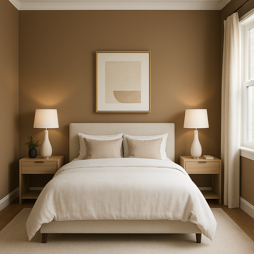
In the bedroom, Valley creates a soothing retreat. Combine it with crisp white linens and soft pastel accents for a serene escape, or add depth with rich navy or charcoal tones for a more dramatic look.
Valley (HC-74) lends itself beautifully to formal dining spaces. Use it on walls to set a refined tone, and incorporate darker coordinating colors like Kendall Charcoal or Hale Navy for furniture or accent pieces.
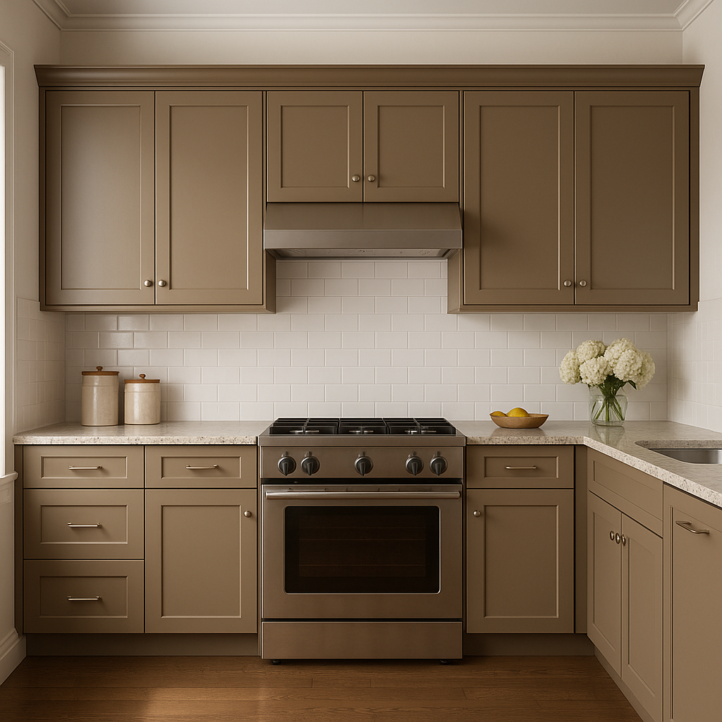
For kitchens, Valley works wonderfully as a wall color or even on cabinetry. Pair it with White Dove for a clean, classic look, or add warmth with natural wood tones and brass hardware.
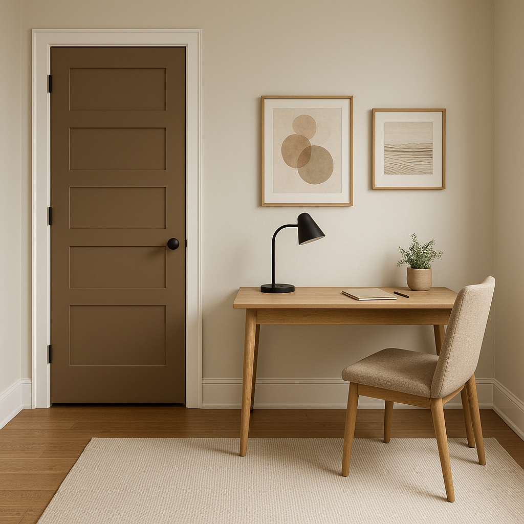
Valley's versatility makes it a fantastic choice for transitional spaces like hallways and entryways. Its soft golden undertones brighten these areas while maintaining a polished, sophisticated feel.
Valley (HC-74) is more than just a neutral—it’s a classic that transcends trends and evolves with your design choices. Whether you’re aiming for a minimalist aesthetic or a richly layered interior, Valley provides a foundation of warmth and elegance. Its adaptability to different lighting conditions and its ability to pair seamlessly with other colors make it a go-to choice for homeowners and designers alike.
With Benjamin Moore Valley (HC-74), you can create spaces that feel timeless, welcoming, and effortlessly stylish.
View Colors Only by Brand (No Imagery):
Sherwin-Williams
|
Benjamin-Moore
|
Behr
|
Valspar
Live on the Eastern Slope of Colorado and looking for a local painting professional, check out all our painting services and reach out for a free estimate.
Copyright © 2026 : Wild Fox Painting Inc. : 12435 Mead Way, Littleton, CO 80125


