Benjamin Moore Fairview Taupe (HC-85) is a distinguished neutral that exudes understated elegance. Perfectly balanced with warm and cool undertones, this shade belongs to Benjamin Moore's Historical Collection—a curated palette inspired by 18th and 19th-century architecture. Fairview Taupe seamlessly blends tradition and modernity, making it a versatile choice for both classic and contemporary interiors.
Fairview Taupe is a rich, earthy taupe with both gray and brown undertones. The subtle warmth in this neutral creates a sense of coziness, while the cooler gray influence lends sophistication and versatility. These undertones allow the color to adapt beautifully to various lighting conditions. In brighter spaces with plenty of natural light, Fairview Taupe leans more toward its gray base, appearing refined and understated. In dimmer or artificial lighting, the warmer brown undertones emerge, enveloping the room in a welcoming and grounded ambiance.
Benjamin Moore Fairview Taupe pairs harmoniously with a variety of hues, making it an excellent choice for creating palettes that are cohesive and visually appealing. Below are some coordinating colors to consider:
Soft Off-Whites: Pair Fairview Taupe with timeless off-whites like Benjamin Moore "White Dove" (OC-17) or "Cloud White" (OC-130) for a clean and airy aesthetic. These lighter tones provide a beautiful contrast, enhancing the richness of the taupe while maintaining a sense of brightness.
Deep Charcoals: For a bold and contemporary pairing, consider Benjamin Moore "Kendall Charcoal" (HC-166). The strong, dark gray anchors the space and adds dramatic depth to the neutral taupe.
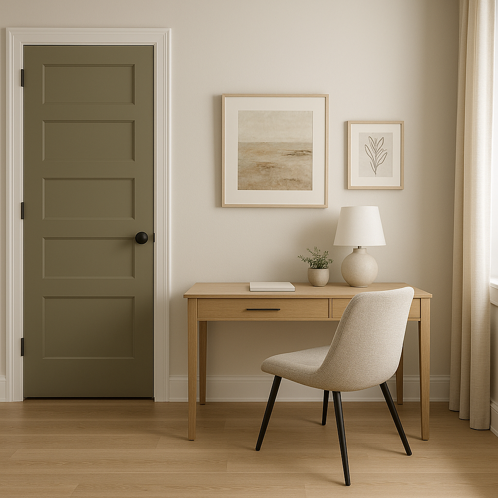
Earthy Greens: Complement Fairview Taupe with muted greens like Benjamin Moore "Sagebrush" (CC-548) or "October Mist" (1495). These organic hues echo its earthy undertones and create a serene, nature-inspired palette.
Warm Accents: Add warmth and vibrancy by incorporating terracotta or rusty red shades like Benjamin Moore "Caliente" (AF-290). These colors enhance the subtle brown undertones in Fairview Taupe and work beautifully in spaces designed with a transitional or rustic aesthetic.
Fairview Taupe is a go-to neutral for designers seeking a shade that bridges the gap between warm and cool tones. Its versatility makes it suitable for a wide range of applications:
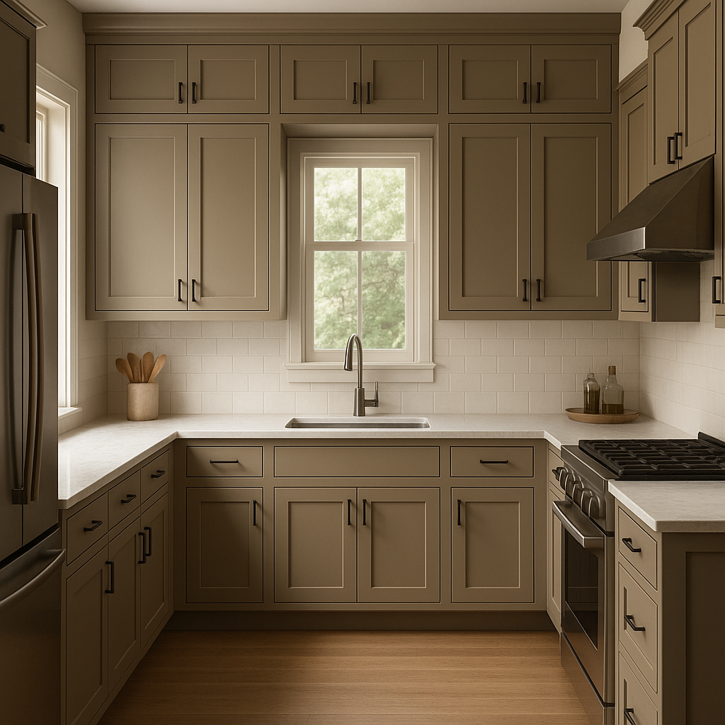
Fairview Taupe creates a cozy yet refined atmosphere in living rooms and family spaces. Pair it with soft neutral furnishings and natural textures like linen, wood, or sisal rugs for a timeless look. This shade is perfect for creating a grounding backdrop that allows accent colors or artwork to shine.
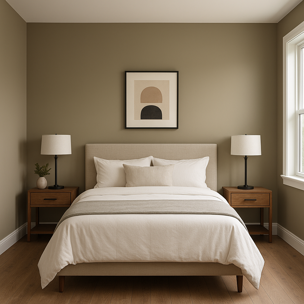
With its soothing undertones, Fairview Taupe is an excellent choice for bedrooms. Use it on walls to create a restful retreat, and complement it with plush textiles in soft whites or muted greens. Layering textures like velvet or knits can elevate the comfort of the space.
Fairview Taupe lends an air of sophistication to dining rooms. Pair it with deep wood furniture and metallic accents like brushed gold or antique bronze for an elegant yet approachable aesthetic. This shade works beautifully with traditional or modern decor styles.
In bathrooms, Fairview Taupe provides a calming, spa-like ambiance. Pair it with crisp white cabinetry and marble countertops for a luxurious feel. Adding greenery or natural stone elements will enhance the earthy undertones of the shade.
For home offices, Fairview Taupe offers a professional and grounded backdrop that promotes focus and productivity. It pairs well with dark wood desks and shelves, creating a space that feels both inviting and sophisticated.
The appearance of Fairview Taupe can vary depending on lighting conditions. In spaces with abundant natural light, the gray undertones will be more pronounced, offering a cooler and more modern feel. In rooms with warm artificial lighting, the brown undertones become more prominent, creating a cozy and intimate environment. Testing a sample in your space is highly recommended to ensure you achieve the desired effect.
Benjamin Moore Fairview Taupe (HC-85) stands out as a versatile neutral that adapts to diverse design styles, from traditional to modern. Its balanced undertones make it a reliable choice for spaces that need warmth without being overly yellow and coolness without feeling stark. Whether used as a main wall color or as part of a complementary palette, Fairview Taupe is sure to elevate your home with timeless charm and sophistication.
View Colors Only by Brand (No Imagery):
Sherwin-Williams
|
Benjamin-Moore
|
Behr
|
Valspar
Live on the Eastern Slope of Colorado and looking for a local painting professional, check out all our painting services and reach out for a free estimate.
Copyright © 2026 : Wild Fox Painting Inc. : 12435 Mead Way, Littleton, CO 80125


