Benjamin Moore Jamesboro (HC-88) is a sophisticated, earthy green that exudes timeless charm and understated elegance. Part of the Benjamin Moore Historical Collection, this shade is inspired by heritage homes and classic design, making it a favorite for both traditional and modern spaces. With its balanced depth and complexity, Jamesboro delivers a grounded yet refreshing ambiance that transforms any room into a serene retreat.
Jamesboro is a unique green that carries subtle gray undertones, giving it a muted and refined appearance. These cool undertones soften the richness of the green, ensuring it doesn’t feel overpowering or overly vibrant. This balanced composition makes Jamesboro incredibly versatile, allowing it to pair seamlessly with a wide range of color palettes. The gray undertones also lend a sense of calmness and sophistication, making it ideal for creating tranquil spaces or adding depth to your design.
To create a cohesive and harmonious look, Benjamin Moore Jamesboro pairs beautifully with a variety of complementary shades. Here are some coordinating colors to consider:
Jamesboro is a versatile shade that works beautifully across a variety of spaces and design styles. Here are some ideas for incorporating it into your home:
Jamesboro brings a sense of sophistication and warmth to living rooms. Pair it with neutral furniture and natural textures like wood or linen for a classic yet inviting atmosphere. Add metallic accents like brass or gold to elevate the space further.
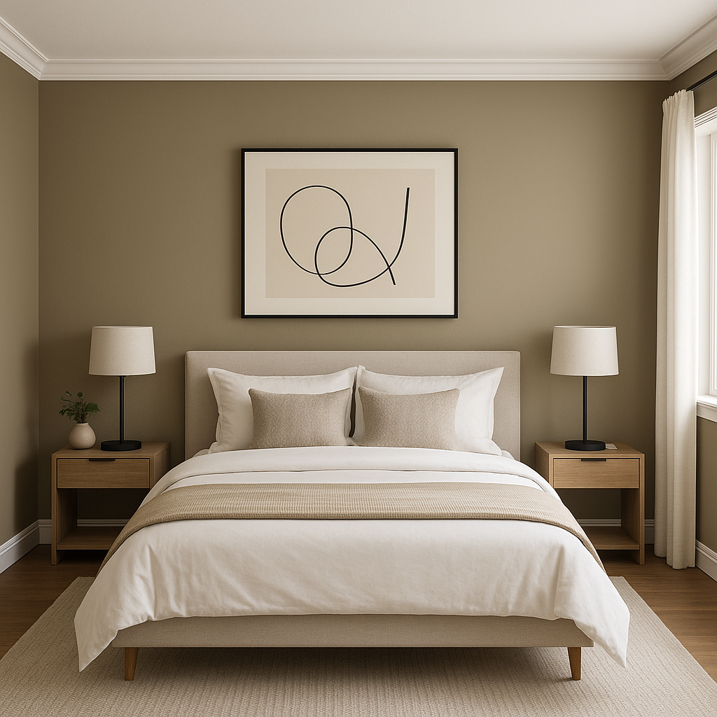
The muted green tones of Jamesboro make it a fantastic choice for bedrooms, where tranquility and relaxation are key. Use it as an accent wall behind the bed or throughout the entire room for a serene, cocoon-like effect. Pair it with soft white bedding and natural wood furniture for a calming retreat.
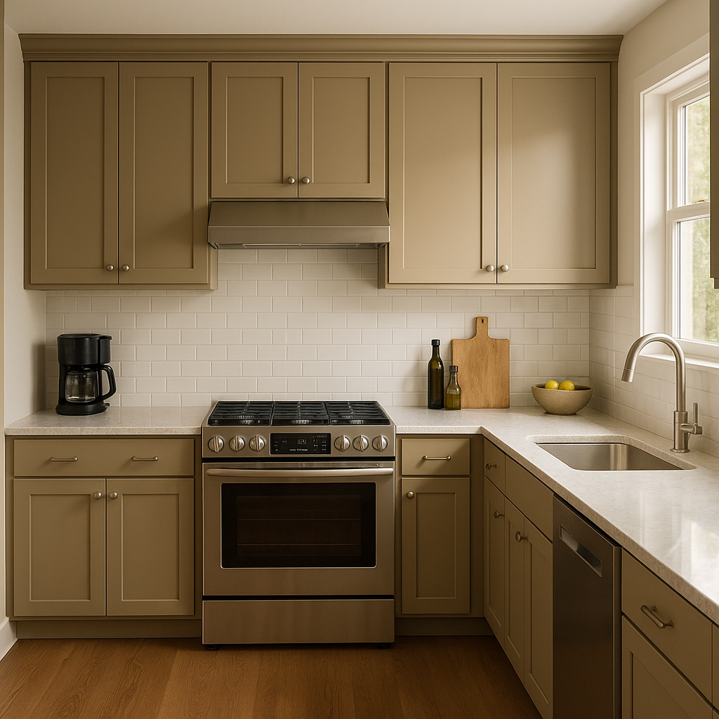
For kitchens and dining spaces, Jamesboro creates a welcoming yet refined environment. Use it on cabinetry for a bold, custom look or as a wall color to complement countertops and backsplashes. Pair it with warm wood tones or brushed nickel hardware to complete the design.
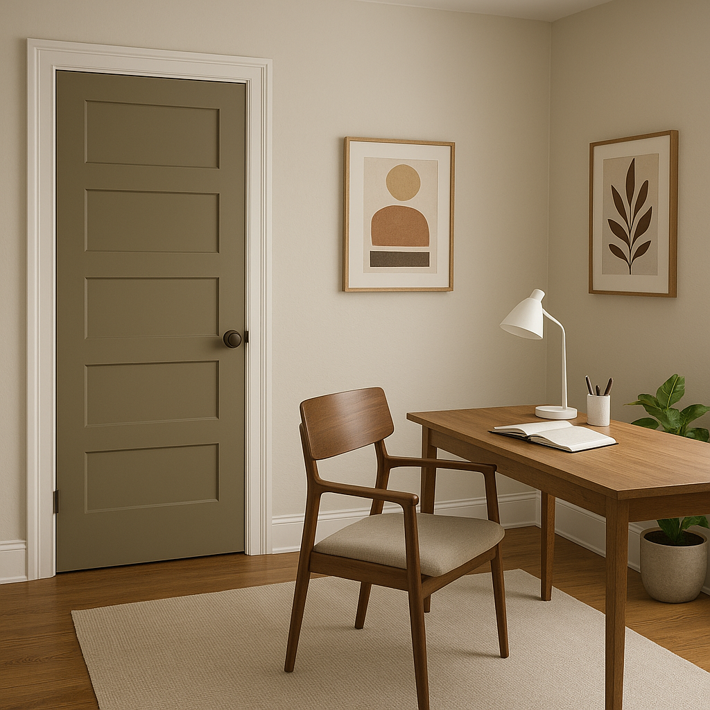
Jamesboro shines in smaller spaces like entryways and hallways, adding depth and character without overwhelming the area. Coordinate it with crisp white trim for a polished and timeless look that sets the tone for the rest of your home.
As part of Benjamin Moore's Historical Collection, Jamesboro is also an excellent choice for exteriors. Whether used as the main house color or as an accent for shutters and doors, its earthy sophistication pairs beautifully with natural landscapes and architectural details.
Jamesboro (HC-88) is more than just a paint color; it’s a statement of timeless style and versatility. Its earthy green base, softened by gray undertones, allows it to adapt to various design aesthetics, from traditional to contemporary. Whether you're looking to create a serene bedroom, a sophisticated living room, or an inviting entryway, Jamesboro offers a unique combination of depth, elegance, and warmth that makes it an excellent choice for any space.
By combining its subtle undertones with carefully curated coordinating colors, Jamesboro becomes the ideal foundation for creating spaces that are both beautiful and functional. Its ability to evoke a sense of calm while remaining visually interesting ensures it will remain a beloved favorite in interior design for years to come.
View Colors Only by Brand (No Imagery):
Sherwin-Williams
|
Benjamin-Moore
|
Behr
|
Valspar
Live on the Eastern Slope of Colorado and looking for a local painting professional, check out all our painting services and reach out for a free estimate.
Copyright © 2026 : Wild Fox Painting Inc. : 12435 Mead Way, Littleton, CO 80125


