Sherwin-Williams Rachel Pink (0026) is a delicate and refined shade that evokes a sense of timeless elegance and feminine charm. This soft pink is perfect for creating a warm, inviting atmosphere and has an understated sophistication that makes it versatile across various design styles. Whether you're reimagining a bedroom, nursery, or accenting a living space with a touch of romance, Rachel Pink is a beautiful choice that exudes balance and serenity.
Rachel Pink leans toward a warm, muted blush with subtle beige undertones, making it more versatile than traditional pinks. The beige undertones prevent it from feeling overly bright or juvenile, while the gentle pink adds a sense of vibrancy and personality without overwhelming the space. This balance makes Rachel Pink suitable for both modern and classic interiors, as it adapts beautifully to its surroundings.
Rachel Pink pairs seamlessly with a variety of complementary shades, allowing for endless possibilities in your color palette. Here are some coordinating colors to consider:
Neutral Pairings:
Combine Rachel Pink with warm neutrals like Sherwin-Williams Alabaster (SW 7008) or Accessible Beige (SW 7036) for a soft, harmonious look. These shades create a calm, cozy environment ideal for bedrooms or quiet sitting areas.
Sophisticated Contrasts:
Pair Rachel Pink with deeper tones like Naval (SW 6244) or Iron Ore (SW 7069) for dramatic accents. These darker hues elevate Rachel Pink’s warmth and make it pop against a bold backdrop.
Playful Combinations:
For a whimsical or youthful look, pair Rachel Pink with soft greens like Sea Salt (SW 6204) or pale blues such as Rainwashed (SW 6211). These combinations evoke a fresh, lighthearted vibe perfect for nurseries or creative spaces.
Rachel Pink’s versatility makes it an ideal choice for a variety of spaces and applications. Here are some ways to incorporate this romantic hue into your home:
Bedrooms:
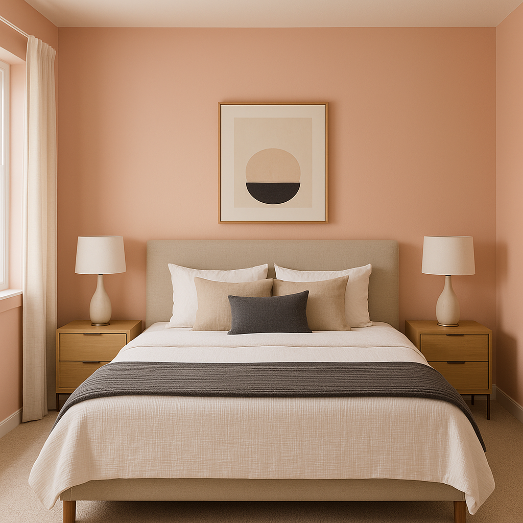
Rachel Pink is perfect for creating a soothing retreat in bedrooms. Its soft, warm tones foster relaxation and tranquility, making it a great backdrop for restful evenings. Pair it with plush textiles and gold or brass accents for a luxurious feel, or keep it minimal with crisp white linens for a modern aesthetic.
Nurseries:
The gentle, blush tones of Rachel Pink make it a top pick for nurseries or children's rooms. It strikes the perfect balance between playful and calming, setting the stage for a nurturing environment. Add whimsical wall art or pastel-colored furniture to complete the look.
Living Spaces:
For living rooms or communal spaces, Rachel Pink can be used as a feature wall or accent color to add warmth without overwhelming the room. Combine it with soft grays, creams, or taupes for a sophisticated palette that feels cozy yet refined.
Bathrooms:
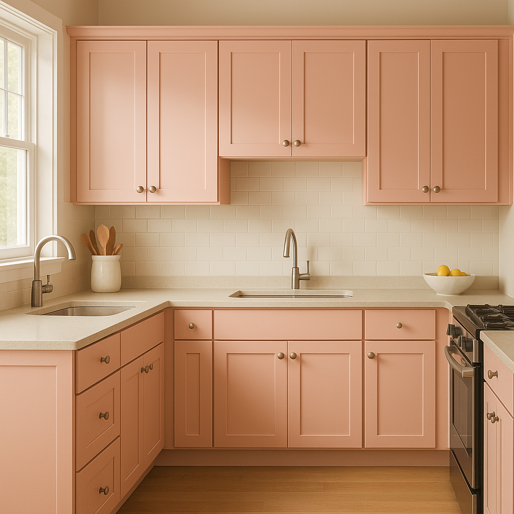
Rachel Pink works beautifully in bathrooms, especially when paired with white tiles, marble countertops, or metallic finishes like brushed nickel or rose gold. The result is a fresh and elegant space that feels luxurious yet approachable.
Accent Color:
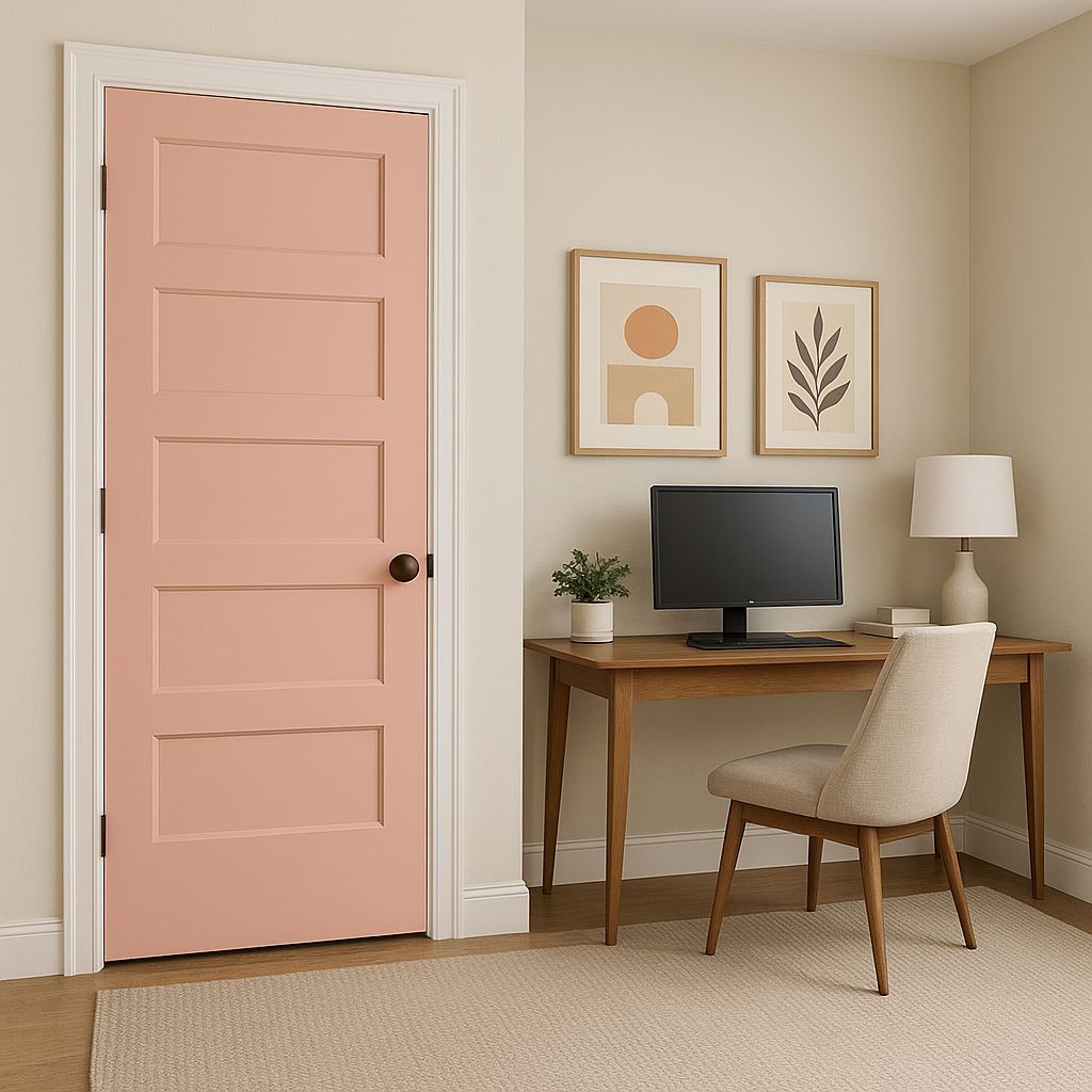
If you're hesitant to use pink as a dominant color, Rachel Pink can also shine as an accent. Use it for furniture, throw pillows, or even cabinetry to add a subtle touch of romance and personality.
Rachel Pink (0026) is more than just a color—it’s a mood, a feeling, a statement of understated beauty. Its warm undertones and versatile nature make it a favorite among interior designers, whether you're looking to craft a serene sanctuary or add a playful twist to your décor. Rachel Pink offers the perfect balance of softness and sophistication, ensuring it remains timeless across trends and styles.
Note: These images were all generated with AI, there may be inaccurate color results. Please only use a general reference to get a rough idea of what a color may look like, we will continue to generate new images to improve accuracy.
View Colors Only by Brand (No Imagery):
Sherwin-Williams
|
Benjamin-Moore
|
Behr
|
Valspar
Live on the Eastern Slope of Colorado and looking for a local painting professional, check out all our painting services and reach out for a free estimate.
Copyright © 2026 : Wild Fox Painting Inc. : 12435 Mead Way, Littleton, CO 80125


