Sherwin-Williams Library Pewter 0038 is a sophisticated and versatile neutral that exudes warmth and elegance. This medium-toned gray has a grounded, classic appeal, making it an excellent choice for a variety of interior design styles, from traditional to modern. Its understated charm allows it to serve as a perfect backdrop or a statement color that ties your space together seamlessly.
Library Pewter 0038 is more than just a neutral gray—it has subtle undertones that make it truly unique. Hints of warm taupe and earthy brown give it a cozy and inviting feel, while a whisper of green undertone adds richness and depth. These undertones prevent the color from feeling flat or dull, making it a well-balanced option for both bright and dimly lit spaces. Depending on the lighting, Library Pewter can lean slightly warmer or cooler, giving it the versatility to adapt to different environments.
The beauty of Library Pewter lies in its adaptability. It pairs effortlessly with a variety of colors, making it a dream choice for creating cohesive and harmonious palettes. Here are some coordinating color suggestions:
Whites and Off-Whites:
For trim, ceilings, or a crisp contrast, pair Library Pewter with soft whites like Alabaster (SW 7008) or Pure White (SW 7005). These shades enhance the warmth and elegance of Library Pewter without overpowering it.
Warm Neutrals:
Complement its earthy undertones with warm neutral tones like Accessible Beige (SW 7036) or Tony Taupe (SW 7038). These combinations are perfect for creating a cozy, layered look.
Deep Accents:
Make a bold statement by pairing Library Pewter with rich, dramatic colors like Urbane Bronze (SW 7048) or Naval (SW 6244). These darker hues create a striking contrast and elevate the overall design.
Soft Blues and Greens:
For a calming, nature-inspired palette, consider pairing it with soft shades like Sea Salt (SW 6204) or Rainwashed (SW 6211). These colors enhance the subtle green undertone in Library Pewter and create a serene atmosphere.
Library Pewter 0038 shines in a wide range of applications, making it a go-to choice for designers and homeowners alike. Here are some ideas for incorporating this versatile shade into your home:
Living Rooms:
Use Library Pewter as the main wall color in living spaces for a sophisticated and cozy feel. It pairs beautifully with both modern and traditional furniture, creating a timeless look.
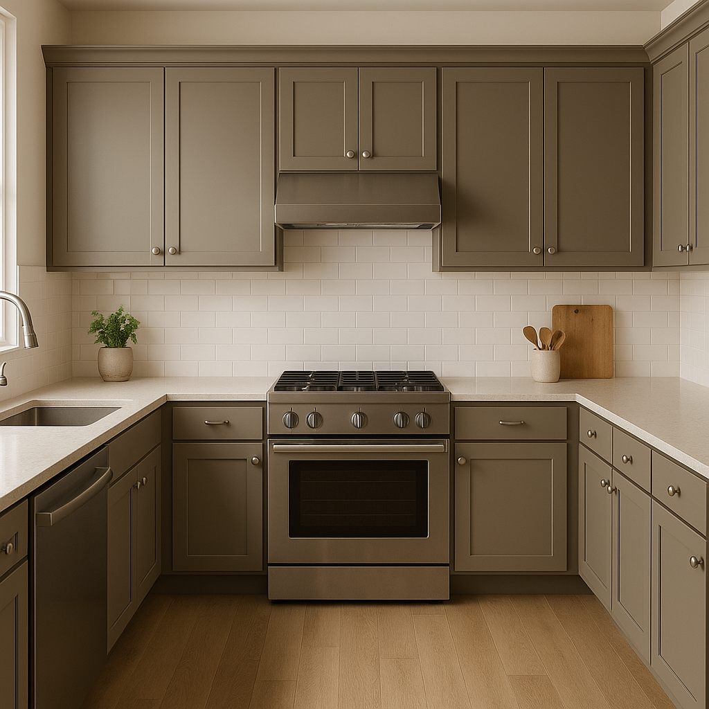
Kitchens and Dining Areas:
This neutral gray is an excellent choice for kitchen cabinets or an accent wall in the dining area. Its warm undertones complement wooden finishes and metallic accents alike, creating a balanced and inviting space.
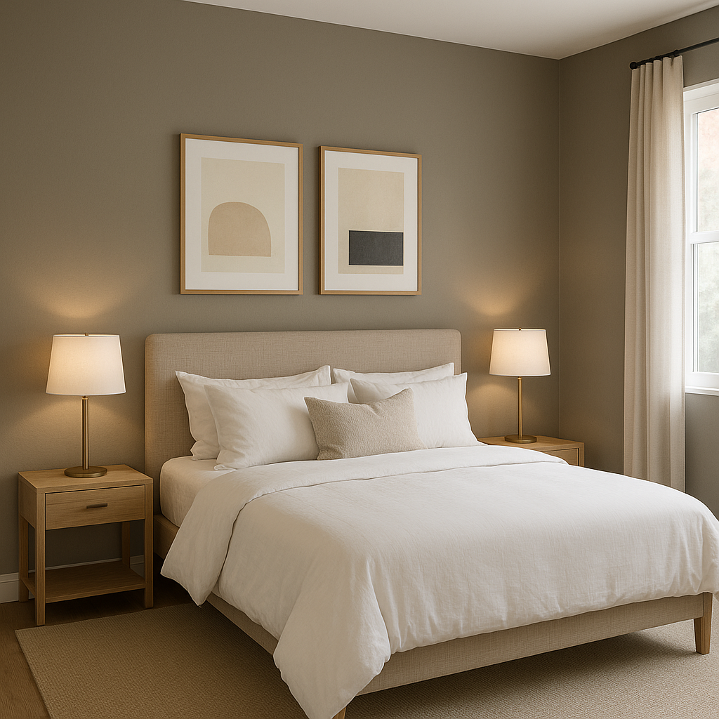
Bedrooms:
For a serene and restful retreat, use Library Pewter on the walls and pair it with soft linens in whites or muted blues. Add texture with natural materials like wood or woven fabrics for extra warmth.
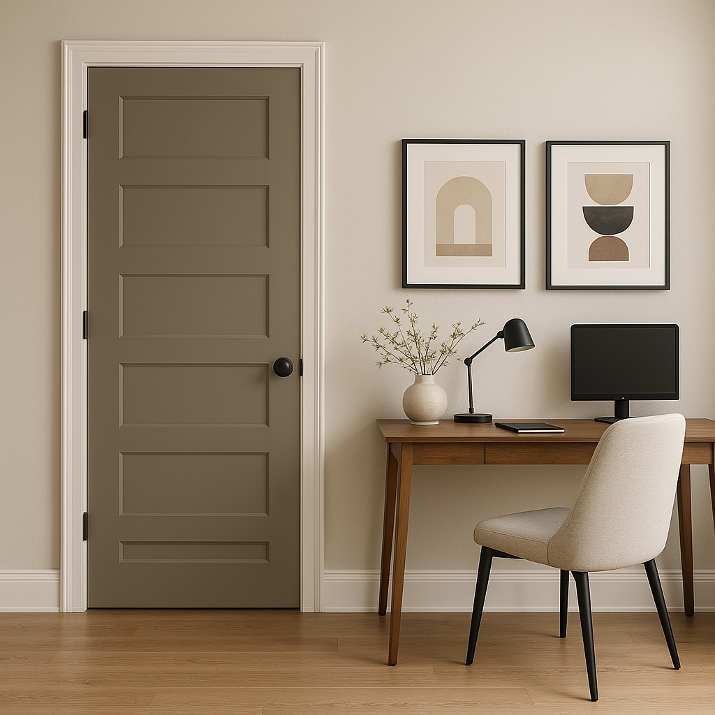
Home Offices or Libraries:
As its name suggests, Library Pewter is a perfect fit for home offices and libraries. Its rich, earthy undertones create a focused and grounded environment, ideal for productivity and relaxation alike.
Bathrooms:
Create a spa-like atmosphere in bathrooms by pairing Library Pewter with crisp white tiles and soft green or blue accents. Its neutrality adds a touch of sophistication without overwhelming the space.
Exteriors:
Library Pewter works beautifully on exteriors, especially for siding or trim. Its warm undertones complement natural stone, brick,
Note: These images were all generated with AI, there may be inaccurate color results. Please only use a general reference to get a rough idea of what a color may look like, we will continue to generate new images to improve accuracy.
View Colors Only by Brand (No Imagery):
Sherwin-Williams
|
Benjamin-Moore
|
Behr
|
Valspar
Live on the Eastern Slope of Colorado and looking for a local painting professional, check out all our painting services and reach out for a free estimate.
Copyright © 2026 : Wild Fox Painting Inc. : 12435 Mead Way, Littleton, CO 80125


