Sherwin-Williams Portrait Tone 0039 is a sophisticated and understated paint color that effortlessly balances warmth and neutrality. This hue is part of Sherwin-Williams' neutral palette, offering a versatile backdrop that adapts beautifully to a variety of interior styles. Its classic yet modern appeal makes it a go-to choice for homeowners and designers seeking a calm, inviting atmosphere.
Portrait Tone 0039 is a warm beige with subtle taupe undertones. These undertones lend it a soft, earthy character that prevents it from feeling too stark or cold. Depending on the lighting, this color may reveal hints of creamy beige or muted gray, giving it a chameleon-like quality that works well in different settings. The warmth of the undertones ensures a cozy and approachable ambiance, making Portrait Tone an excellent option for spaces where comfort and serenity are priorities.
To maximize the potential of Portrait Tone 0039, pair it with complementary colors that enhance its subtle charm. Here are some suggestions:
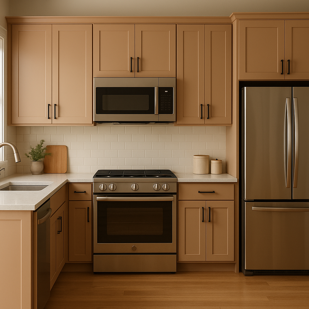
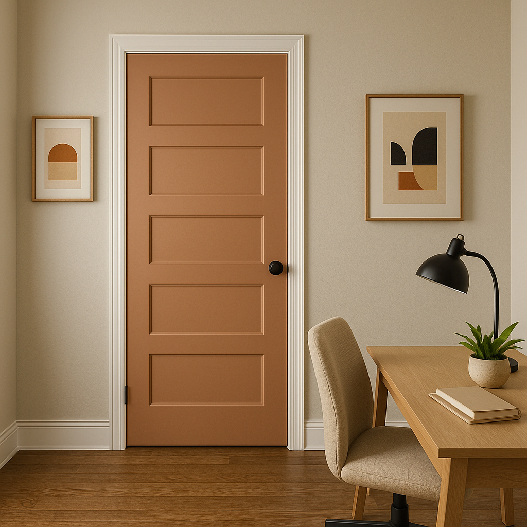
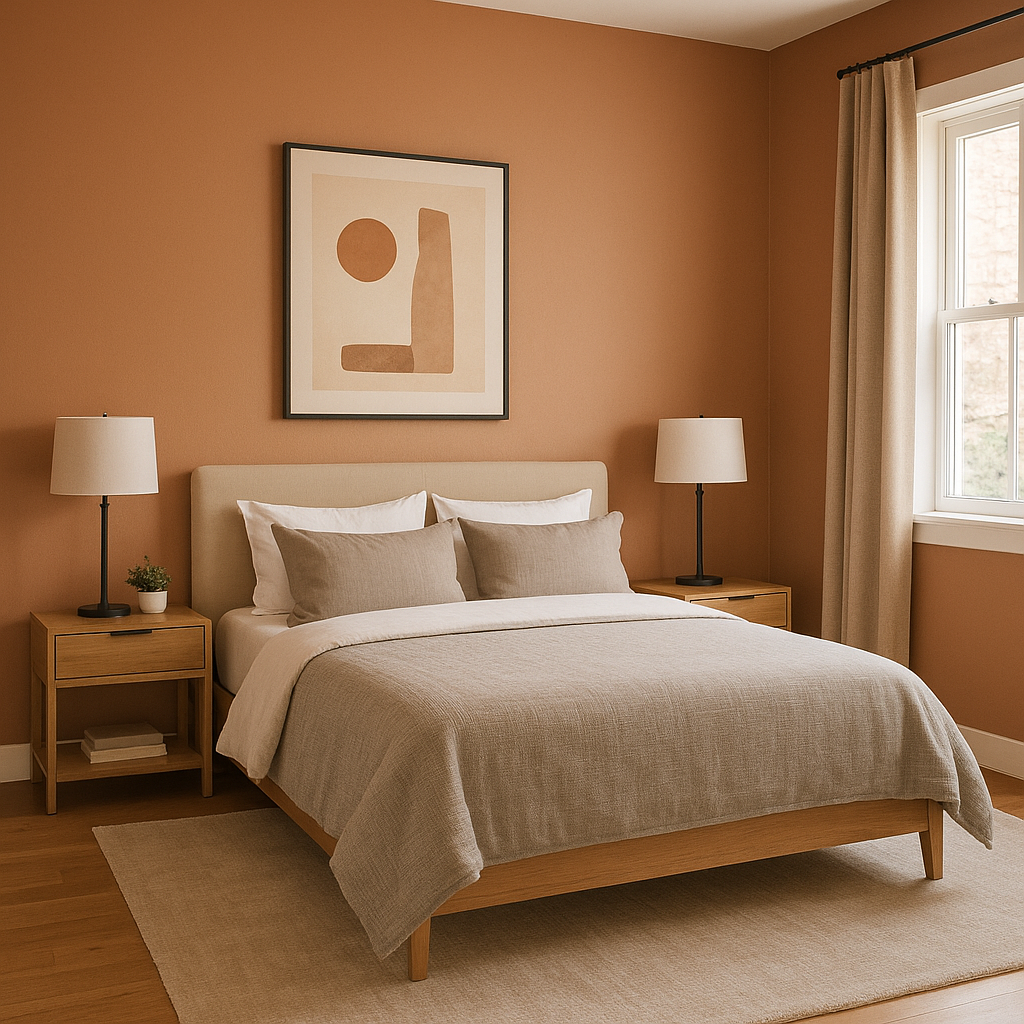
Portrait Tone 0039 is as versatile as it is timeless, lending itself to a variety of applications throughout your home or workspace. Here are some of the best ways to incorporate this shade:
Sherwin-Williams Portrait Tone 0039 is a color that transcends trends, offering a timeless look that adapts to changing styles and personal tastes. Its ability to complement a wide array of colors, materials, and textures ensures it will remain a cherished part of your interior design for years to come. Whether you're designing a modern minimalist space or a traditional home with classic charm, Portrait Tone 0039 is a reliable choice that delivers both beauty and balance.
Note: These images were all generated with AI, there may be inaccurate color results. Please only use a general reference to get a rough idea of what a color may look like, we will continue to generate new images to improve accuracy.
View Colors Only by Brand (No Imagery):
Sherwin-Williams
|
Benjamin-Moore
|
Behr
|
Valspar
Live on the Eastern Slope of Colorado and looking for a local painting professional, check out all our painting services and reach out for a free estimate.
Copyright © 2026 : Wild Fox Painting Inc. : 12435 Mead Way, Littleton, CO 80125


