Sherwin-Williams Pearl Gray (0052) is a sophisticated and serene paint color that embodies understated elegance. This classic neutral captures the essence of soft gray, offering a delicate and refined backdrop that seamlessly complements various design styles. Whether you're creating a modern, minimalist space or a more traditional setting, Pearl Gray is a versatile choice that effortlessly elevates your interiors.
Pearl Gray boasts subtle undertones that make it an adaptable and dynamic neutral. It leans slightly toward cooler tones, with soft hints of blue and a whisper of lavender. These cool undertones lend the shade a freshness and airiness, making it ideal for spaces where you want to create a calm and tranquil atmosphere. While the undertones are subtle, they provide just enough depth to keep the color from feeling flat or stark, ensuring a sophisticated finish.
When paired with warm lighting, Pearl Gray may appear slightly warmer, while cooler lighting will accentuate its blue-lavender undertones. This interplay with lighting makes it a fantastic choice for rooms that require flexibility and a dynamic aesthetic.
Sherwin-Williams Pearl Gray harmonizes beautifully with other shades, making it easy to craft a well-balanced color palette. Here are some coordinating colors that pair seamlessly with Pearl Gray:
Pearl Gray is a versatile choice that works beautifully in various spaces and applications. Its neutral nature makes it a favorite among interior designers for creating cohesive and timeless interiors. Here are some popular uses for this elegant shade:
Pearl Gray provides a sophisticated foundation for living rooms. Pair it with plush furniture in warm neutrals or jewel tones to create a space that feels both elegant and inviting. Add metallic accents like brushed nickel or chrome to enhance its cool undertones.
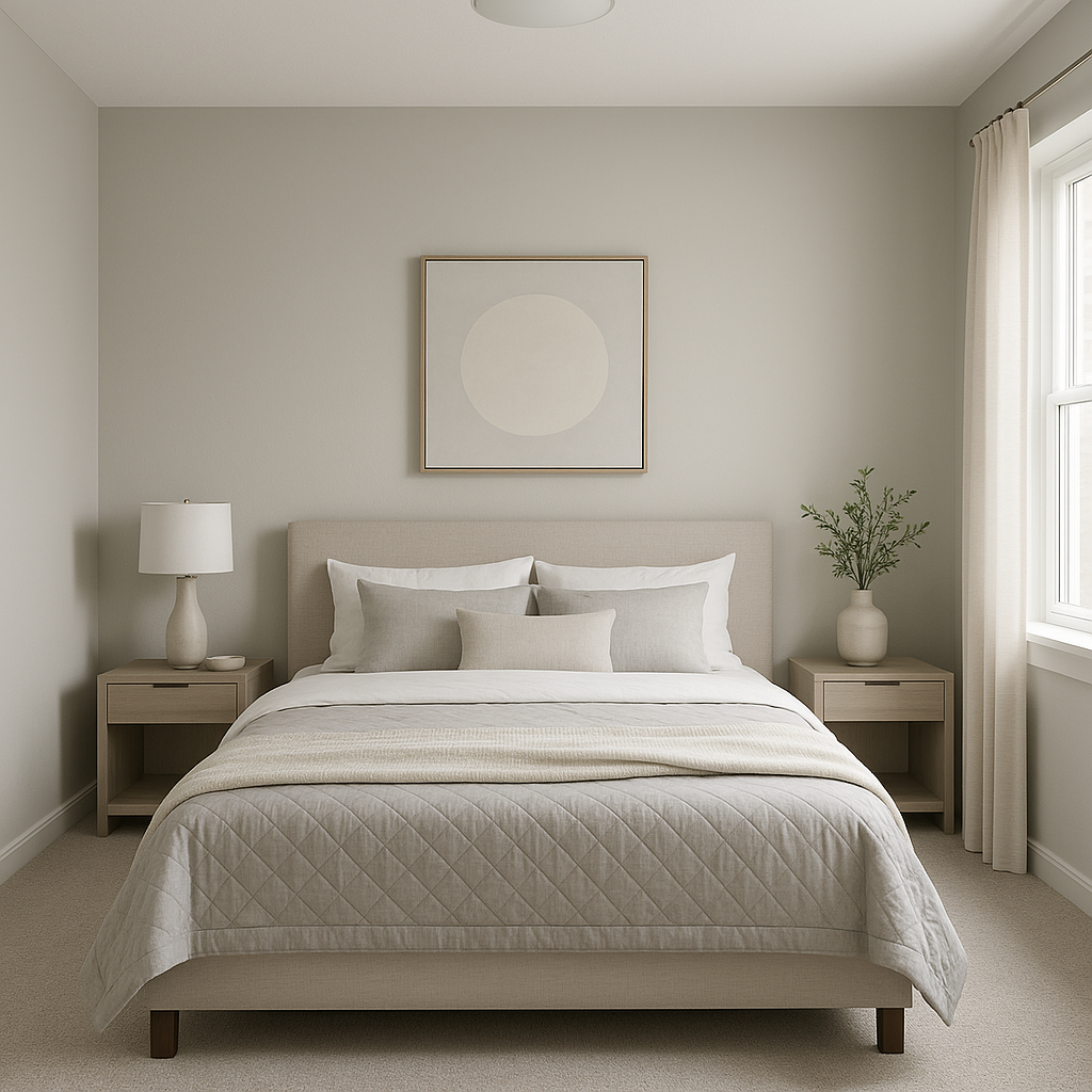
The calm and soothing nature of Pearl Gray makes it an excellent choice for bedrooms. Use it as the main wall color and layer with soft linens in coordinating blues, whites, or pastels. Its tranquil vibe promotes relaxation and restful sleep.
For a spa-like atmosphere, Pearl Gray is a natural fit in bathrooms. Combine it with white subway tiles, marble countertops, and silver fixtures for a clean and luxurious aesthetic. Its fresh undertones bring a sense of light and clarity to smaller spaces.
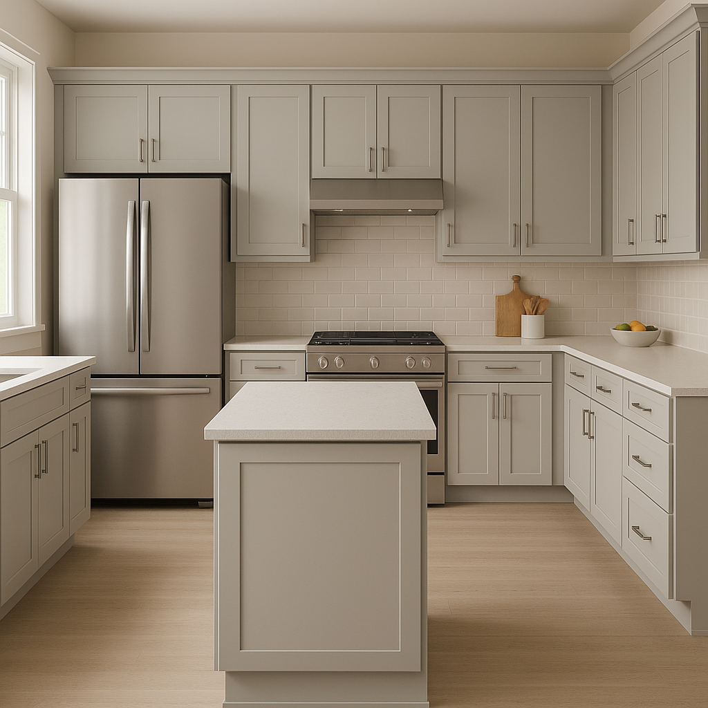
Pearl Gray pairs beautifully with white cabinetry and stainless steel appliances, making it a chic option for modern kitchens. Add pops of color through accessories like ceramic vases or patterned rugs to keep the space lively and personalized.
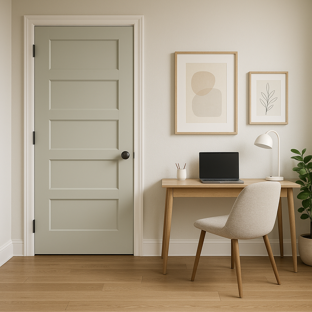
As a neutral backdrop, Pearl Gray shines in transitional areas like hallways and entryways. It creates a seamless flow between rooms while maintaining an elegant and polished appearance. Pair it with wooden accents or a bold front door to add personality.
While Pearl Gray works wonderfully as a whole-room color, it can also be used for accent walls. Pair it with deeper shades like navy or charcoal for a striking contrast that draws attention to architectural features or focal points.
The way Pearl Gray interacts with lighting is key to its versatility. In natural daylight, its cool undertones shine through, creating a fresh and airy ambiance. In artificial lighting, especially warm incandescent bulbs, it takes on a slightly warmer appearance, making it adaptable for both daytime and evening settings. For best results, test the color in your space under different lighting conditions to see how it behaves.
Sherwin-Williams Pearl Gray (0052) is more than just a color—it’s a versatile design statement that adapts effortlessly to your unique style. Whether you're creating a serene retreat or a polished modern space, this timeless shade offers endless possibilities to transform your interiors with elegance and charm.
Note: These images were all generated with AI, there may be inaccurate color results. Please only use a general reference to get a rough idea of what a color may look like, we will continue to generate new images to improve accuracy.
View Colors Only by Brand (No Imagery):
Sherwin-Williams
|
Benjamin-Moore
|
Behr
|
Valspar
Live on the Eastern Slope of Colorado and looking for a local painting professional, check out all our painting services and reach out for a free estimate.
Copyright © 2026 : Wild Fox Painting Inc. : 12435 Mead Way, Littleton, CO 80125


