Sherwin-Williams Porcelain (SW 0053) is a versatile and serene paint color that embodies the perfect balance of sophistication and tranquility. This soft blue hue is infused with subtle gray undertones, making it an ideal choice for spaces where you want to evoke a sense of calm while maintaining an air of refinement. Whether you're designing a coastal-inspired retreat, a modern farmhouse, or a traditional home, Porcelain effortlessly adapts to a wide variety of interior styles.
Porcelain features delicate undertones of gray, giving this shade its muted and elegant quality. Unlike brighter or bolder blues, Porcelain leans towards a more subdued palette, ensuring it doesn’t overwhelm a space. The gray undertones also allow it to pair beautifully with both cool and warm colors, offering remarkable flexibility for interior design projects. Its understated nature makes it a wonderful backdrop for spaces that prioritize subtle sophistication.
Sherwin-Williams Porcelain can be effortlessly paired with a variety of complementary colors to create harmonious and visually appealing spaces. Here are some coordinating options:
Neutral Pairings:
Warm Accents:
Bold Contrasts:
Porcelain’s versatility allows it to blend seamlessly with both muted neutrals and bold statement colors, giving you endless options to create a cohesive and dynamic design.
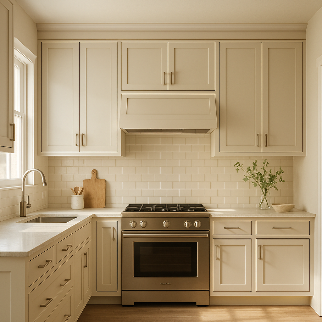
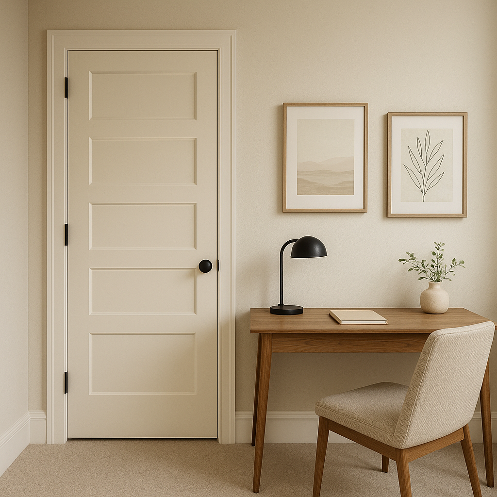
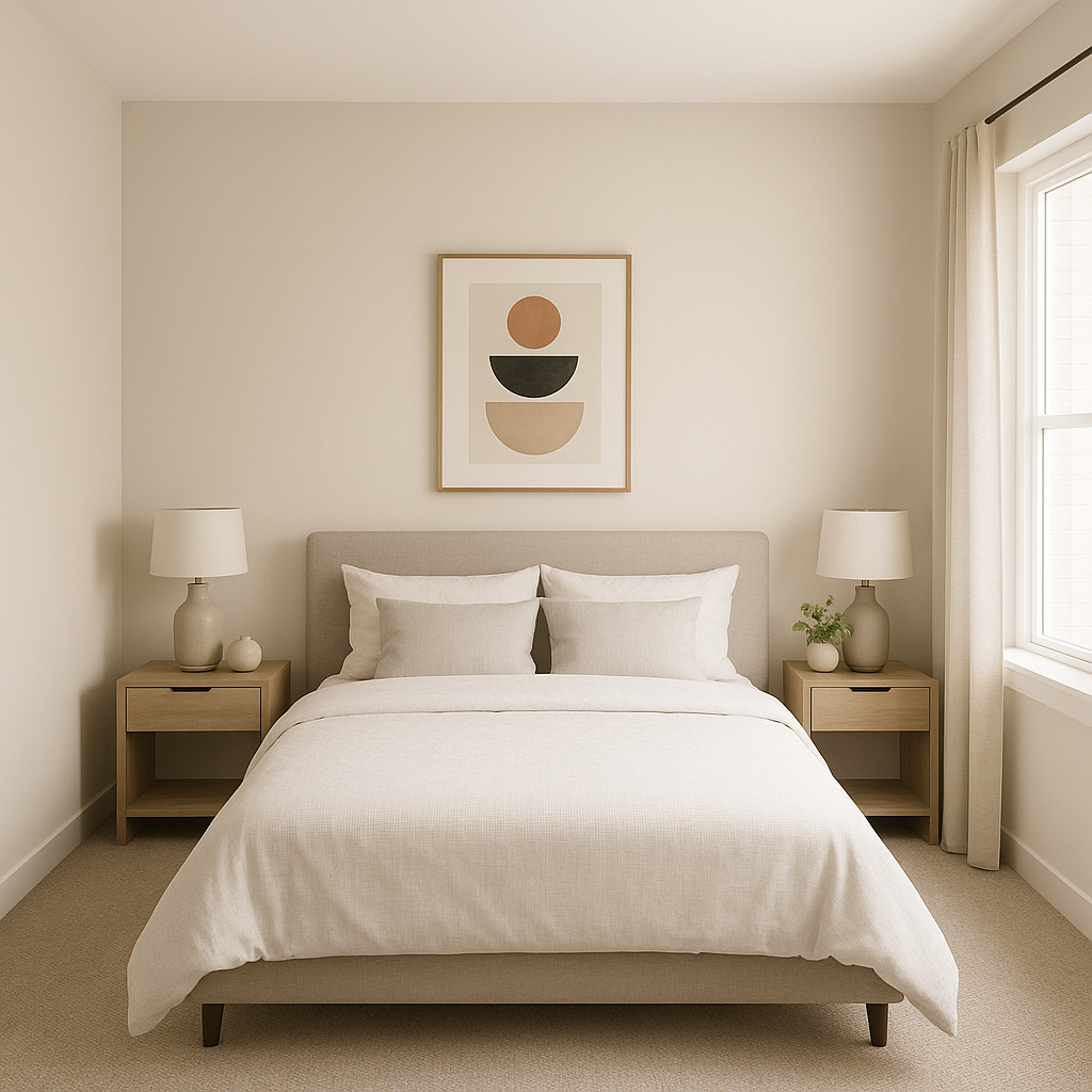
Porcelain is a highly adaptable color that works beautifully in a range of applications throughout the home. Its calming presence makes it particularly well-suited for spaces where relaxation and serenity are key. Here are some ideas on how to use Sherwin-Williams Porcelain:
Porcelain’s appearance can shift depending on the lighting conditions in your space. In rooms with abundant natural light, the blue tones will feel more prominent and luminous, emphasizing its airy qualities. In spaces with artificial or low lighting, the gray undertones may become more pronounced, lending a cozy and intimate feel. Testing a sample in your specific environment will help you understand how Porcelain interacts with your lighting.
Sherwin-Williams Porcelain (SW 0053) is a timeless and adaptable color that brings elegance and peace to any room. Its soft blue-gray balance, paired with its ability to coordinate with a wide variety of colors, makes it a go-to choice for homeowners and designers alike. Whether used as a primary wall color or as an accent, Porcelain is sure to elevate your interiors with its understated charm.
Note: These images were all generated with AI, there may be inaccurate color results. Please only use a general reference to get a rough idea of what a color may look like, we will continue to generate new images to improve accuracy.
View Colors Only by Brand (No Imagery):
Sherwin-Williams
|
Benjamin-Moore
|
Behr
|
Valspar
Live on the Eastern Slope of Colorado and looking for a local painting professional, check out all our painting services and reach out for a free estimate.
Copyright © 2026 : Wild Fox Painting Inc. : 12435 Mead Way, Littleton, CO 80125


