Sherwin-Williams Copen Blue (SW 0068) is a soothing, versatile color that instantly evokes feelings of calm and tranquility. This soft blue with subtle green undertones creates a timeless and refreshing look, making it an excellent choice for both modern and traditional interiors. Whether you're crafting a serene bedroom retreat, a sophisticated living room, or an airy kitchen space, Copen Blue offers the perfect balance of color and neutrality to transform your home into a haven of relaxation.
Copen Blue is a beautiful blend of blue and green with a hint of gray undertone. These undertones make the color adaptable to a wide range of lighting conditions. In spaces with natural light, the blue and green tones may feel more prominent, while in dimmer settings, the gray undertone can add a sense of depth and sophistication. The subtle combination of these undertones ensures that Copen Blue feels neither overly bright nor muted, making it a perfect middle ground for those seeking a soft, calming hue.
Copen Blue pairs wonderfully with a variety of coordinating colors, allowing you to create harmonious and well-balanced designs. Here are some ideal options to complement this versatile shade:
Neutral Pairings:
For a timeless and serene look, combine Copen Blue with soft neutrals like Sherwin-Williams Alabaster (SW 7008) or Extra White (SW 7006). These whites bring out the crispness of the blue and keep the space light and airy.
Earthy Tones:
Pair Copen Blue with warm, earthy shades such as Accessible Beige (SW 7036) or Natural Linen (SW 9109). These tones create a grounded, inviting space with a natural, organic feel.
Accent Colors:
Add pops of color with bold accents like Naval (SW 6244) or Ripe Olive (SW 6209). These deeper hues make for striking contrasts and can add depth and personality to your design.
Wood and Metallics:
Copen Blue works beautifully alongside natural wood finishes, brass, and brushed gold accents, enhancing its timeless appeal.
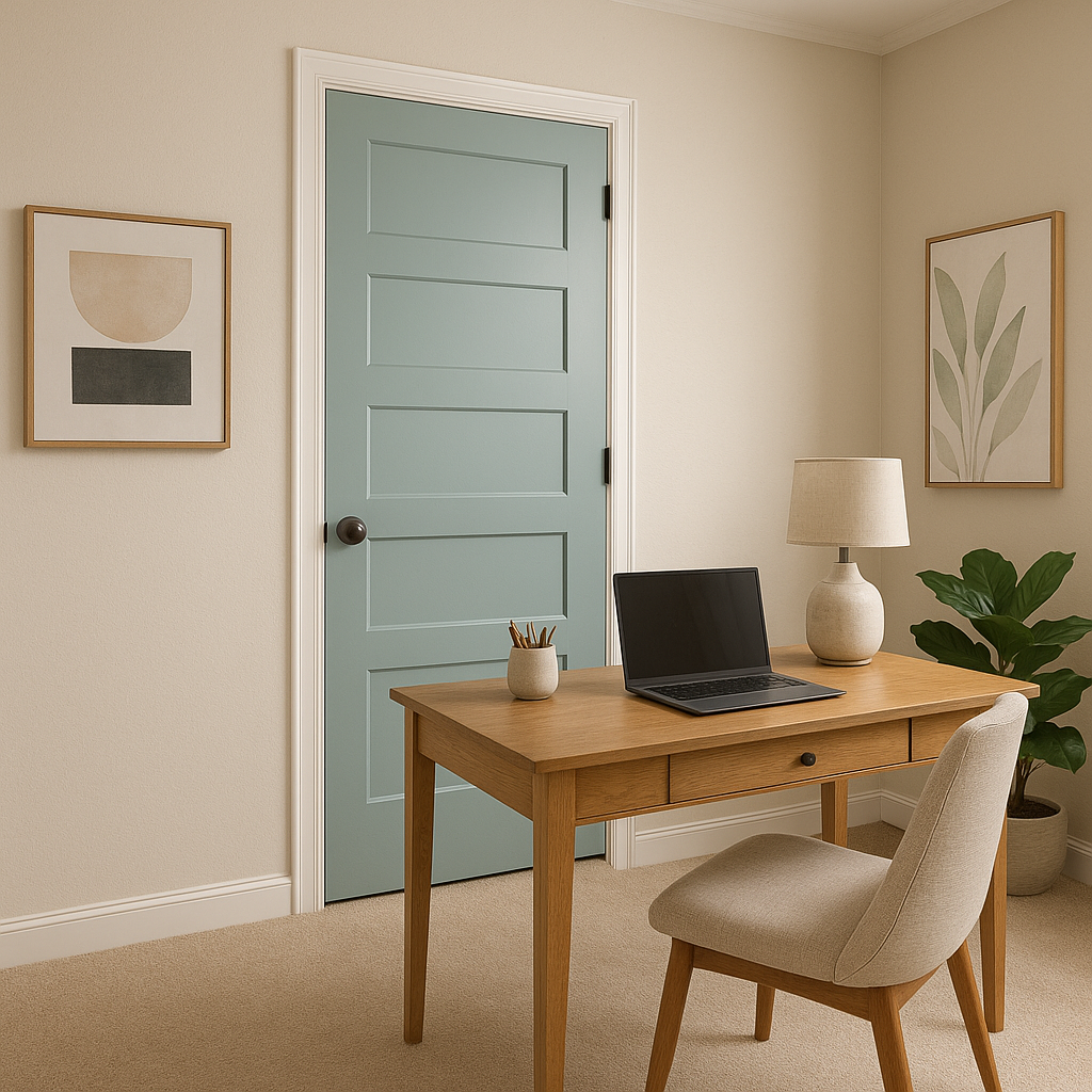
Copen Blue is an incredibly versatile color that can be used across various spaces in your home. Below are some popular applications for this serene shade:
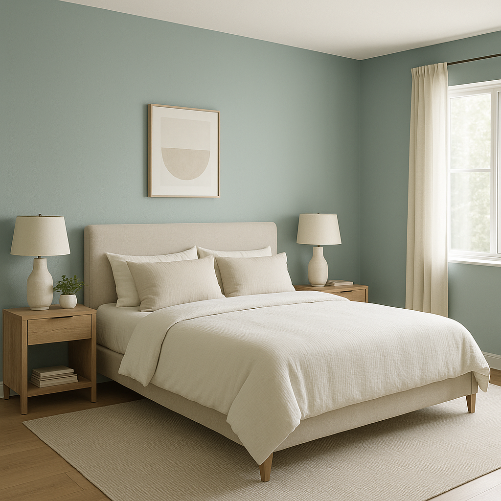
Bedrooms:
The calming nature of Copen Blue makes it a perfect choice for bedrooms. Pair it with crisp white bedding and natural wood furniture to create a tranquil retreat that promotes rest and relaxation.
Bathrooms:
Copen Blue is ideal for bathrooms, as its fresh undertones evoke a spa-like atmosphere. Use it on walls or cabinetry, and complement it with gleaming white tiles and chrome fixtures for a clean, refreshing look.
Living Rooms:
In living spaces, Copen Blue creates an elegant yet relaxed vibe. Combine it with plush textures like velvet or soft throws in neutral tones to create a cozy yet refined ambiance.
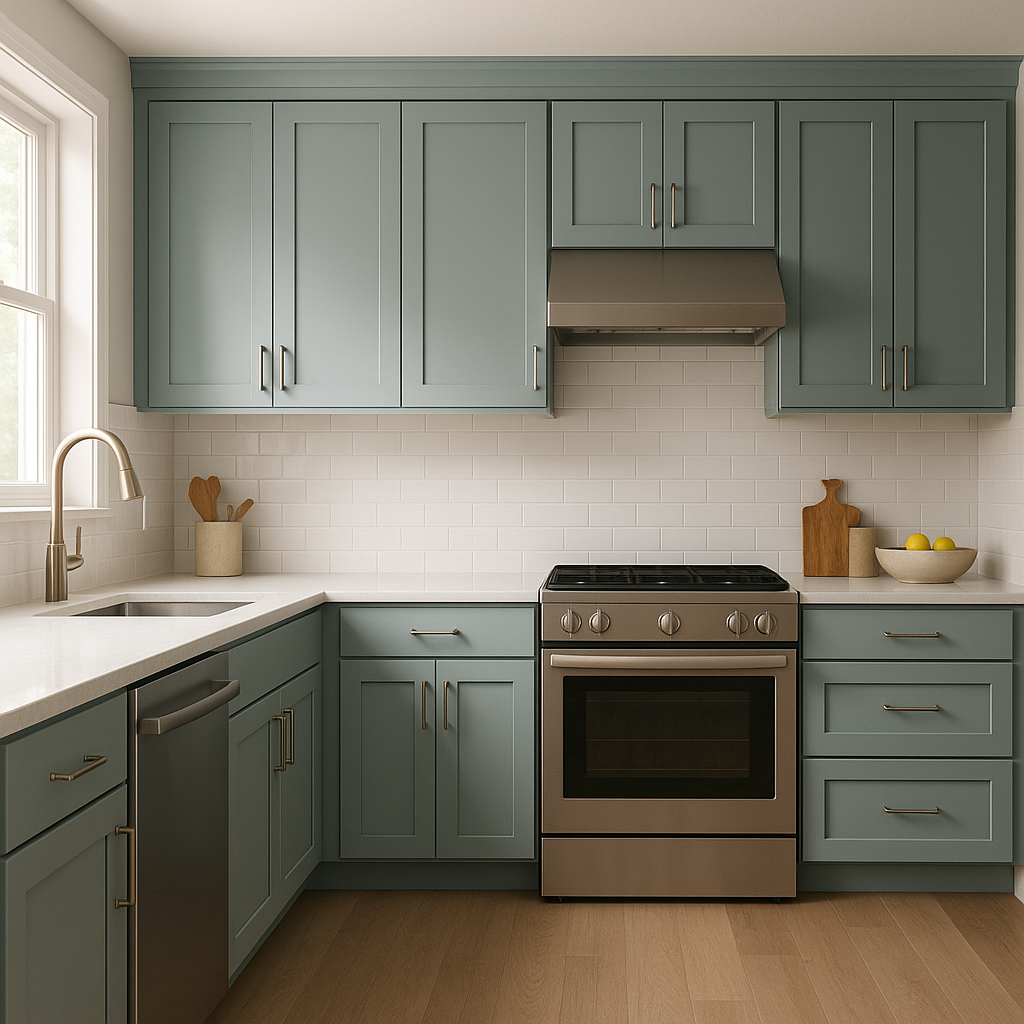
Kitchens:
When used on kitchen cabinets or walls, Copen Blue delivers a modern yet timeless aesthetic. Pair it with white countertops, subway tiles, and brushed brass hardware for a sophisticated coastal-inspired look.
Entryways:
Copen Blue is an excellent choice for entryways, as it greets guests with a calming and welcoming feel. Combine it with warm wood flooring and crisp white trim for an inviting first impression.
Sherwin-Williams Copen Blue (SW 0068) is more than just a color—it’s an expression of peace and timeless beauty. Its balanced blend of blue, green, and gray makes it an adaptable choice for various design styles, from coastal chic to modern farmhouse. Whether you're looking to add a touch of serenity to your space or create a sophisticated backdrop, Copen Blue delivers a sense of effortless elegance that will stand the test of time.
Note: These images were all generated with AI, there may be inaccurate color results. Please only use a general reference to get a rough idea of what a color may look like, we will continue to generate new images to improve accuracy.
View Colors Only by Brand (No Imagery):
Sherwin-Williams
|
Benjamin-Moore
|
Behr
|
Valspar
Live on the Eastern Slope of Colorado and looking for a local painting professional, check out all our painting services and reach out for a free estimate.
Copyright © 2026 : Wild Fox Painting Inc. : 12435 Mead Way, Littleton, CO 80125


