Sherwin-Williams Appleblossom (0076) is a delightful paint color that embodies warmth, elegance, and a touch of vintage charm. This shade effortlessly bridges the gap between soft pink and muted beige, making it an adaptable choice for homeowners and designers seeking a sophisticated yet approachable aesthetic. Whether you're designing a cozy bedroom retreat, a stylish living room, or a serene nursery, Appleblossom lends itself beautifully to a variety of spaces.
Appleblossom is best described as a warm, delicate blush with subtle peachy undertones. It has a gentle, sunlit quality that feels both inviting and calming, making it an excellent option for creating restful environments. The warmth of its peach undertones ensures that this color doesn’t feel saccharine or overly sweet; instead, it exudes refinement and timeless appeal. Appleblossom is soft enough to serve as a neutral yet distinct enough to stand out as a feature color.
This hue works particularly well in spaces with ample natural light, as the peachy-pink undertones are brought to life in sunlight. In lower-light settings, Appleblossom takes on a slightly deeper and cozier appearance, maintaining its versatility across varying lighting conditions.
To create a harmonious palette, pair Sherwin-Williams Appleblossom with complementary hues that enhance its warmth and charm. Here are some coordinating colors to consider:
Neutral Pairings:
Accent Colors:
Other Coordinating Colors:
Appleblossom’s understated elegance makes it a versatile choice for a wide range of applications. Here are some ideas for incorporating this charming hue into your home:
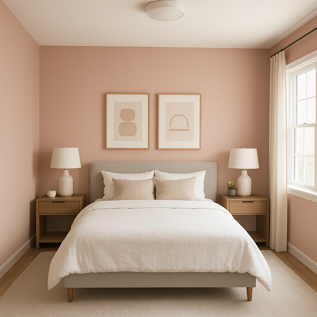
Bedrooms: Appleblossom is a natural fit for bedrooms, thanks to its soothing and romantic qualities. Pair it with crisp white bedding and touches of gold or brass for a luxurious yet approachable ambiance.
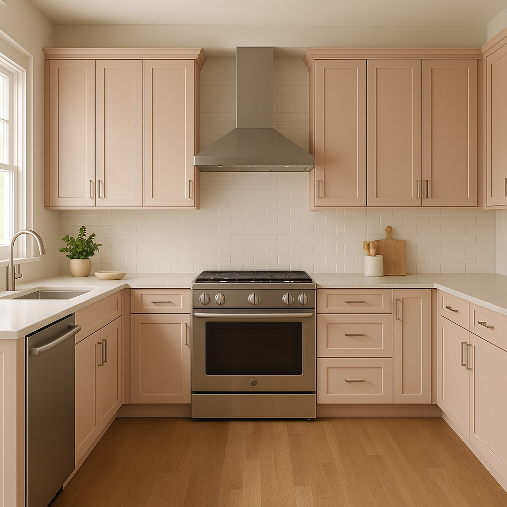
Living Rooms: Create an inviting and stylish living room by using Appleblossom on the walls or as an accent color. Combine it with warm woods, textured textiles, and muted earth tones for a cozy, layered effect.
Nurseries: This blush-toned paint brings a soft, nurturing feel to nurseries and children’s rooms. Pair it with pastel accents or whimsical patterns for a playful yet serene space.
Bathrooms: Transform your bathroom into a spa-like retreat with Appleblossom. Use it alongside white subway tiles, brushed nickel fixtures, and lush greenery for a fresh, elegant look.
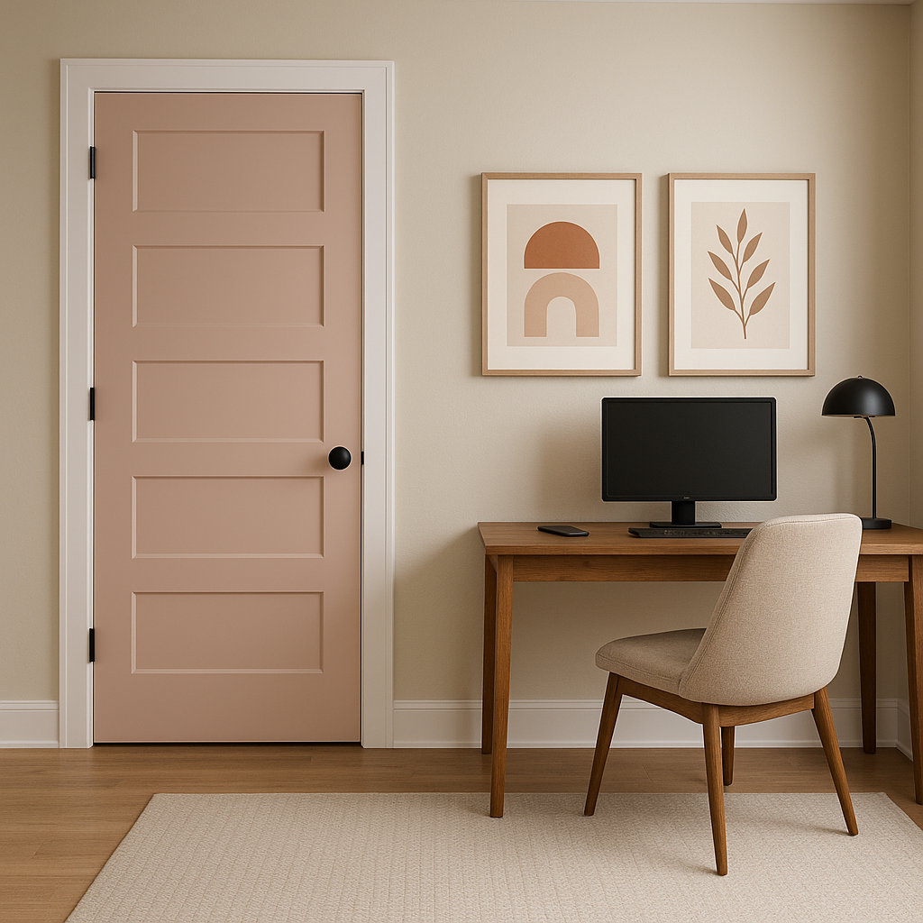
Accent Walls: If you’re hesitant to commit to Appleblossom throughout an entire room, consider using it as an accent wall. Its subtle warmth adds depth without overwhelming the space.
Furniture and Cabinetry: For a unique twist, try using Appleblossom on furniture pieces or cabinetry. This unexpected application can bring a pop of color to neutral spaces and add personality to your design.
Sherwin-Williams Appleblossom (0076) is more than just a paint color—it’s a versatile design tool that adds warmth, sophistication, and charm to any space. With its balance of subtle pink and peach undertones, it’s ideal for creating environments that feel both comforting and stylish. Whether paired with soft neutrals or bold accents, Appleblossom adapts effortlessly to your design goals, making it a timeless choice for a wide range of interior projects.
Note: These images were all generated with AI, there may be inaccurate color results. Please only use a general reference to get a rough idea of what a color may look like, we will continue to generate new images to improve accuracy.
View Colors Only by Brand (No Imagery):
Sherwin-Williams
|
Benjamin-Moore
|
Behr
|
Valspar
Live on the Eastern Slope of Colorado and looking for a local painting professional, check out all our painting services and reach out for a free estimate.
Copyright © 2026 : Wild Fox Painting Inc. : 12435 Mead Way, Littleton, CO 80125


