Sherwin-Williams Downing Slate (SW 2819) is a distinguished and versatile paint color that effortlessly blends sophistication with warmth. This rich, muted shade sits at the crossroads of deep gray and soft brown, creating a timeless hue that brings depth and character to any space. Downing Slate is part of the brand’s historic color collection, making it an excellent choice for both traditional and modern interiors. Its complexity and understated elegance make it suitable for a wide variety of design styles, from classic to contemporary.
One of the defining characteristics of Downing Slate is its earthy undertones. While primarily a deep gray-brown, the color features subtle green undertones that add an organic richness. This complexity gives the shade a chameleon-like quality, allowing it to shift slightly depending on the lighting conditions. In brighter spaces, Downing Slate leans more toward its cooler gray side, while in dim lighting or surrounded by warm accents, its brown and green undertones emerge, creating a cozier ambiance.
Downing Slate pairs beautifully with a range of complementary and coordinating hues. Whether you’re designing a monochromatic palette or looking for contrasting colors, this shade provides endless possibilities. Here are some suggestions:
Downing Slate’s versatility makes it suitable for a wide range of applications, whether you’re aiming for a cozy retreat or a stately space. Here are some ideas to inspire its use:
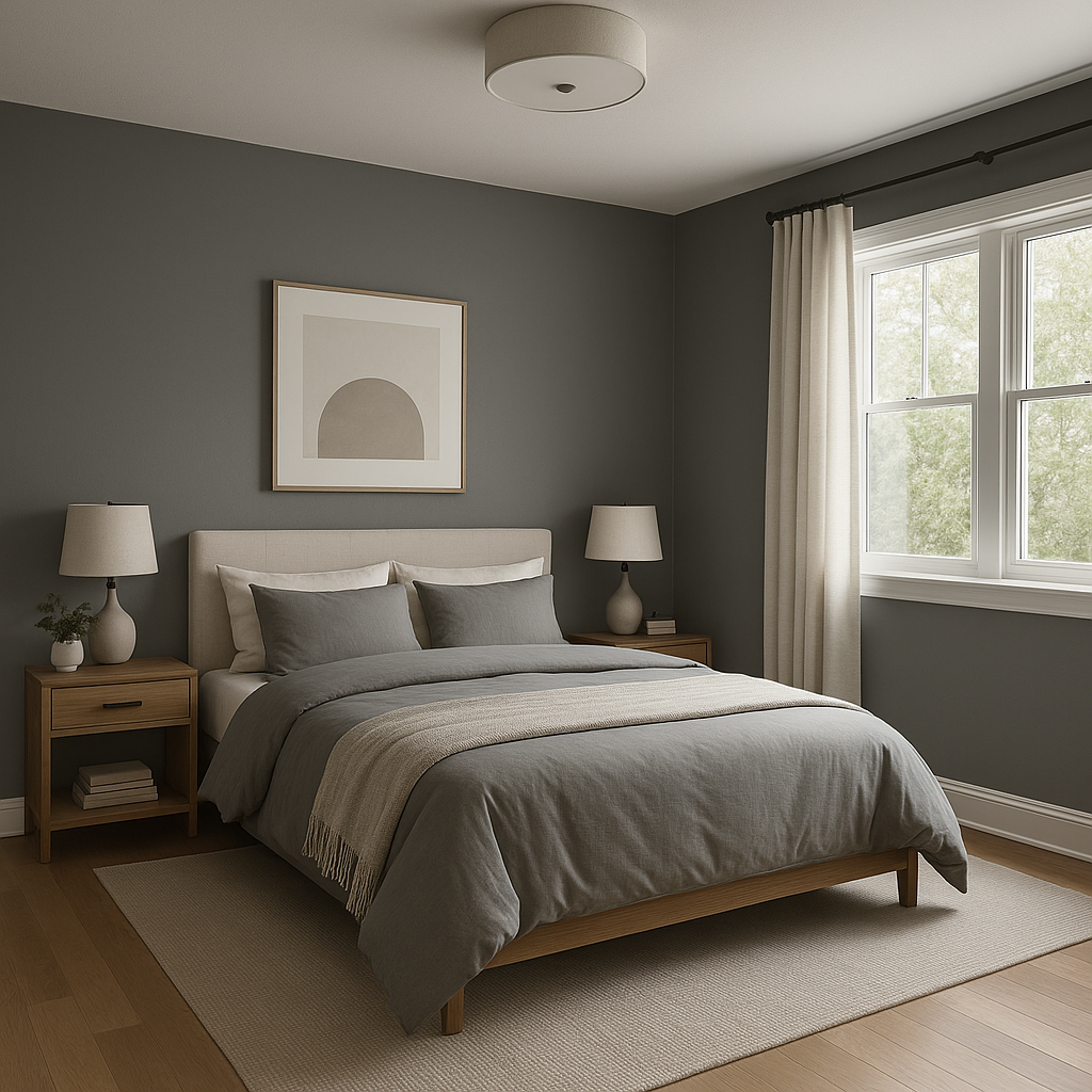
Downing Slate is an excellent choice for walls in living rooms, dining rooms, or bedrooms where you want to create a sense of warmth and sophistication. Its muted tones allow it to act as both a statement color and a neutral backdrop for art, furniture, and decor.
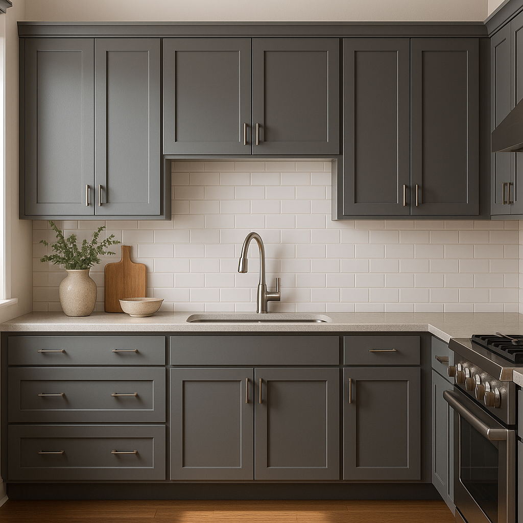
This shade is particularly stunning on kitchen or bathroom cabinets. Its rich depth adds an upscale feel, and it pairs beautifully with marble or quartz countertops.
For spaces that need a touch of drama, Downing Slate works wonderfully as an accent wall color. Pair it with lighter tones, such as Alabaster or Accessible Beige, to balance the visual weight.
Downing Slate is a gorgeous option for exterior siding or shutters. Its historic roots make it ideal for traditional homes, but its understated elegance also works for modern exteriors. Pair it with crisp white trim for a classic look or use it alongside darker accents for a more contemporary vibe.
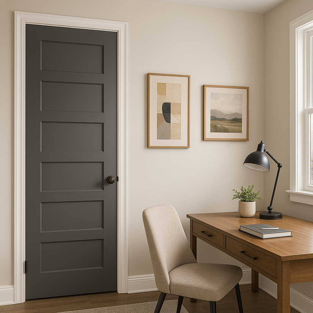
For a bold yet sophisticated choice, consider Downing Slate for ceilings or trim. It creates a striking contrast with lighter wall colors and adds depth to architectural details.
Sherwin-Williams Downing Slate (SW 2819) is a color that transcends trends, offering timeless appeal and versatility. Its ability to shift between warm and cool, depending on its surroundings, makes it a dynamic choice for both interiors and exteriors. Whether you’re aiming for a cozy, grounded feel or a refined, sophisticated aesthetic, this shade delivers with ease. Pair it with coordinating neutrals, bold accents, or natural materials like wood and stone to create a harmonious look that feels curated and intentional.
Note: These images were all generated with AI, there may be inaccurate color results. Please only use a general reference to get a rough idea of what a color may look like, we will continue to generate new images to improve accuracy.
View Colors Only by Brand (No Imagery):
Sherwin-Williams
|
Benjamin-Moore
|
Behr
|
Valspar
Live on the Eastern Slope of Colorado and looking for a local painting professional, check out all our painting services and reach out for a free estimate.
Copyright © 2026 : Wild Fox Painting Inc. : 12435 Mead Way, Littleton, CO 80125


