Sherwin-Williams Downing Stone (SW 2821) is a timeless, versatile paint color that exudes sophistication and balance. Belonging to the Historic Collection, this hue is inspired by classic architecture and traditional design, making it a perfect choice for spaces that aim to feel grounded yet elegant. Downing Stone is a medium-toned greige—a seamless blend of gray and beige—that offers warmth and softness without feeling overly heavy or stark. Its neutral character allows it to work beautifully in a variety of settings, whether you're leaning toward traditional or modern aesthetics.
Downing Stone has subtle undertones of green and taupe, giving it an earthy depth while maintaining a neutral appearance. The green undertones make it especially suitable for spaces where you want to create a connection with nature or bring in organic textures. At the same time, the taupe adds a sense of warmth, ensuring the color doesn't feel too cool or sterile. Depending on the lighting in your space, Downing Stone can shift slightly—appearing more gray in cooler light and more beige in warmer light. This chameleon-like quality makes it adaptable and versatile for a variety of rooms.
Downing Stone pairs effortlessly with other colors, making it an excellent choice for creating harmonious and layered designs. Here are some coordinating colors to consider:
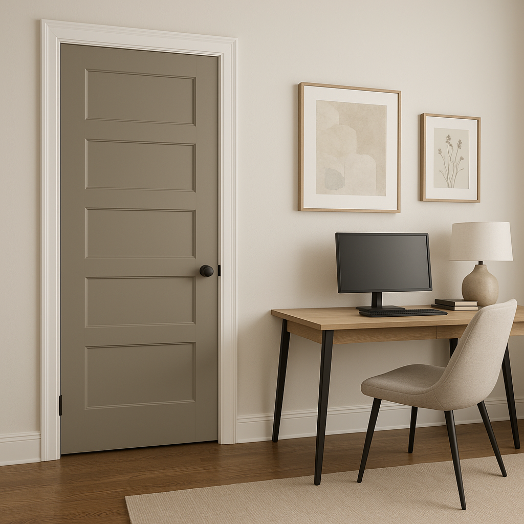
Downing Stone’s neutral yet impactful personality makes it a versatile choice for a wide range of applications. Its medium tone provides enough depth to make a statement while remaining understated and calming. Here are some ideas for incorporating Downing Stone into your home:
Downing Stone creates a cozy, inviting atmosphere in living rooms. Pair it with warm woods, plush upholstery, and textured textiles for a space that feels both elegant and comfortable. Use it as the main wall color and complement it with accents like sage green pillows or brass lighting fixtures.
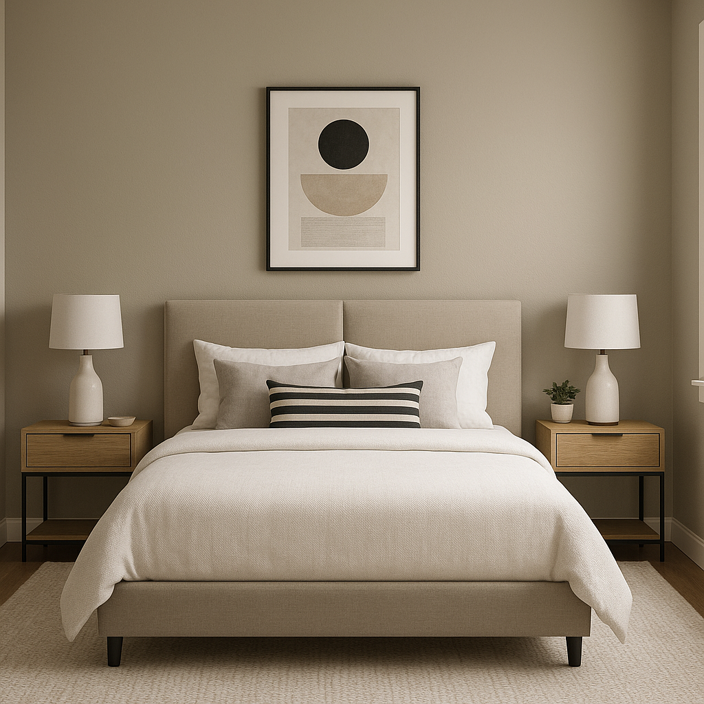
For a serene retreat, Downing Stone is an excellent choice for bedroom walls. Its soft warmth promotes relaxation, making it ideal for spaces where you unwind. Pair it with crisp white linens and natural fiber rugs for a balanced and tranquil design.
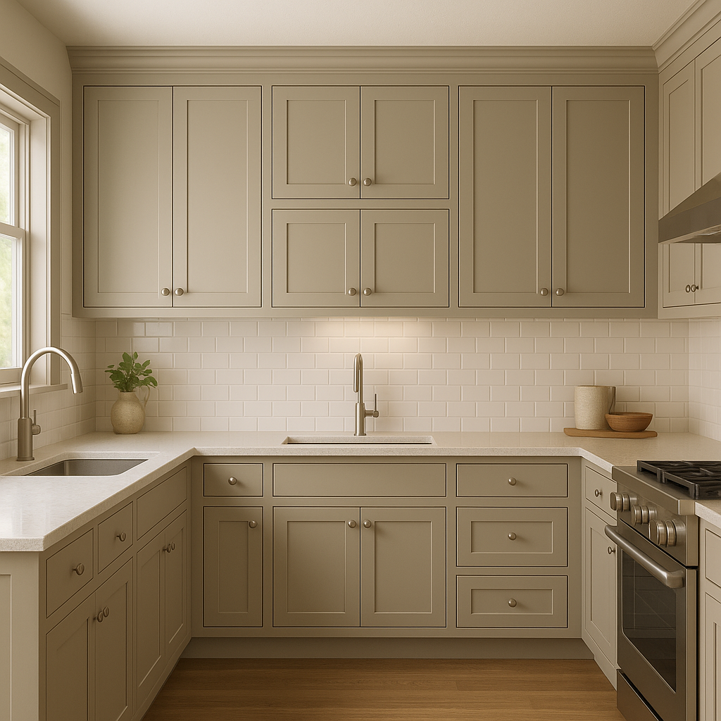
Downing Stone works beautifully in kitchens, especially when paired with white or cream cabinetry and brushed nickel hardware. It provides a neutral backdrop that allows countertops, backsplashes, or bold accents to shine.
The understated elegance of Downing Stone makes it perfect for bathrooms. Pair it with marble finishes, chrome fixtures, and soft lighting to create a spa-like ambiance.
As part of the Historic Collection, Downing Stone is a fantastic choice for exterior applications. Use it for siding, paired with white trim for classic curb appeal, or combine it with darker accents like Urbane Bronze for a more modern take.
Downing Stone’s adaptability shines in different lighting conditions. In natural light, its green undertones may become more pronounced, lending a soft earthiness to the space. Under artificial lighting, especially warmer tones, its taupe warmth takes center stage, creating a cozy feel. Be sure to test it in your space at different times of the day to see how the light interacts with its undertones.
Sherwin-Williams Downing Stone is a versatile neutral that offers the best of both worlds—warmth and sophistication. Its balanced blend of gray and beige makes it suitable for a variety of design styles, from traditional to modern. Whether you're refreshing a single room or planning a whole-home color palette, this shade adapts effortlessly to your needs, creating spaces that feel timeless and inviting.
Note: These images were all generated with AI, there may be inaccurate color results. Please only use a general reference to get a rough idea of what a color may look like, we will continue to generate new images to improve accuracy.
View Colors Only by Brand (No Imagery):
Sherwin-Williams
|
Benjamin-Moore
|
Behr
|
Valspar
Live on the Eastern Slope of Colorado and looking for a local painting professional, check out all our painting services and reach out for a free estimate.
Copyright © 2026 : Wild Fox Painting Inc. : 12435 Mead Way, Littleton, CO 80125


