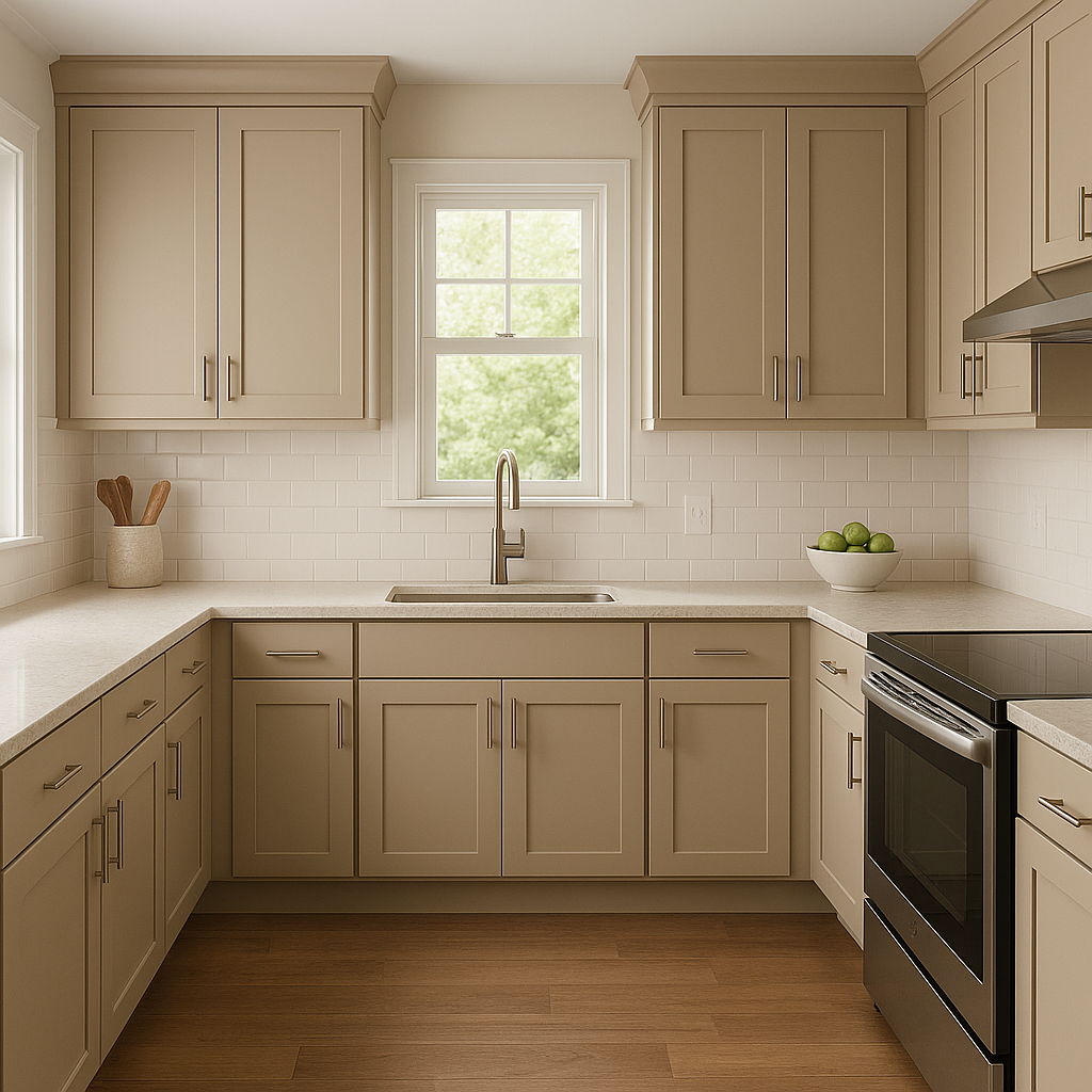
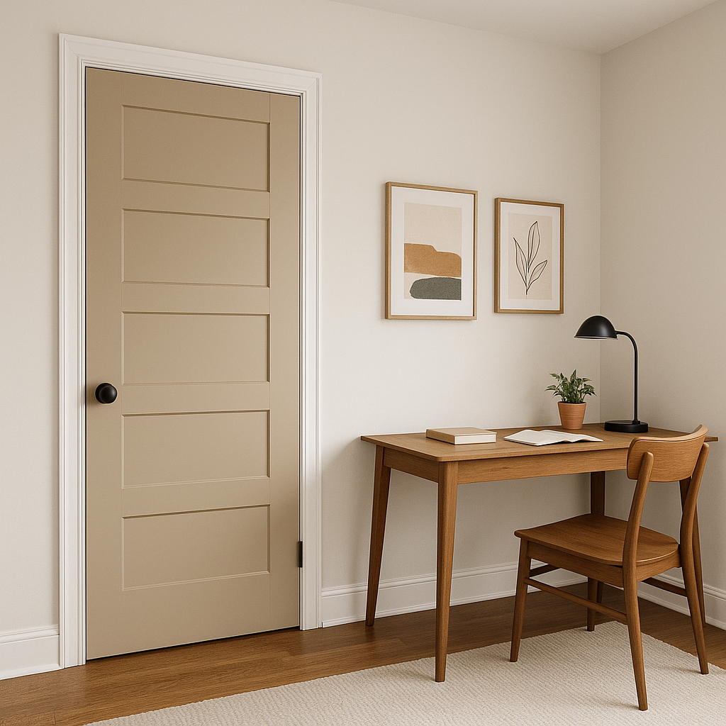
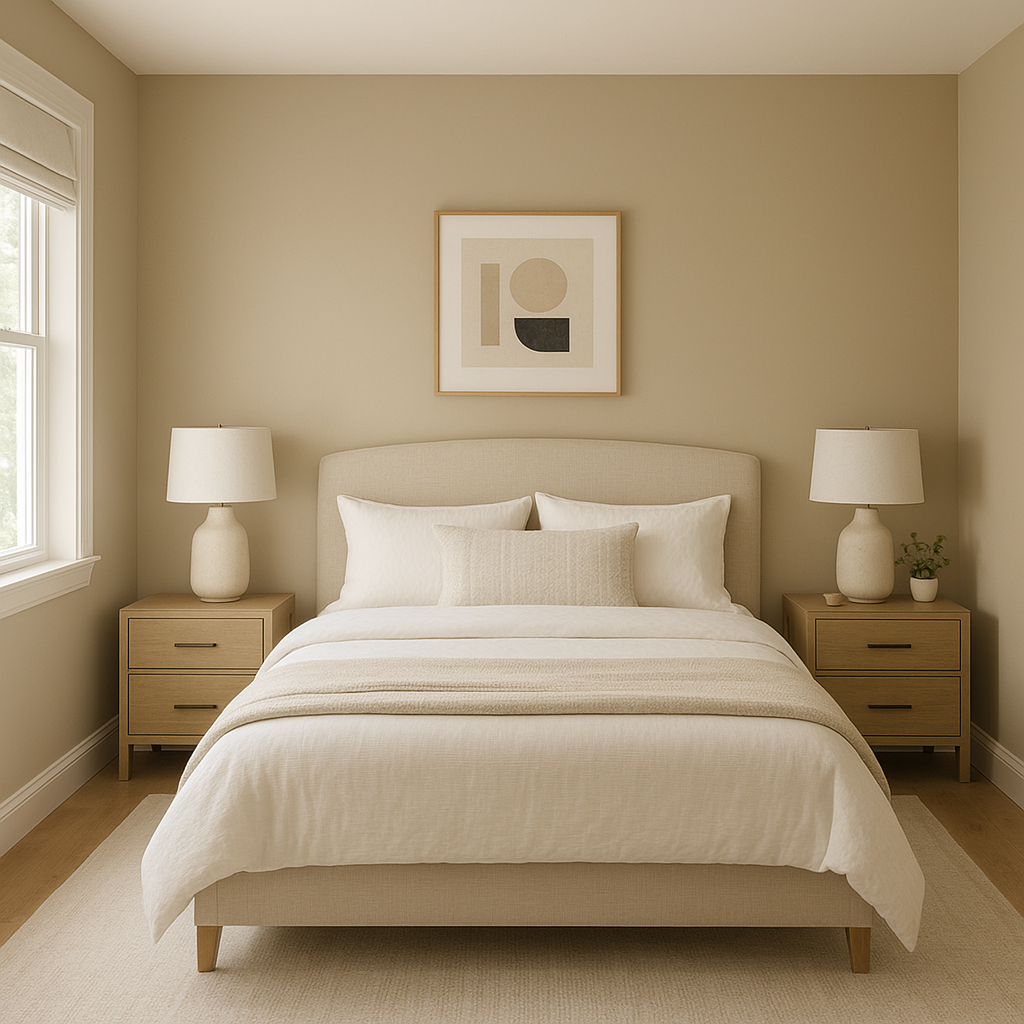
Sherwin-Williams Downing Sand (SW 2822) is an elegant and versatile neutral that evokes the charm of historical design while seamlessly fitting into contemporary spaces. Its warm, sandy beige hue is inspired by the rich tones found in nature and traditional architecture, making it a perfect choice for homeowners and designers seeking a classic yet adaptable color. Whether you’re designing a cozy living room, an inviting entryway, or a serene bedroom, Downing Sand delivers an understated sophistication that enhances a wide variety of design styles.
Downing Sand has subtle golden undertones that create a welcoming warmth without overpowering the space. These undertones prevent the color from feeling sterile or cold, allowing it to create a comfortable and grounded atmosphere. However, its neutral base ensures it remains soft and versatile, making it suitable for both expansive spaces and intimate areas. The balance of beige and gold undertones gives Downing Sand its timeless appeal, allowing it to pair beautifully with both traditional and modern elements.
One of the strengths of Sherwin-Williams Downing Sand is its ability to coordinate effortlessly with a range of complementary colors. Here are some suggestions for creating harmonious palettes:
Downing Sand excels as a main wall color or as a complementary shade in spaces that need a touch of warmth and sophistication. Its neutral qualities make it ideal for a variety of interior applications:
Downing Sand is more than just a paint color—it’s a design foundation that brings warmth, character, and versatility to your home. Its ability to complement a wide range of palettes and design styles makes it a favorite among interior designers and homeowners alike. Whether you’re looking to create a cozy retreat or an elegant gathering space, Sherwin-Williams Downing Sand is a timeless choice that will elevate your interior or exterior design.
Note: These images were all generated with AI, there may be inaccurate color results. Please only use a general reference to get a rough idea of what a color may look like, we will continue to generate new images to improve accuracy.
View Colors Only by Brand (No Imagery):
Sherwin-Williams
|
Benjamin-Moore
|
Behr
|
Valspar
Live on the Eastern Slope of Colorado and looking for a local painting professional, check out all our painting services and reach out for a free estimate.
Copyright © 2026 : Wild Fox Painting Inc. : 12435 Mead Way, Littleton, CO 80125


