Sherwin-Williams Chelsea Gray (SW 2850) is a sophisticated, medium-toned gray that exudes timeless elegance and versatility. Perfect for interiors and exteriors alike, Chelsea Gray strikes a harmonious balance between warmth and depth, making it an ideal choice for spaces that demand a refined yet approachable aesthetic. Whether you're designing a cozy living room, a serene bedroom, or a polished office environment, this neutral shade adapts effortlessly to a wide range of design styles, from modern minimalism to classic traditional.
Chelsea Gray features subtle warm undertones that differentiate it from cooler, bluish grays. These undertones imbue the color with a soft, inviting quality, preventing it from feeling too stark or industrial. The slight brown or taupe undertones make Chelsea Gray a versatile option that pairs beautifully with both warm and cool color palettes. This adaptability ensures it works seamlessly across various lighting conditions, whether your space is drenched in natural sunlight or illuminated by artificial lighting.
Creating a cohesive color scheme with Chelsea Gray is effortless due to its neutrality and understated elegance. Here are some coordinating colors to consider:
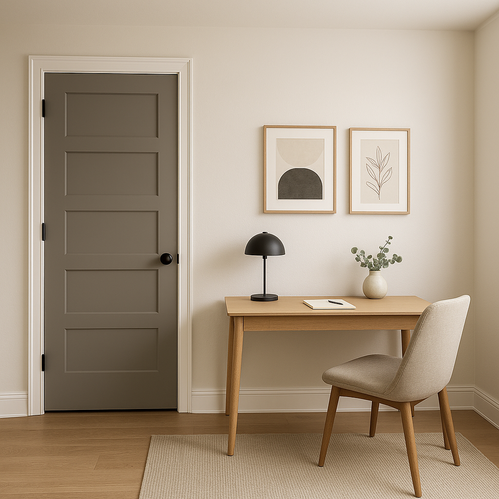
Chelsea Gray is a versatile shade that works in nearly any room or setting. Here are some specific ways to incorporate this color into your design projects:
Chelsea Gray is an excellent choice for creating a cozy yet sophisticated living room. Pair it with plush textures like velvet or linen in neutral shades or add pops of color with vibrant cushions and artwork. Use it on accent walls or throughout the entire space for a dramatic yet inviting atmosphere.
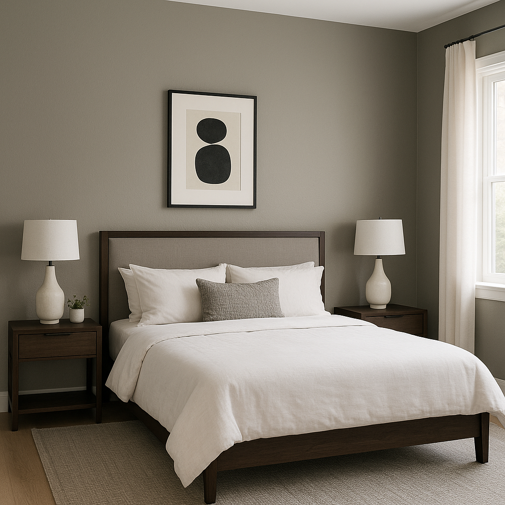
In bedrooms, Chelsea Gray can serve as a grounding backdrop for soft, layered bedding and warm wood furniture. Pair it with creamy whites or pastel tones to evoke tranquility and relaxation.
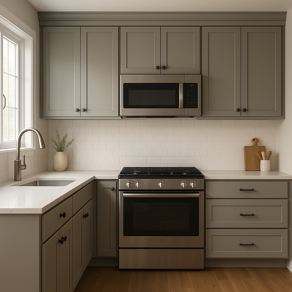
Chelsea Gray works beautifully for cabinetry in kitchens and bathrooms, offering a contemporary yet timeless look. Combine it with polished chrome hardware and white marble countertops for a chic aesthetic, or opt for brushed brass finishes to enhance its warmth.
On exteriors, Chelsea Gray is a showstopper. Use it for siding or shutters to create a sophisticated curb appeal. Pair it with crisp whites like Pure White (SW 7005) for trim and window frames to achieve a classic look, or combine it with darker accents for a modern vibe.
Sherwin-Williams Chelsea Gray (SW 2850) is a truly versatile paint color that serves as the perfect backdrop or statement shade for a variety of interior and exterior design styles. Its understated depth, warm undertones, and adaptability make it a go-to choice for homeowners and designers alike seeking a sophisticated yet approachable neutral.
Note: These images were all generated with AI, there may be inaccurate color results. Please only use a general reference to get a rough idea of what a color may look like, we will continue to generate new images to improve accuracy.
View Colors Only by Brand (No Imagery):
Sherwin-Williams
|
Benjamin-Moore
|
Behr
|
Valspar
Live on the Eastern Slope of Colorado and looking for a local painting professional, check out all our painting services and reach out for a free estimate.
Copyright © 2026 : Wild Fox Painting Inc. : 12435 Mead Way, Littleton, CO 80125


