Sherwin-Williams Powder Blue (SW 2863) is a soft, serene shade that brings a refreshing and calming quality to any space. Its delicate blend of muted blue with subtle gray undertones makes it an incredibly versatile choice for interiors that aim to evoke peace, sophistication, and timeless charm. Powder Blue is perfect for both modern and traditional aesthetics, effortlessly bridging the gap between airy lightness and grounded elegance.
Powder Blue leans toward a cool spectrum, with its gray undertones softening the intensity of its blue base. This muted quality prevents it from feeling overly vibrant or saturated, making it an ideal choice for spaces where relaxation and tranquility are key. The undertones also allow Powder Blue to adapt beautifully to varying lighting conditions, creating subtle shifts in its appearance throughout the day. In brighter light, it may appear breezy and fresh, while in dimmer settings, it takes on a more sophisticated and introspective tone.
One of the strengths of Powder Blue is its ability to pair seamlessly with a variety of colors, offering endless possibilities for interior design. Here are some complementary shades to consider:
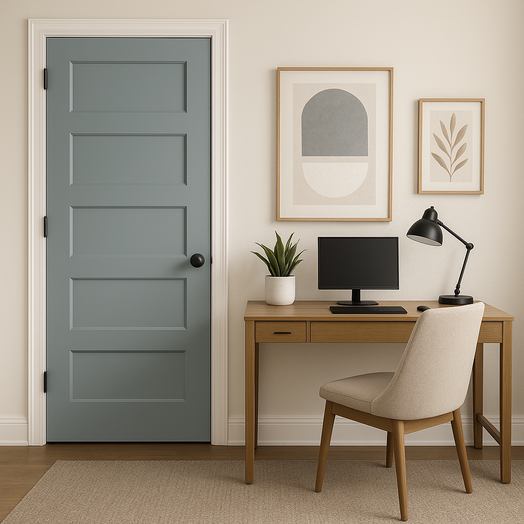
Powder Blue’s versatility makes it suitable for a wide range of applications, from walls to cabinetry and even accents. Here are some ideas for incorporating this shade into your home or space:
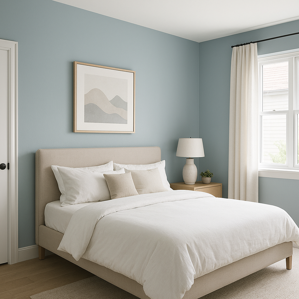
Powder Blue is a fantastic choice for bedrooms, as its soothing qualities create a peaceful retreat. Pair it with crisp white linens and soft gray accents for a serene, spa-like ambiance that promotes restful sleep.
Transform your bathroom into a calming oasis with Powder Blue. Its cool tone works beautifully with white subway tiles, polished chrome fixtures, and natural wood finishes to evoke a fresh and airy atmosphere.
In living areas, Powder Blue can act as an inviting backdrop that pairs well with warm wood furniture and neutral upholstery. Add textured throws or patterned pillows in complementary hues for a layered, designer-inspired look.
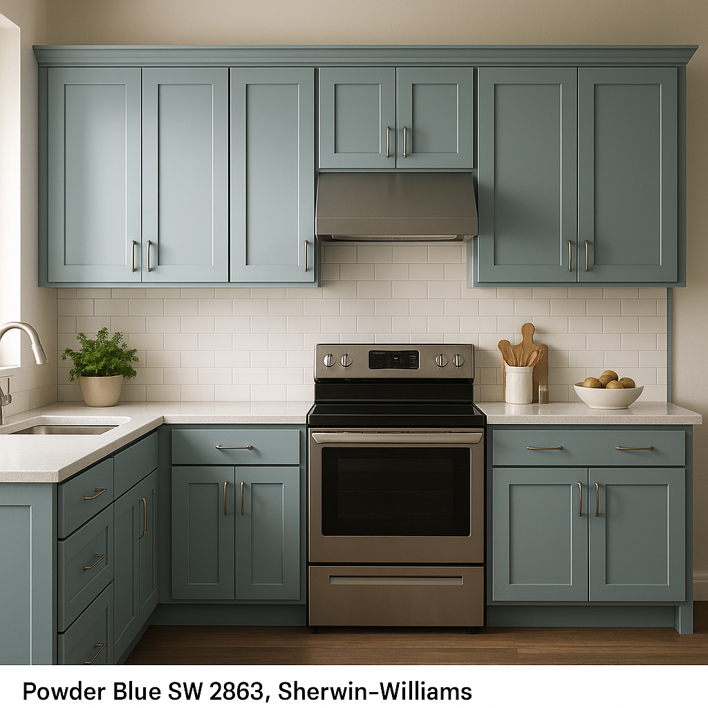
Powder Blue is also a stunning option for kitchen cabinetry. It brings a subtle pop of color while maintaining a classic, timeless feel. Pair it with marble countertops and brushed brass hardware for a sophisticated yet approachable design.
For a gender-neutral nursery, Powder Blue offers a soothing palette that fosters comfort and tranquility. Pair it with warm creams, soft pastels, and natural wood accents for a cozy and inviting space.
When choosing Powder Blue, it’s important to consider how lighting will impact its appearance. In rooms with ample natural light, the color will feel light and airy, while artificial light in warmer tones can bring out its gray undertones. Experimenting with swatches in different lighting conditions will help ensure the perfect application.
Sherwin-Williams Powder Blue (SW 2863) strikes the perfect balance between elegance and calm, making it a go-to choice for designers and homeowners alike. Whether you’re creating a coastal retreat, a modern minimalist space, or a cozy traditional haven, this versatile color adapts to a variety of styles, ensuring your home feels both timeless and inviting.
Note: These images were all generated with AI, there may be inaccurate color results. Please only use a general reference to get a rough idea of what a color may look like, we will continue to generate new images to improve accuracy.
View Colors Only by Brand (No Imagery):
Sherwin-Williams
|
Benjamin-Moore
|
Behr
|
Valspar
Live on the Eastern Slope of Colorado and looking for a local painting professional, check out all our painting services and reach out for a free estimate.
Copyright © 2026 : Wild Fox Painting Inc. : 12435 Mead Way, Littleton, CO 80125


