Sherwin-Williams Grayish (SW 6001) is a sophisticated neutral that strikes the perfect balance between gray and beige, offering a timeless and versatile color that complements a wide range of design styles. Its soft, muted appearance creates a calming atmosphere while providing just enough warmth to keep spaces from feeling stark or cold. Whether you're designing a minimalist retreat or a cozy, welcoming interior, Grayish is a top-tier choice for elevating your home with understated elegance.
Grayish is a greige hue, blending gray with subtle beige undertones that soften its overall appearance. Its undertones lean slightly warm, making it an excellent alternative to cooler grays that can sometimes feel clinical. The beige undertones ensure that Grayish harmonizes beautifully with both warm and cool color palettes, giving it exceptional adaptability. When paired with natural light, Grayish reveals a gentle depth, while artificial lighting can enhance its cozy and refined qualities.
Sherwin-Williams Grayish pairs beautifully with a wide range of colors, allowing you to create cohesive and harmonious spaces. Here are some suggested coordinating colors:
By combining these colors with Grayish, you can create anything from a peaceful retreat to a bold, modern aesthetic depending on your design goals.
Grayish is a versatile color that works well in various rooms and applications, thanks to its neutral yet warm personality. Here are some ideas for incorporating Grayish into your home:
Grayish is ideal for living spaces, offering a neutral backdrop that lets furniture and décor shine. Pair it with cozy textiles like plush throws and woven rugs to amplify its inviting nature. Use coordinating accents like wood tones, metallic finishes, or soft pastel accessories to create a balanced and layered look.
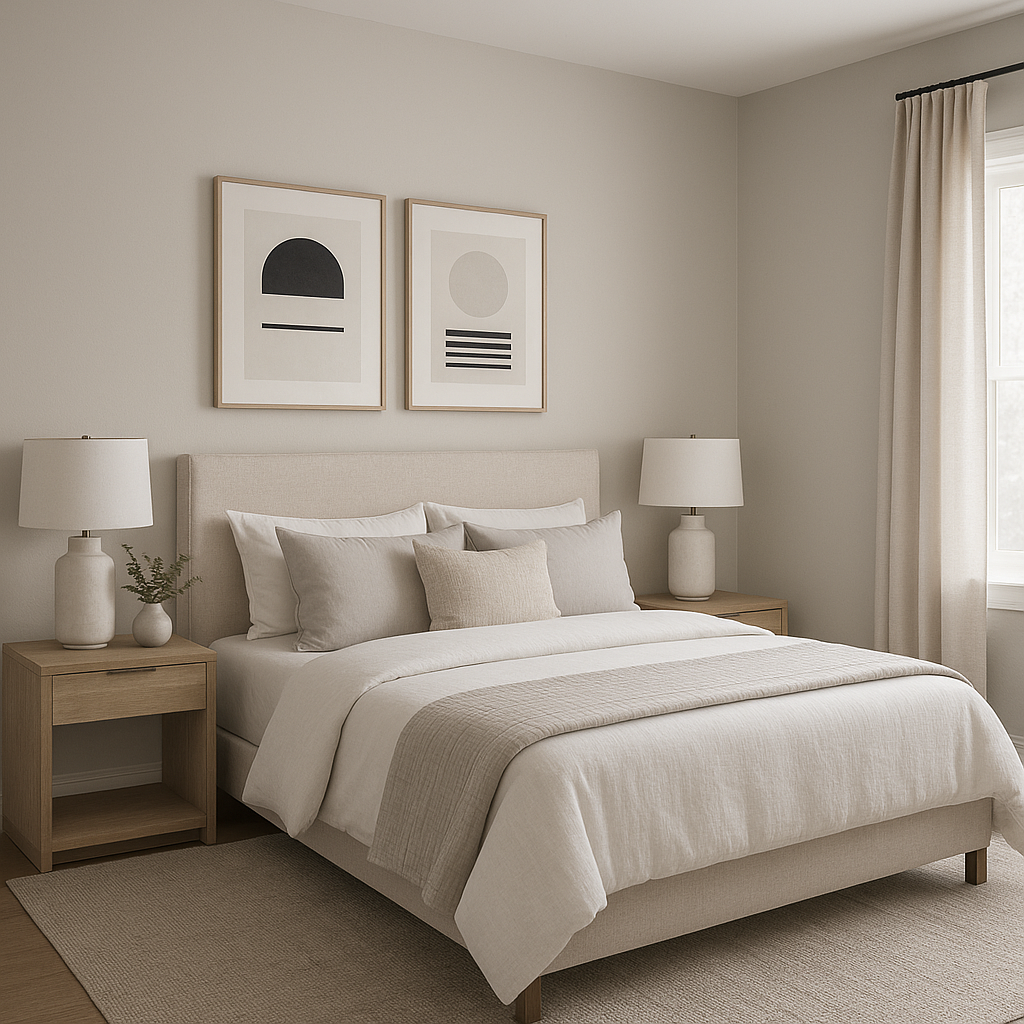
In bedrooms, Grayish provides a tranquil foundation for relaxation. Combine it with soft whites and warm taupes for a serene vibe or introduce pops of muted pink or blue for added personality. Its warmth ensures that the space feels cozy yet sophisticated.
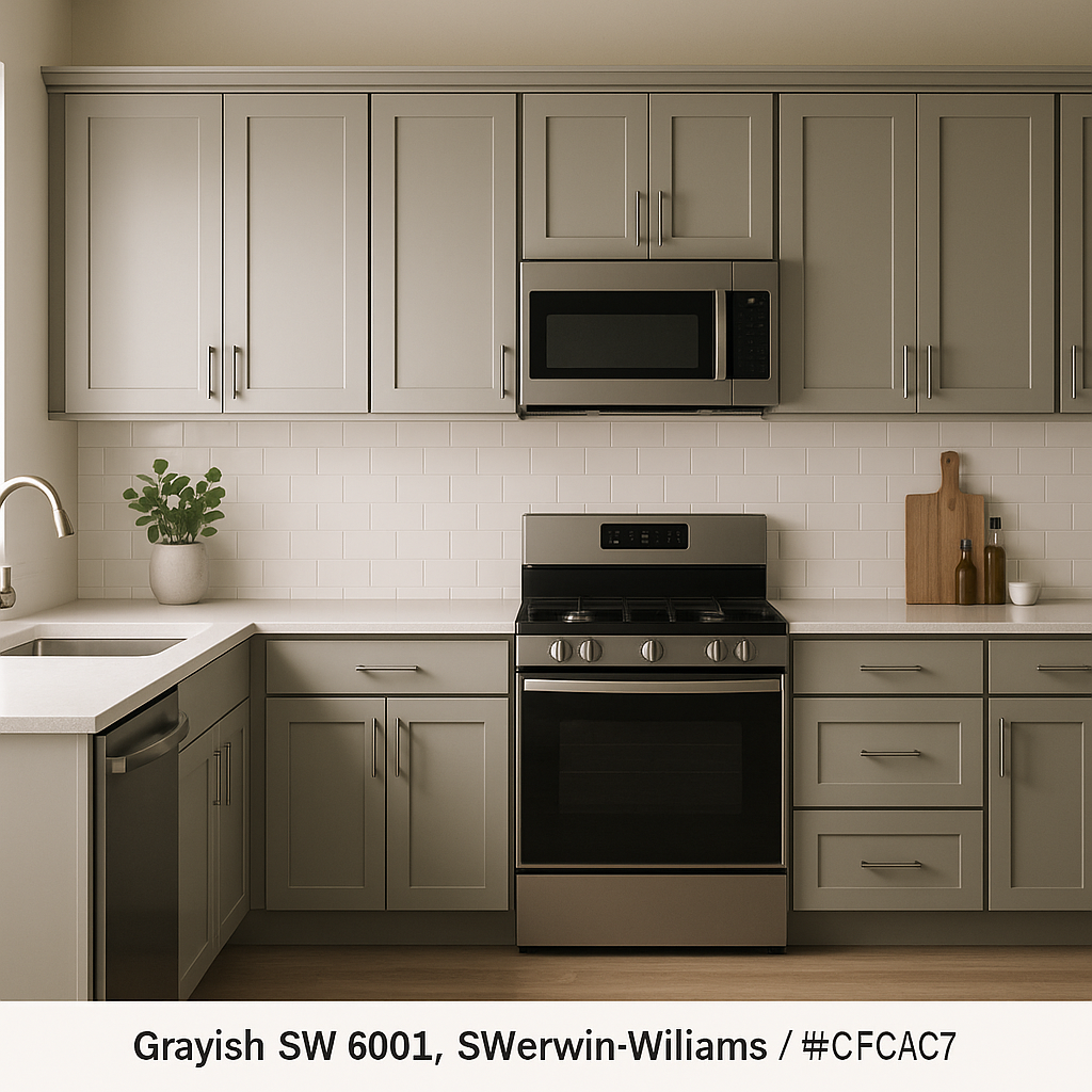
Grayish is a fantastic choice for kitchens and dining rooms, especially when paired with white cabinetry and natural wood accents. The beige undertones complement wood grains beautifully, while its gray base adds a modern touch. Consider incorporating metallic finishes like brushed brass or stainless steel for a contemporary edge.
For bathrooms, Grayish creates a spa-like ambiance that’s clean yet inviting. Pair it with crisp white tiles, soft greens, or natural stone accents for a soothing, upscale aesthetic. Because of its neutrality, it works equally well in small powder rooms or expansive master baths.
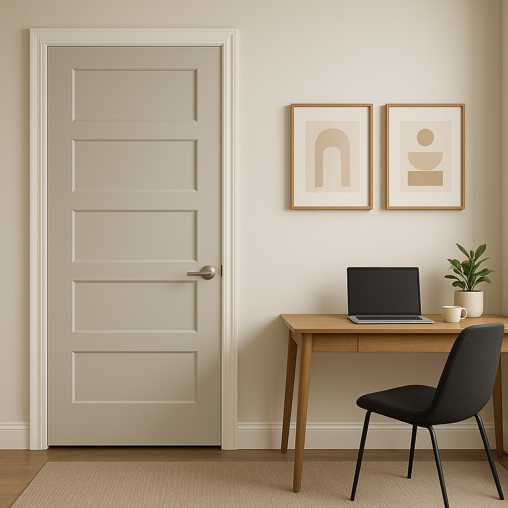
Grayish shines in transitional spaces like entryways and hallways, providing a subtle yet polished backdrop that ties together the surrounding rooms. Its versatility ensures that it complements a variety of flooring materials, from hardwood to tile.
Grayish is highly adaptable to different lighting conditions. In spaces with abundant natural light, the beige undertones become more prominent, lending the color a warm and welcoming feel. In rooms with limited light or cooler artificial lighting, the gray base takes center stage, creating a more subdued and modern look. To optimize its appearance, test Grayish in your space at different times of the day to see how it interacts with your lighting.
Sherwin-Williams Grayish is the perfect choice if you’re looking for a versatile neutral that feels modern yet timeless. Its adaptability, warm undertones, and ability to coordinate with a wide range of colors make it a go-to option for homeowners and designers alike. Whether you’re updating a single room or transforming your entire home, Grayish is a color that will stand the test of time while enhancing the beauty of your space.
Note: These images were all generated with AI, there may be inaccurate color results. Please only use a general reference to get a rough idea of what a color may look like, we will continue to generate new images to improve accuracy.
View Colors Only by Brand (No Imagery):
Sherwin-Williams
|
Benjamin-Moore
|
Behr
|
Valspar
Live on the Eastern Slope of Colorado and looking for a local painting professional, check out all our painting services and reach out for a free estimate.
Copyright © 2026 : Wild Fox Painting Inc. : 12435 Mead Way, Littleton, CO 80125


