Sherwin-Williams Glamour 6031 is a captivating and luxurious color that instantly elevates any space with its refined presence. This rich plum hue is the epitome of sophistication, offering a deep, velvety quality that creates warmth, depth, and elegance in interior design. Whether you're looking to make a bold statement or add a subtle touch of drama, Glamour 6031 is a versatile choice that adapts to a variety of styles and settings.
Glamour 6031 features prominent purple undertones with a warm, red-leaning base. These undertones give the color its rich, jewel-like quality, making it feel luxe and inviting rather than overly moody. The subtle redness in its undertone also ensures that it doesn’t feel too cold or stark, striking the perfect balance between boldness and comfort. This depth of color makes it ideal for creating cozy, intimate spaces while maintaining a touch of opulence.
Pairing Glamour 6031 with the right coordinating shades enhances its beauty and creates a cohesive color palette for your space. Here are some complementary colors to consider:
Neutrals:
To balance the richness of Glamour 6031, soft, warm neutrals like Sherwin-Williams Alabaster (SW 7008) or Neutral Ground (SW 7568) work beautifully. These lighter tones provide contrast and keep the space feeling open and airy.
Metallic Accents:
Incorporate metallic finishes like gold, brass, or champagne to emphasize the luxurious vibe of Glamour 6031. These accents can be introduced through light fixtures, mirrors, or hardware for a polished and cohesive look.
Greens:
For a bold and modern color pairing, try shades of green like Sherwin-Williams Evergreen Fog (SW 9130) or Shagreen (SW 6422). These earthy tones create a harmonious contrast with the plum, adding depth and intrigue to your design.
Blush Pinks:
Soft blush tones such as Intimate White (SW 6322) or Rose Embroidery (SW 0022) beautifully complement the purple undertones of Glamour 6031, creating a romantic and feminine ambiance.
Deeper Complementary Colors:
If you’re looking for a monochromatic or dramatic effect, pair Glamour 6031 with deeper purples or burgundies, such as Sherwin-Williams Blackberry (SW 7577) or Burgundy (SW 6300).
Glamour 6031 is a versatile color that can be used in both residential and commercial spaces to achieve a variety of design aesthetics. Here are some of its best applications:
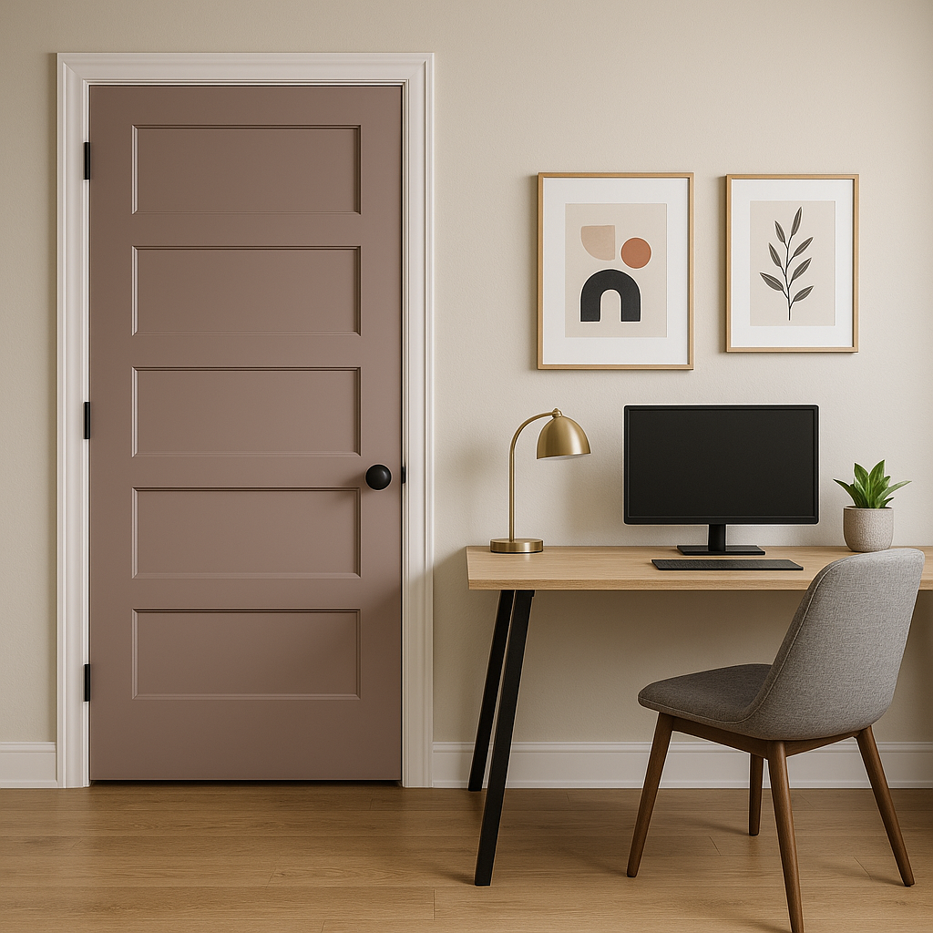
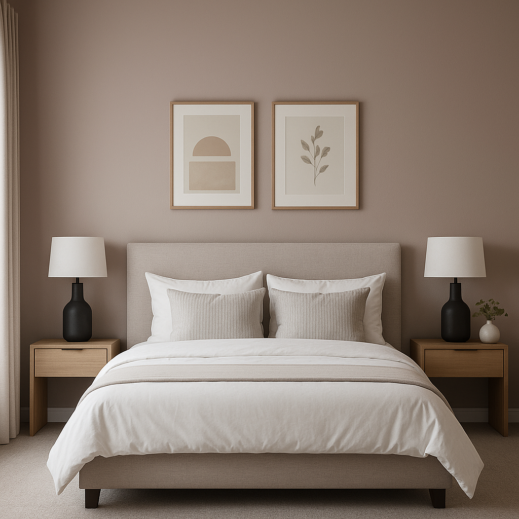
This dramatic hue works wonderfully as an accent wall in living rooms, dining rooms, or bedrooms. Its depth draws attention, creating a focal point that feels both cozy and high-end. Pair it with neutral walls and furnishings to let the color shine.
For an unexpected touch of drama, use Glamour 6031 on the ceiling to create a cocoon-like effect. This approach works particularly well in spaces like libraries, powder rooms, or formal dining areas.
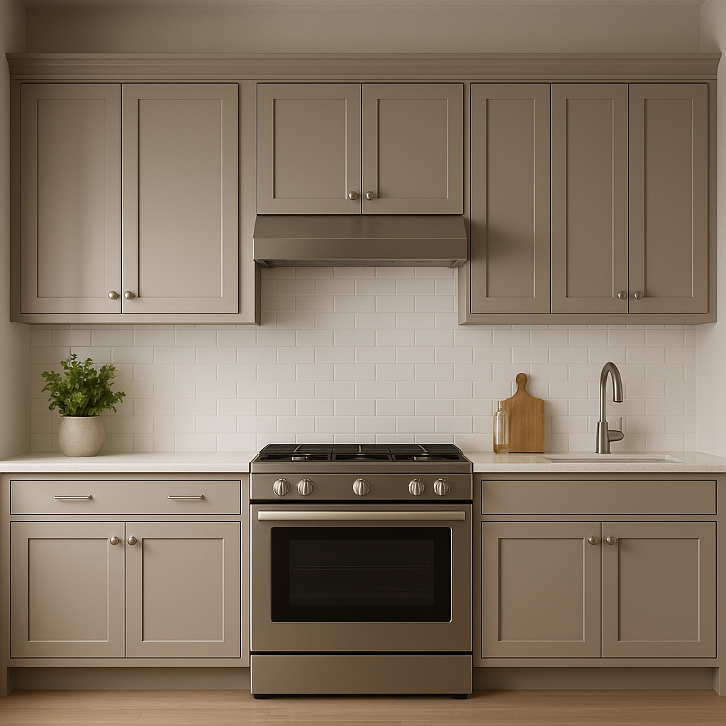
Consider painting furniture or cabinetry in Glamour 6031 for a custom, designer look. This color can give a modern twist to traditional pieces or add depth to contemporary ones. For example, it’s stunning on kitchen islands, bathroom vanities, or built-in bookshelves, especially when paired with metallic hardware.
Note: These images were all generated with AI, there may be inaccurate color results. Please only use a general reference to get a rough idea of what a color may look like, we will continue to generate new images to improve accuracy.
View Colors Only by Brand (No Imagery):
Sherwin-Williams
|
Benjamin-Moore
|
Behr
|
Valspar
Live on the Eastern Slope of Colorado and looking for a local painting professional, check out all our painting services and reach out for a free estimate.
Copyright © 2026 : Wild Fox Painting Inc. : 12435 Mead Way, Littleton, CO 80125


