Sherwin-Williams Dutch Cocoa (SW 6032) is a rich, medium-dark brown paint color that evokes the comforting warmth of freshly ground cocoa powder. Its earthy sophistication and subtle depth make it a versatile choice for creating cozy, inviting spaces that feel grounded and timeless. Whether you’re designing a modern rustic retreat or adding warmth to a contemporary palette, Dutch Cocoa offers an enduring charm that works well across a variety of styles.
Dutch Cocoa (SW 6032) carries warm, reddish undertones that lend richness and depth to the color. These undertones make it distinct from cooler browns or taupes, giving it a more welcoming feel. The red undertones in this shade are subtle enough to avoid overpowering a space but noticeable enough to create a sense of warmth and intimacy. This balance makes Dutch Cocoa ideal for rooms where comfort and coziness are essential, such as living rooms, bedrooms, or even dining areas.
Sherwin-Williams Dutch Cocoa pairs beautifully with a variety of coordinating colors, allowing you to create a well-rounded and visually appealing palette. Below are some recommended colors to complement Dutch Cocoa:
Neutral Pairings:
For a timeless and elegant look, pair Dutch Cocoa with soft, creamy neutrals like Sherwin-Williams Alabaster (SW 7008) or Sherwin-Williams Accessible Beige (SW 7036). These lighter tones provide contrast while keeping the overall vibe warm and cohesive.
Earthy Greens:
Bring out the natural warmth of Dutch Cocoa by pairing it with earthy greens such as Sherwin-Williams Retreat (SW 6207) or Sherwin-Williams Svelte Sage (SW 6164). These shades create a harmonious connection to nature, perfect for rustic or organic-inspired interiors.
Warm Accent Colors:
Add depth and vibrancy with warm accent hues like Sherwin-Williams Spiced Cider (SW 7702) or Sherwin-Williams Red Bay (SW 6321). These rich tones complement Dutch Cocoa’s reddish undertones, providing a bold and dramatic contrast.
Dark Contrasts:
For a sophisticated and moody aesthetic, pair Dutch Cocoa with darker colors like Sherwin-Williams Iron Ore (SW 7069) or Sherwin-Williams Black Fox (SW 7020). These deeper shades enhance Dutch Cocoa’s richness while creating a bold, modern look.
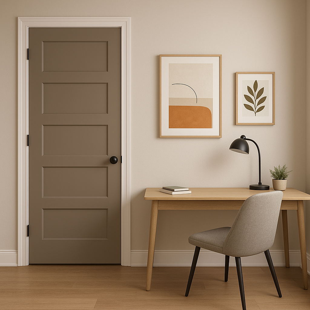
Dutch Cocoa is a highly adaptable color that can be used in various spaces and applications to achieve different effects. Here are some ideas for incorporating Sherwin-Williams Dutch Cocoa into your home:
Living Rooms:
Use Dutch Cocoa to create a cozy, inviting atmosphere in your living space. Pair it with soft cream furniture and warm wood accents to enhance its earthy charm. Consider painting an accent wall or using it as the primary color in larger rooms for a grounded feel.
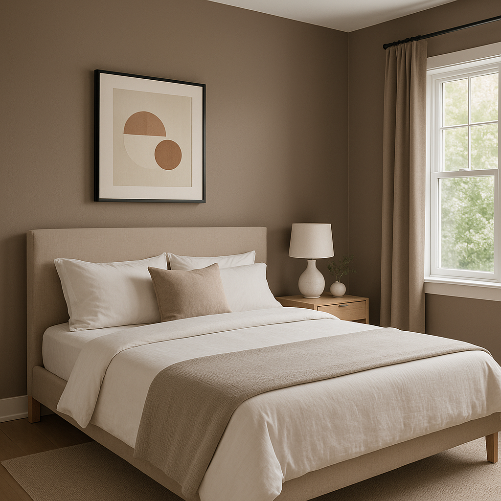
Bedrooms:
Dutch Cocoa’s warm undertones make it an excellent choice for creating a restful bedroom retreat. Complement it with soft textiles and neutral bedding for a serene space, or add pops of color with bold accessories for a more personalized look.
Dining Rooms:
Elevate the elegance of your dining area with Dutch Cocoa on the walls. Pair it with metallic finishes, such as brass or gold, and deep wood tones to create a refined, luxurious ambiance.
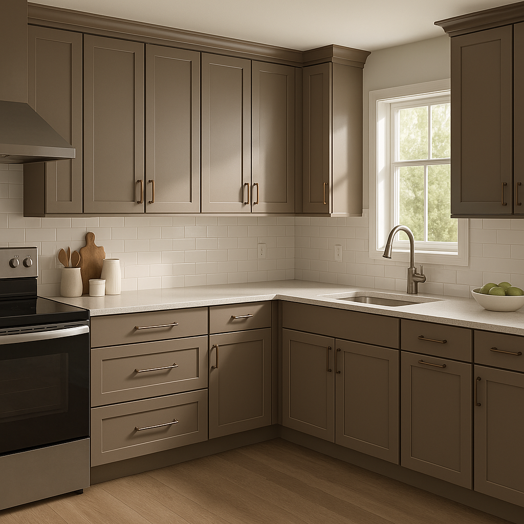
Cabinets and Furniture:
For a unique twist, consider using Dutch Cocoa as a cabinet or furniture color. It works beautifully in kitchens with white countertops or backsplashes, adding depth and contrast to the space.
Exterior Applications:
Dutch Cocoa can also be used to add warmth to your home’s exterior. Pair it with lighter trim colors, such as creamy whites, for a classic look, or combine it with darker accents for a bold, modern facade.
The appearance of Dutch Cocoa can vary depending on the lighting in your space. In rooms with ample natural light, the reddish undertones will feel more pronounced, giving the color a warm and inviting glow. In dim or artificial lighting, Dutch Cocoa may appear slightly deeper and more muted, creating an intimate and cozy ambiance. Be sure to test the color in your space under different lighting conditions before committing to it.
Sherwin-Williams Dutch Cocoa (SW 6032) is a deeply versatile shade that brings warmth, comfort, and timeless beauty to any interior or exterior. Whether used as a primary color or an accent, its earthy sophistication ensures it will remain a favorite for years to come.
Note: These images were all generated with AI, there may be inaccurate color results. Please only use a general reference to get a rough idea of what a color may look like, we will continue to generate new images to improve accuracy.
View Colors Only by Brand (No Imagery):
Sherwin-Williams
|
Benjamin-Moore
|
Behr
|
Valspar
Live on the Eastern Slope of Colorado and looking for a local painting professional, check out all our painting services and reach out for a free estimate.
Copyright © 2026 : Wild Fox Painting Inc. : 12435 Mead Way, Littleton, CO 80125


