Sherwin-Williams Temperate Taupe (SW 6037) is a versatile and sophisticated neutral that strikes the perfect balance between warmth and coolness. This mid-tone taupe offers an understated elegance with its soft, earthy hues, making it a popular choice for a variety of interior design styles—from modern minimalism to timeless traditional spaces. Whether you’re looking to create a cozy retreat or a polished, professional atmosphere, Temperate Taupe is a reliable go-to color that sets the tone for any room.
Temperate Taupe is defined by its complex undertones, which give it depth and adaptability. It leans into a subtle mix of both warm and cool tones, with a foundation of soft gray and brown. These undertones allow it to shift in appearance depending on the lighting and surrounding decor.
This chameleon-like quality means that Temperate Taupe can adapt beautifully to both warm and cool palettes, making it an ideal choice for transitional spaces or rooms that see varying light throughout the day.
Sherwin-Williams Temperate Taupe pairs effortlessly with a range of complementary colors, thanks to its neutral base. Whether you’re looking to create a monochromatic scheme or add a pop of contrast, there are plenty of coordinating hues to explore.
For a serene, tone-on-tone look, consider pairing Temperate Taupe with other taupe and beige shades:
Temperate Taupe works beautifully with whites and off-whites for a clean, crisp aesthetic:
To add vibrancy and personality, introduce accent colors that complement Temperate Taupe's earthy base:
Temperate Taupe's versatility makes it a standout option for a variety of applications. Its ability to work with both warm and cool tones means it can seamlessly tie together different design elements in your home. Here are some of the best ways to use this elegant shade:
Living Rooms: Create a welcoming space by painting Temperate Taupe on the walls and pairing it with plush, neutral furniture and soft textiles. Add metallic accents like brass or bronze for a touch of glamour.
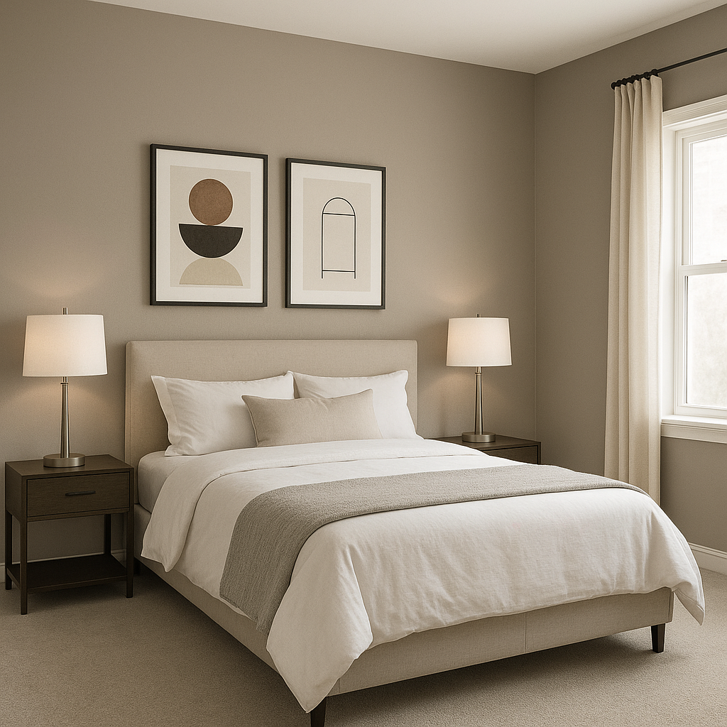
Bedrooms: Its soothing and balanced tones make it ideal for a restful retreat. Combine it with white bed linens, natural wood furniture, and warm lighting to foster a serene atmosphere.
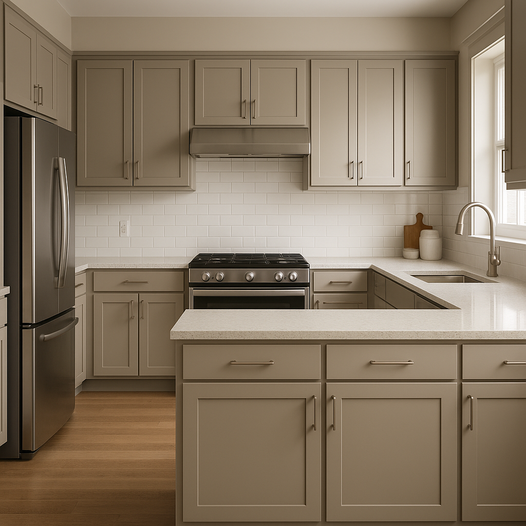
Kitchens: Use this shade on cabinets or walls to achieve a timeless, grounded look. Pair it with white subway tile, black granite countertops, or matte brass fixtures for a chic, modern farmhouse vibe.
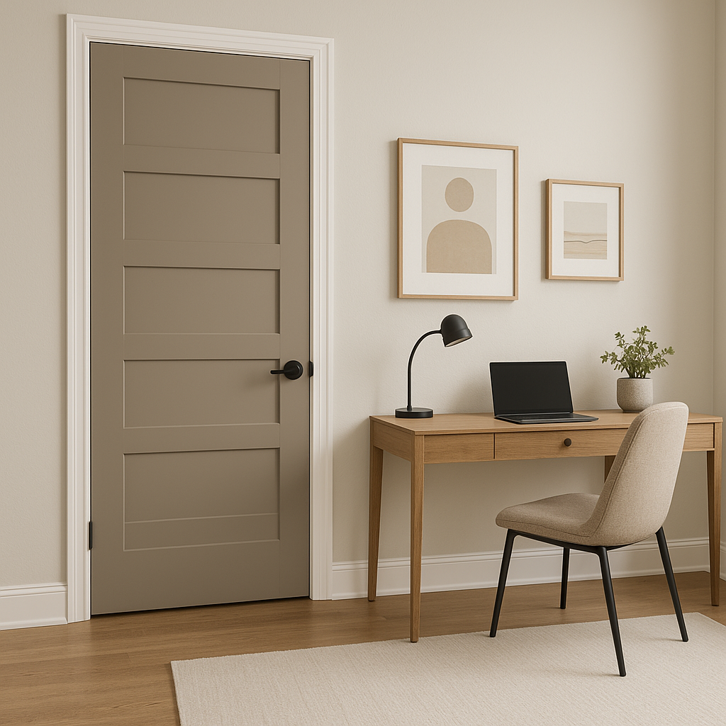
Home Offices: Temperate Taupe's calm and neutral presence creates a focused and productive environment. Incorporate cool metals and minimalist decor for a clean, professional finish.
Bathrooms: For a spa-like feel, pair Temperate Taupe with soft whites, light grays, and accents of green or blue. It works beautifully with both matte and glossy finishes, allowing you to customize the level of sophistication.
Sherwin-Williams Temperate Taupe is more than just a neutral—it’s a color that adapts effortlessly to its surroundings while maintaining a timeless elegance. Its subtle undertones and versatile nature make it easy to coordinate with a variety of palettes, whether you're aiming for a cozy and warm style or a sleek, modern aesthetic. Perfect for any room in your home, Temperate Taupe offers a polished yet approachable backdrop that complements both bold and subtle design choices.
Note: These images were all generated with AI, there may be inaccurate color results. Please only use a general reference to get a rough idea of what a color may look like, we will continue to generate new images to improve accuracy.
View Colors Only by Brand (No Imagery):
Sherwin-Williams
|
Benjamin-Moore
|
Behr
|
Valspar
Live on the Eastern Slope of Colorado and looking for a local painting professional, check out all our painting services and reach out for a free estimate.
Copyright © 2026 : Wild Fox Painting Inc. : 12435 Mead Way, Littleton, CO 80125


