Sherwin-Williams Sashay Sand (SW 6051) is a beautifully balanced neutral that exudes warmth, sophistication, and versatility. Its soft, muted tone makes it an ideal choice for creating calming spaces while offering a subtle richness that feels cozy yet refined. Whether you're designing a serene retreat or an elegant living area, Sashay Sand is a timeless option that works across a variety of styles and settings.
Sashay Sand is a warm, beige-toned neutral with gentle pink undertones that add a touch of softness and charm. The pink notes are subtle enough that they don't overwhelm the color but instead lend it a warmth that feels inviting and comforting. These undertones help it stand out from other neutrals by providing a slight blush-like quality, making it an excellent choice for spaces that aim to feel cozy and welcoming.
The undertones also shift depending on lighting conditions. In natural daylight, Sashay Sand leans more toward a creamy beige, while under artificial or dim lighting, the pink undertones may become more pronounced, adding depth and character to the space.
Sherwin-Williams Sashay Sand pairs beautifully with a curated mix of complementary and contrasting shades, allowing for endless design possibilities. Here are some coordinating colors to inspire your palette:
Sashay Sand is a versatile color that can be used across multiple rooms and design styles, from modern farmhouse to classic traditional and even transitional interiors. Its gentle warmth makes it particularly suited for spaces where relaxation and comfort are central themes.
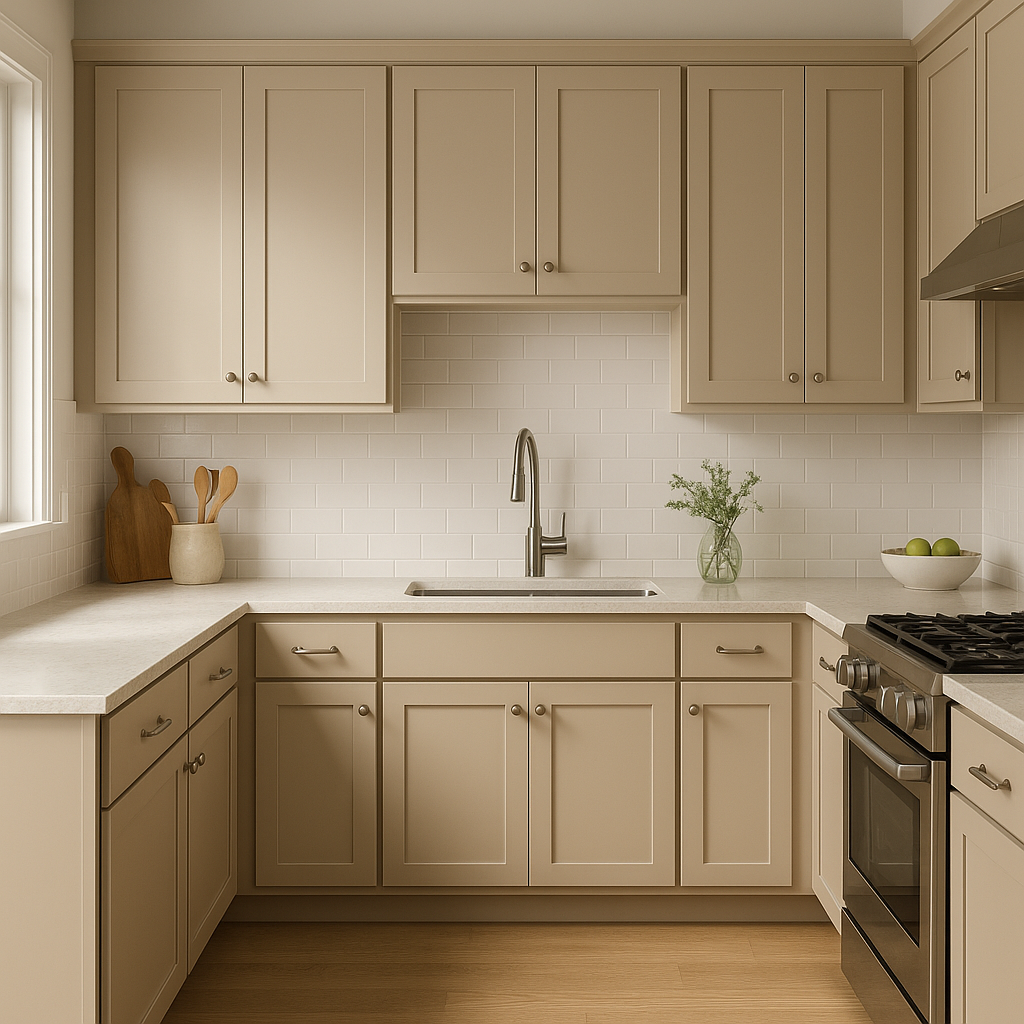
Sashay Sand creates an inviting atmosphere in living spaces, making it ideal for walls in family rooms or living rooms. Pair it with plush furniture in neutral tones, textured throws, and warm metallic accents like brushed gold or bronze for a cozy yet chic aesthetic.
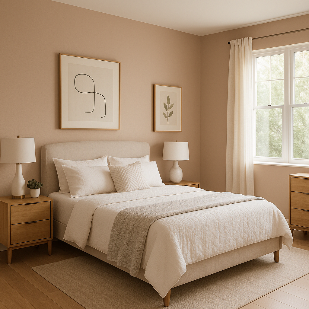
For bedrooms, Sashay Sand’s soft pink undertones contribute to a tranquil and romantic vibe. Use it as a wall color alongside creamy whites for bedding and curtains, or incorporate blush-colored accents to enhance its warmth.
In bathrooms, Sashay Sand brings an understated elegance. Pair it with crisp white tiles, sleek black fixtures, or soft gray stone accents for a clean yet inviting space. Consider adding greenery to balance the neutral warmth with a natural element.
This hue is an excellent choice for dining rooms, where its muted warmth fosters a cozy atmosphere conducive to intimate gatherings. Add contrasting dark wood furniture and metallic finishes for a refined, polished look.
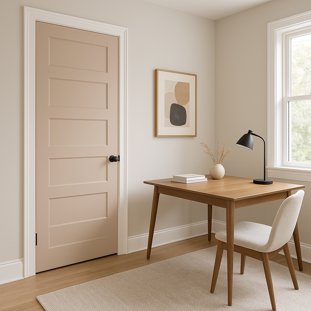
Sashay Sand’s neutral tone promotes focus and calm, making it a smart option for home offices or creative workspaces. Pair it with navy blue or charcoal accents for a professional and grounded feel.
Lighting plays a significant role in how Sashay Sand is perceived. It tends to look lighter and more neutral in spaces with abundant natural light, while artificial or warm-toned lighting enhances its pink undertones. To test its appearance, consider trying a sample in your space under different lighting conditions to ensure it aligns with your vision.
Sherwin-Williams Sashay Sand is more than just a neutral paint color; it’s a versatile design asset that brings warmth, elegance, and a touch of personality to any room. Its ability to coordinate beautifully with a range of colors, along with its adaptable undertones, makes it a go-to choice for both homeowners and interior designers. If you're looking for a neutral that offers more depth and charm than the typical beige or gray, Sashay Sand is an exceptional choice to elevate your space.
Note: These images were all generated with AI, there may be inaccurate color results. Please only use a general reference to get a rough idea of what a color may look like, we will continue to generate new images to improve accuracy.
View Colors Only by Brand (No Imagery):
Sherwin-Williams
|
Benjamin-Moore
|
Behr
|
Valspar
Live on the Eastern Slope of Colorado and looking for a local painting professional, check out all our painting services and reach out for a free estimate.
Copyright © 2026 : Wild Fox Painting Inc. : 12435 Mead Way, Littleton, CO 80125


