Sherwin-Williams Heron Plume (SW 6070) is a soft, versatile neutral that exudes understated elegance. Perfect for those seeking a refined backdrop, this color is ideal for creating serene, sophisticated interiors. Its delicate balance of warmth and coolness makes it a popular choice among homeowners and designers alike.
Heron Plume is a light greige—a harmonious blend of gray and beige—that leans slightly warm while maintaining an airy softness. Its subtle warm undertones give it a welcoming feel without veering too yellow or creamy. This neutrality allows it to adapt beautifully to various lighting conditions, whether bathed in natural sunlight or illuminated by artificial light. Depending on the surrounding decor and light exposure, you may notice faint taupe or beige undertones peeking through, offering depth and dimension to the space.
Heron Plume's versatility shines when paired with complementary hues. Its muted tone allows it to work seamlessly with both bold and subdued palettes. Below are some coordinating colors that pair beautifully with Heron Plume:
For an earthy and natural aesthetic, pair Heron Plume with wood tones, organic elements, and matte finishes.
Heron Plume’s adaptability and gentle warmth make it an excellent choice for a wide range of applications. Here are some ideas on how to integrate this timeless neutral into your home:
Heron Plume creates a calm and inviting atmosphere in living rooms. Pair it with plush furniture in neutral tones, textured throws, and metallic accents for a contemporary yet cozy vibe. Its ability to balance between warm and cool undertones makes it a great choice for spaces with mixed materials such as wood, stone, and metal.
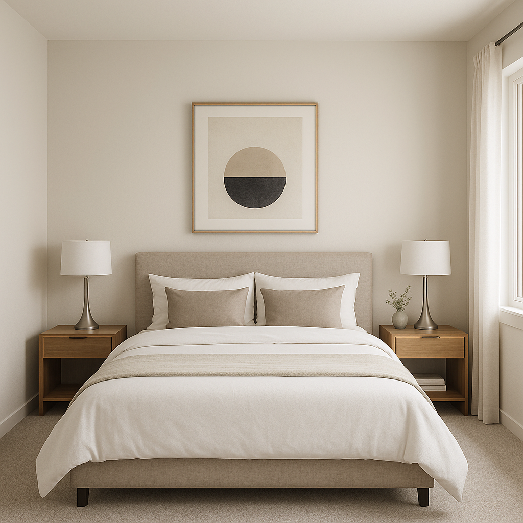
Transform your bedroom into a tranquil retreat by using Heron Plume as the primary wall color. Incorporate soft fabrics like linen or velvet in coordinating shades such as taupe, cream, or light gray. Add pops of color with navy or sage green accents to create a serene yet stylish space.
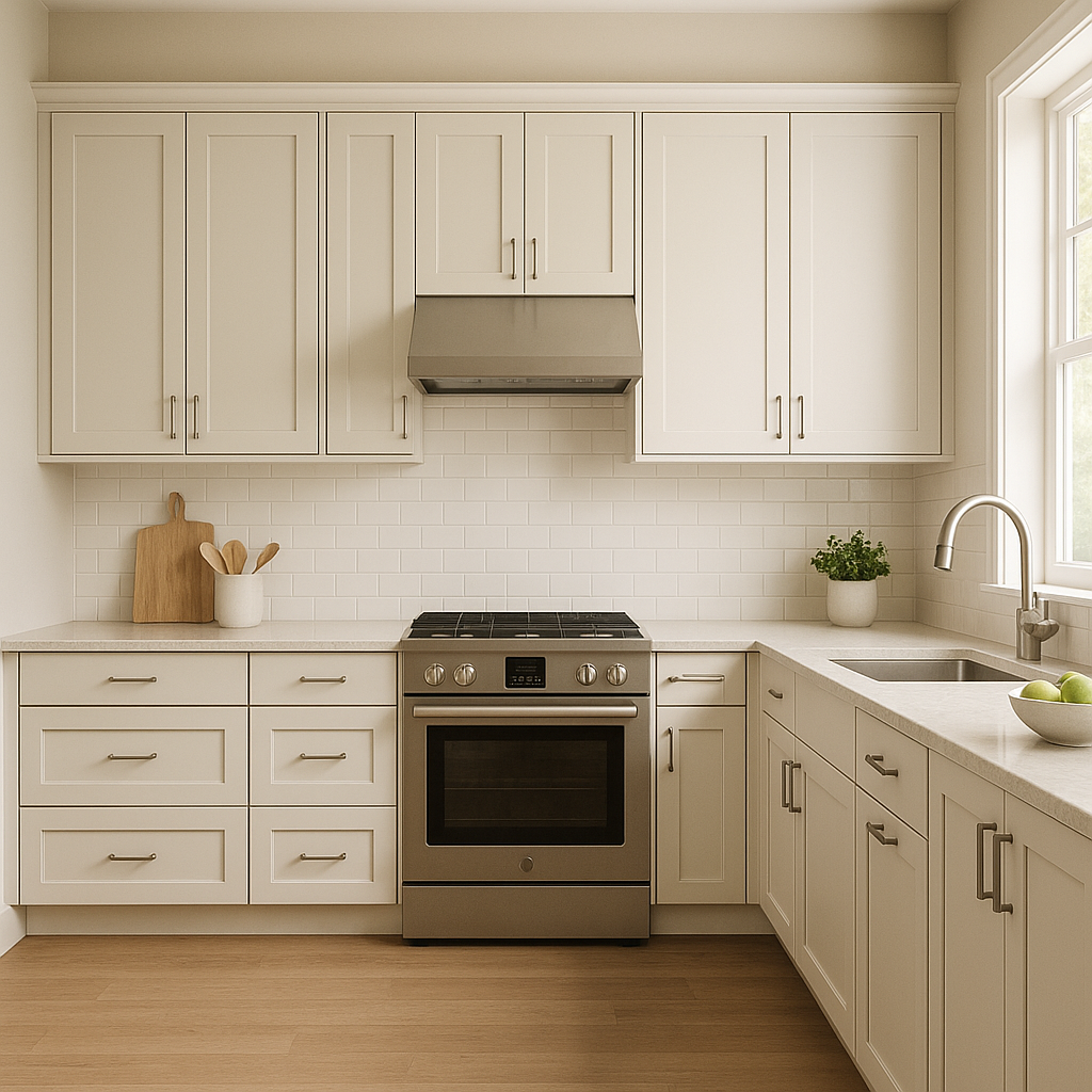
Heron Plume serves as an excellent choice for kitchen walls or cabinetry. Its neutral tone pairs well with marble countertops, stainless steel appliances, or matte black fixtures. Consider accenting the space with greenery or bold tiles to inject personality without overwhelming the room.
In a bathroom, Heron Plume provides a clean and spa-like ambiance. Pair it with crisp white trim, brushed nickel hardware, and soft blue or green accents for a refreshing, coastal-inspired look.
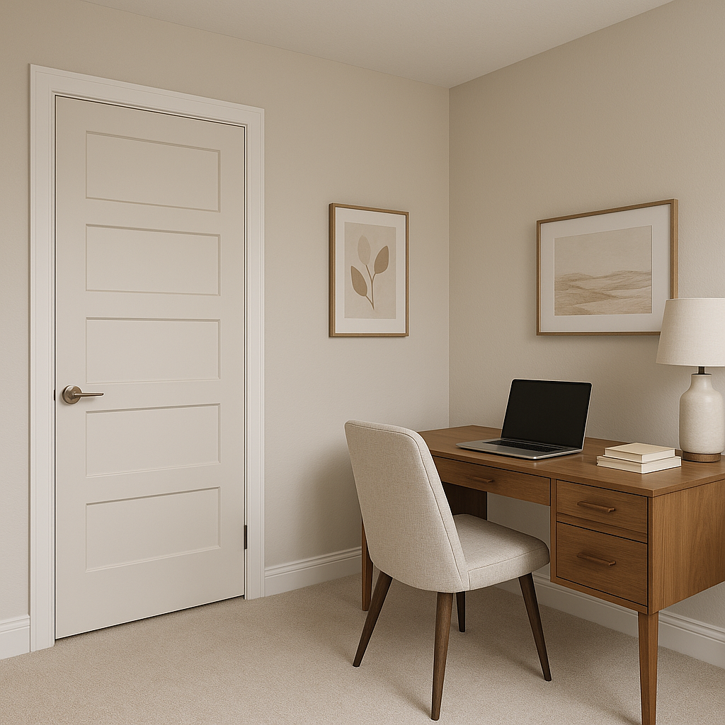
Heron Plume is perfect for hallways and entryways due to its ability to brighten narrow spaces without feeling stark. Use it to welcome guests with understated elegance and pair it with bold wall art or decorative mirrors for added interest.
Lighting plays a crucial role in how Heron Plume appears in your space. In areas with ample natural light, it leans toward a soft warm gray, enhancing its airy quality. In spaces with limited light, its beige undertones become slightly more pronounced, lending warmth and coziness. To maintain its balance, consider using warm white bulbs for artificial lighting to complement its undertones.
Sherwin-Williams Heron Plume is the epitome of timeless versatility, offering a neutral canvas that adapts to a wide range of design styles. Whether your aesthetic leans modern, transitional, or farmhouse chic, this color can seamlessly anchor your space while allowing other elements to shine. From walls to cabinetry, Heron Plume is the perfect choice for creating a home that feels welcoming, sophisticated, and effortlessly polished.
Elevate your interiors with Sherwin-Williams Heron Plume (SW 6070)—the neutral that never goes out of style.
Note: These images were all generated with AI, there may be inaccurate color results. Please only use a general reference to get a rough idea of what a color may look like, we will continue to generate new images to improve accuracy.
View Colors Only by Brand (No Imagery):
Sherwin-Williams
|
Benjamin-Moore
|
Behr
|
Valspar
Live on the Eastern Slope of Colorado and looking for a local painting professional, check out all our painting services and reach out for a free estimate.
Copyright © 2026 : Wild Fox Painting Inc. : 12435 Mead Way, Littleton, CO 80125


