Sherwin-Williams Nuthatch (6088) is a sophisticated and versatile paint color that combines the warmth of earthy tones with a subtle richness. Perfect for interiors that aim to evoke comfort and understated elegance, Nuthatch offers a medium-depth brown that feels grounded yet refined. Its timeless appeal makes it a go-to choice for a variety of design styles, from rustic farmhouse to contemporary chic.
Nuthatch carries warm undertones of red and orange, which imbue the shade with a cozy and inviting vibe. These undertones prevent the brown from feeling too heavy or flat, making it a dynamic and lively neutral. Depending on the lighting in your space, Nuthatch may lean slightly warmer or deeper, giving it a chameleon-like quality that adapts beautifully to natural and artificial light. This flexibility allows it to work seamlessly in spaces with varying light conditions, ensuring it always feels welcoming.
Sherwin-Williams Nuthatch pairs effortlessly with a curated palette of complementary colors, making it a versatile choice for a cohesive design. Consider the following options:
Warm Neutrals: Pair Nuthatch with Sherwin-Williams Creamy (SW 7012) or Believable Buff (SW 6120) for a harmonious and inviting look. These lighter hues balance Nuthatch’s depth and create a soothing atmosphere.
Rich Accents: For a bold and dramatic contrast, combine Nuthatch with Sherwin-Williams Tricorn Black (SW 6258) or Naval (SW 6244). These darker hues add sophistication and create striking focal points.
Earthy Greens: Nuthatch’s warm undertones work beautifully with muted greens like Sherwin-Williams Clary Sage (SW 6178) or Svelte Sage (SW 6164). This pairing evokes a natural, organic feel that is perfect for transitional or rustic aesthetics.
Soft Whites: For a crisp and clean look, pair Nuthatch with Sherwin-Williams Alabaster (SW 7008) or Pure White (SW 7005). These whites provide a fresh contrast to Nuthatch’s richness and brighten the overall space.
Nuthatch is a color that lends itself to versatility, making it suitable for a range of applications throughout your home or commercial space. Here are some thoughtful ways to incorporate this neutral tone:
Transform your living room into a cozy retreat with Nuthatch as the primary wall color. Pair it with a plush area rug, soft cream-colored curtains, and wooden furniture to create a warm, inviting ambiance. Add metallic accents like bronze or gold for a touch of sophistication.
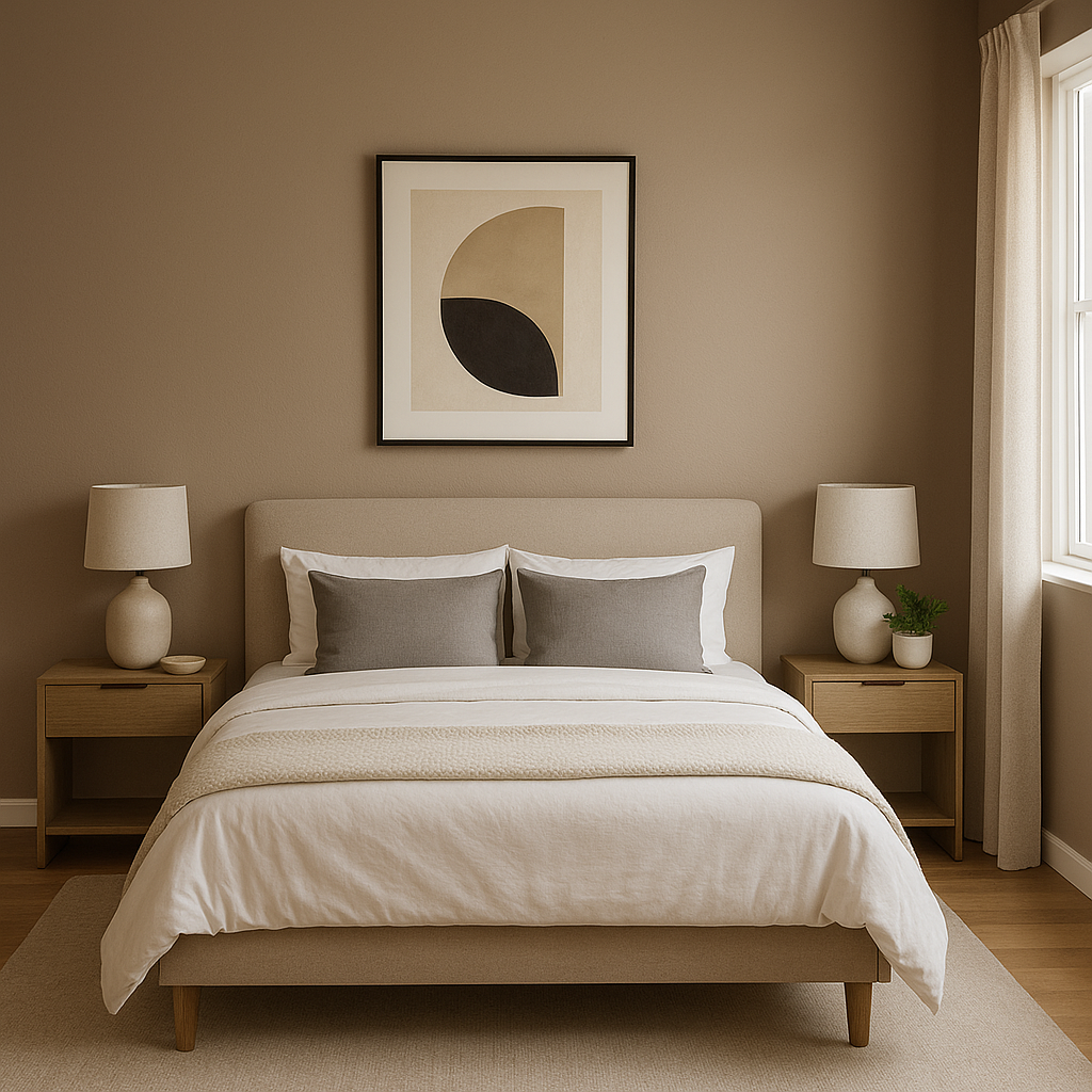
As a mid-tone brown with warm undertones, Nuthatch creates a calming environment ideal for bedrooms. Use it as an accent wall behind your bed or apply it throughout the room for a cocoon-like effect. Pair with soft linens in beige or sage green to enhance the tranquil atmosphere.
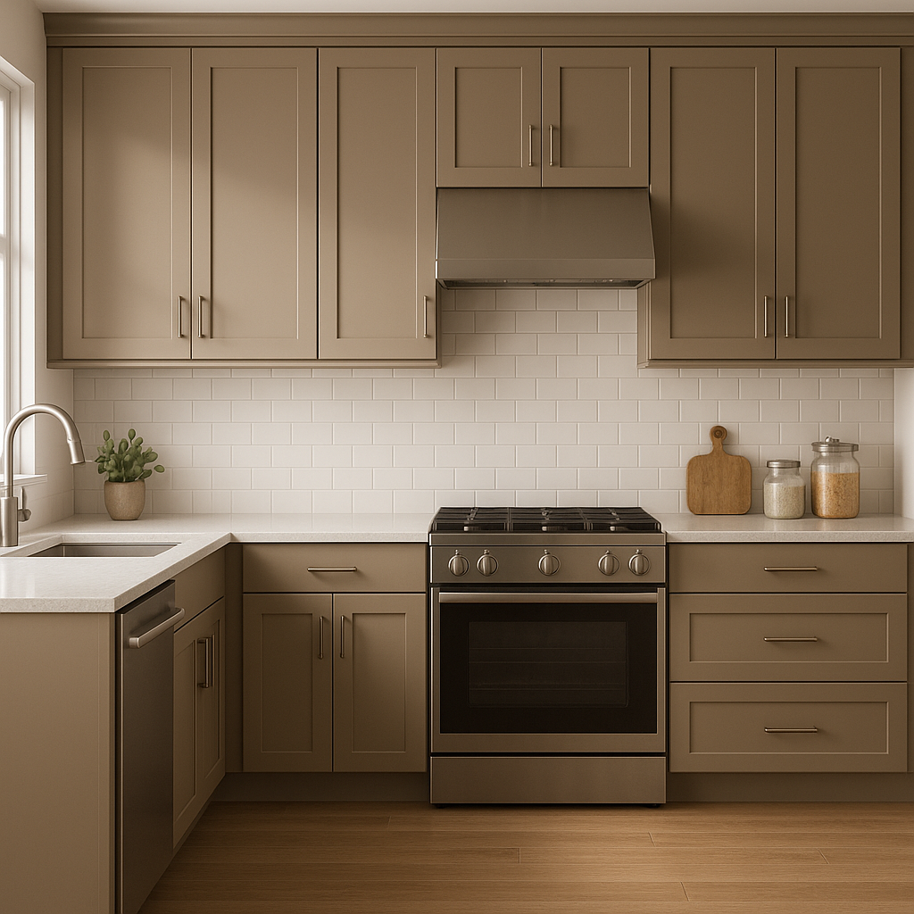
Nuthatch works wonderfully in kitchens or dining rooms, especially when paired with wood cabinetry. It complements natural textures like stone countertops or wooden dining tables, creating a space that feels grounded and welcoming. Add greenery with potted plants or herbs for a pop of freshness.
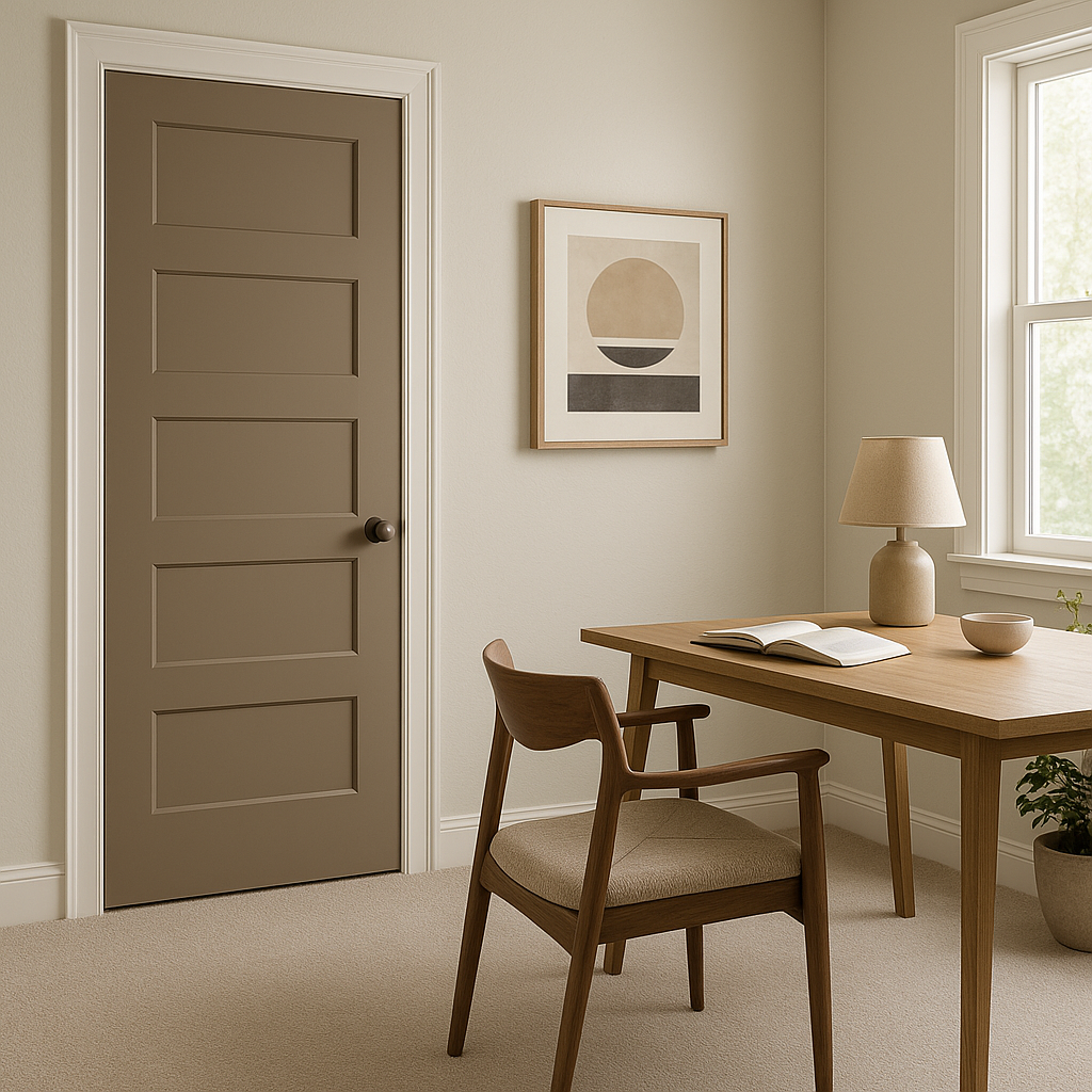
Bring warmth and focus to your work environment with Nuthatch. Its rich, neutral tone fosters concentration while maintaining an inviting atmosphere. Combine it with clean white trim and dark wood furniture for a polished, professional look.
Nuthatch also shines as an exterior color. Use it for siding or trim to create a timeless façade that blends beautifully with natural surroundings. Pair it with darker accents for a modern look or lighter neutrals for a classic appeal.
Sherwin-Williams Nuthatch (6088) is more than just a paint color—it’s a design statement. Its warm undertones, adaptability, and ability to pair effortlessly with a range of coordinating colors make it an exceptional choice for both residential and commercial spaces. Whether you’re looking to create a cozy retreat indoors or enhance curb appeal outdoors, Nuthatch offers the perfect balance of depth, warmth, and sophistication.
Note: These images were all generated with AI, there may be inaccurate color results. Please only use a general reference to get a rough idea of what a color may look like, we will continue to generate new images to improve accuracy.
View Colors Only by Brand (No Imagery):
Sherwin-Williams
|
Benjamin-Moore
|
Behr
|
Valspar
Live on the Eastern Slope of Colorado and looking for a local painting professional, check out all our painting services and reach out for a free estimate.
Copyright © 2026 : Wild Fox Painting Inc. : 12435 Mead Way, Littleton, CO 80125


