Sherwin-Williams Pacer White (6098) is a warm, off-white paint color that exudes understated elegance and versatility. Perfect for those seeking a neutral base that complements a wide variety of design styles, Pacer White offers subtle sophistication with its creamy undertones. Whether you're designing a minimalist retreat, a cozy farmhouse-inspired setting, or a transitional home, this color serves as an adaptable canvas for your creative vision.
Pacer White is distinguished by its gentle beige undertones, giving it a welcoming warmth without feeling overly yellow or golden. These creamy nuances make it an excellent choice for spaces that need a soft, enveloping neutral. Unlike cooler whites that can sometimes feel stark or clinical, Pacer White provides a sense of coziness and depth while maintaining its light and airy appearance.
Its warm undertones strike the perfect balance, making it suitable for both north-facing rooms, where light tends to be cooler, and south-facing spaces, where natural light enhances its inviting warmth. This adaptability ensures Pacer White looks stunning throughout the day, regardless of lighting conditions.
Sherwin-Williams Pacer White pairs beautifully with a range of complementary colors, thanks to its neutral base. Here are some coordinating options to consider:
Accent Colors:
Opt for rich, earthy tones like Sherwin-Williams Urban Bronze (SW 7048) or Sherwin-Williams Iron Ore (SW 7069) for dramatic contrast. These darker hues bring depth and sophistication to spaces where Pacer White serves as the primary wall color.
Complementary Colors:
For a softer palette, combine Pacer White with gentle muted hues like Sherwin-Williams Sea Salt (SW 6204) or Sherwin-Williams Repose Gray (SW 7015). These calming shades create a serene environment ideal for bedrooms, bathrooms, or living rooms.
Trim Colors:
Enhance the subtle elegance of Pacer White with crisp trim options like Sherwin-Williams Pure White (SW 7005) or Sherwin-Williams Extra White (SW 7006). These cooler whites provide a clean, polished finish that frames the walls beautifully.
With its versatility, Pacer White works harmoniously alongside natural wood tones, metallic finishes, and textured materials, making it a favorite among designers for layering textures and finishes.
Sherwin-Williams Pacer White is a workhorse neutral that shines in a variety of applications. Whether you're painting an entire room or using it as part of a broader design scheme, this warm off-white can elevate any space. Here are some ideas for incorporating Pacer White into your home:
Create a welcoming and timeless living area by using Pacer White on walls. Pair it with plush furniture in earthy tones, natural wood accents, and layered textiles for a cozy yet refined feel. Add statement pieces like a bold area rug or a gallery wall to bring personality into the space.
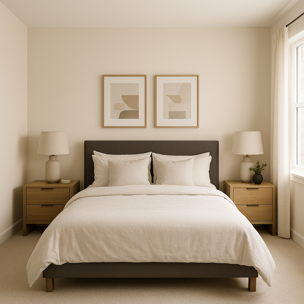
Pacer White is ideal for bedrooms where comfort and relaxation take priority. Its creamy undertones create a serene atmosphere that pairs beautifully with soft bedding in pastel or neutral shades. Incorporate warm woods or brass accents for a modern yet inviting touch.
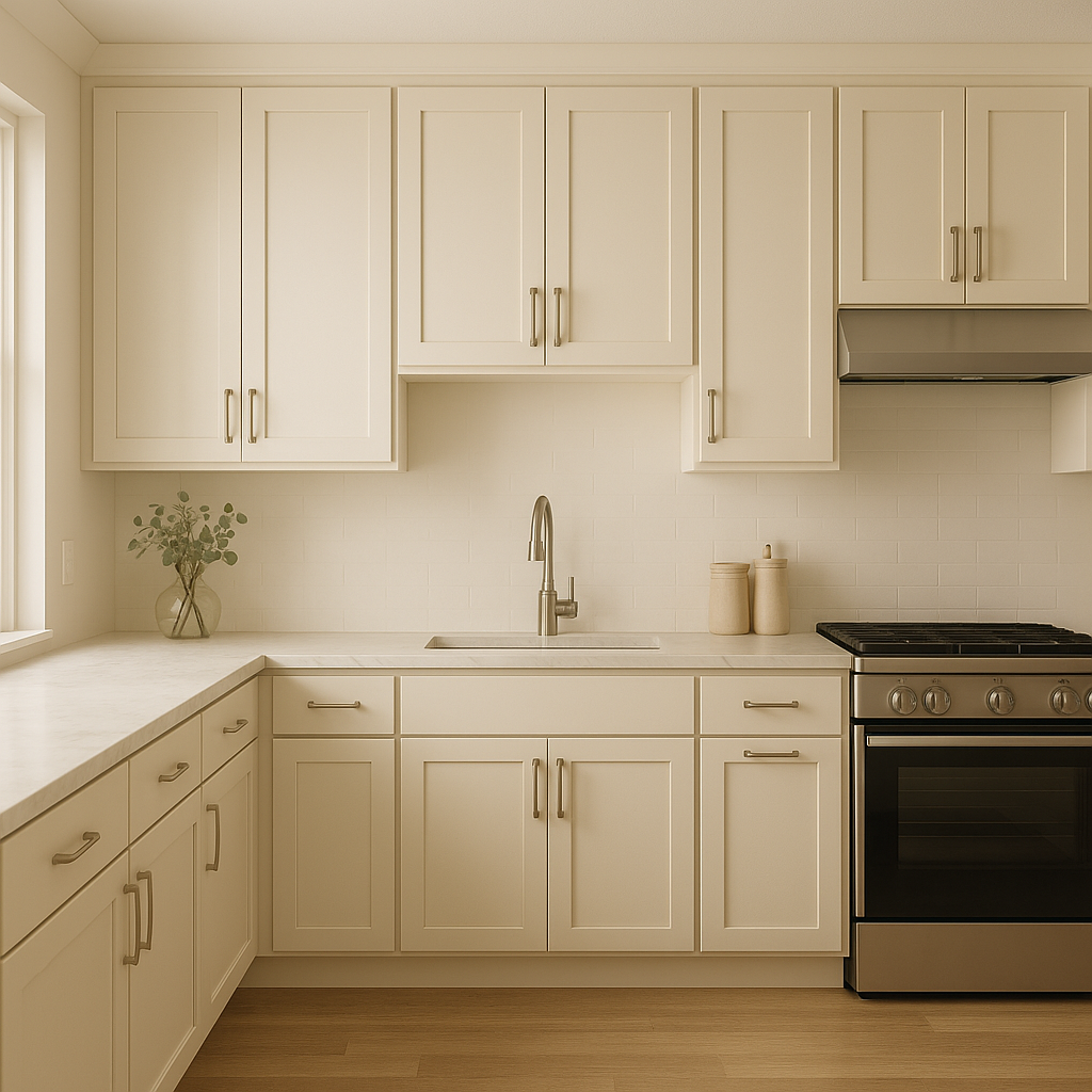
In kitchens, Pacer White offers a clean, fresh look without appearing stark. Use it on cabinetry for a timeless aesthetic, or paint the walls and pair with subway tiles, quartz countertops, and stainless steel appliances for a classic-meets-contemporary design.
Transform your bathroom into a spa-like retreat by using Pacer White on walls or trim. Complement it with cool blues, soft greens, or even charcoal accents for a calming yet chic palette.
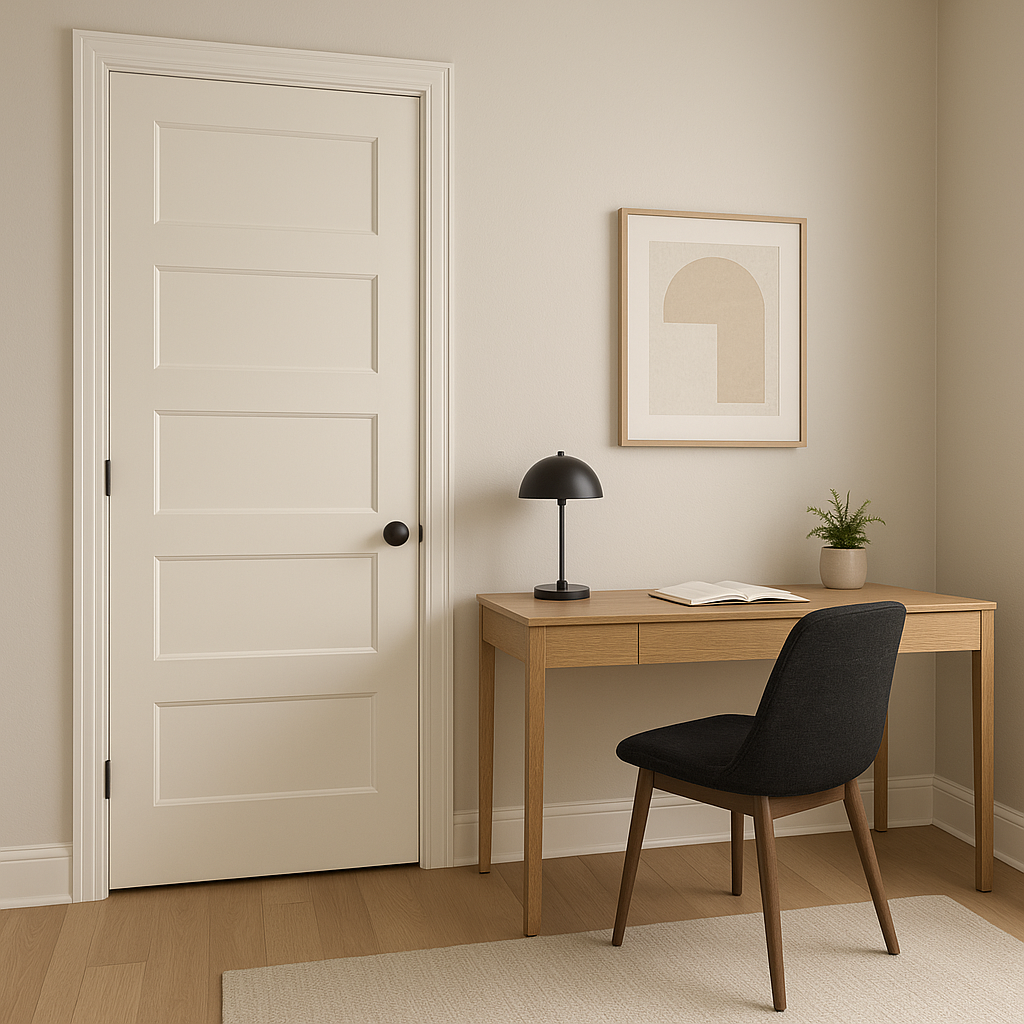
Pacer White's understated charm makes it perfect for high-traffic areas such as hallways and entryways. Its warm undertones ensure the space feels inviting, while its lightness helps brighten narrow or enclosed spaces.
Sherwin-Williams Pacer White is more than just a paint color—it's a design tool that brings elegance, warmth, and adaptability to any space. Whether you're refreshing a single room or redesigning your entire home, this off-white hue offers the perfect balance of softness and sophistication. Its ability to harmonize with a variety of palettes and styles ensures that it will remain a timeless choice for years to come.
Note: These images were all generated with AI, there may be inaccurate color results. Please only use a general reference to get a rough idea of what a color may look like, we will continue to generate new images to improve accuracy.
View Colors Only by Brand (No Imagery):
Sherwin-Williams
|
Benjamin-Moore
|
Behr
|
Valspar
Live on the Eastern Slope of Colorado and looking for a local painting professional, check out all our painting services and reach out for a free estimate.
Copyright © 2026 : Wild Fox Painting Inc. : 12435 Mead Way, Littleton, CO 80125


