Sherwin-Williams Sands of Time (SW 6101) is a timeless and versatile paint color that effortlessly blends warmth, elegance, and subtle sophistication. With its earthy beige base and gentle undertones, this shade is a go-to choice for creating spaces that feel cozy, grounded, and inviting. Whether you’re designing a serene living room, a tranquil bedroom, or a welcoming entryway, Sands of Time offers the perfect backdrop to complement a wide range of design aesthetics.
Sands of Time (SW 6101) carries soft peachy-beige undertones that infuse it with warmth without feeling overly yellow or orange. These undertones give the color a sense of depth and richness, making it an excellent choice for spaces that need a touch of warmth and character. The subtle peach notes lend a sunny, uplifting quality to the shade, especially when paired with natural light, while maintaining its neutral essence.
Because of its balanced warmth, Sands of Time works beautifully in a variety of lighting conditions. In rooms with abundant natural light, the color appears warm and radiant, while in spaces with lower light, it offers a soft, cozy glow that never feels too heavy or dull.
Sands of Time is a highly adaptable neutral that pairs effortlessly with a range of coordinating colors, allowing you to create harmonious and stylish palettes. Here are some recommendations to inspire your design choices:
Accent Colors: To create a vibrant and lively space, consider pairing Sands of Time with rich accents like Sherwin-Williams Naval (SW 6244), a bold navy blue, or Ravishing Coral (SW 6612), a cheerful coral shade. These pops of color add depth and energy without overwhelming the space.
Complementary Neutrals: For a monochromatic or tone-on-tone look, combine Sands of Time with other warm neutrals such as Sherwin-Williams Wool Skein (SW 6148) or Macadamia (SW 6142). These hues create a seamless, layered effect that enhances the overall sophistication of the design.
Cool Contrast: If you’re aiming for balance, pair Sands of Time with cooler tones like Rainwashed (SW 6211), a soft blue-green, or Silver Strand (SW 7057), a muted gray. This contrast helps create a serene, modern aesthetic that feels fresh and inviting.
Trim and Ceiling Colors: For trims and ceilings, opt for crisp whites like Sherwin-Williams Extra White (SW 7006) or Alabaster (SW 7008) to highlight Sands of Time’s warmth and provide clean, defined edges.
The versatility of Sands of Time makes it suitable for various spaces and design styles. This shade is particularly effective in the following areas:
Living Rooms: Create a warm, welcoming atmosphere in your living room by using Sands of Time as the main wall color. Its neutral warmth acts as an ideal canvas for layering textures, patterns, and accent pieces like throw pillows or rugs.
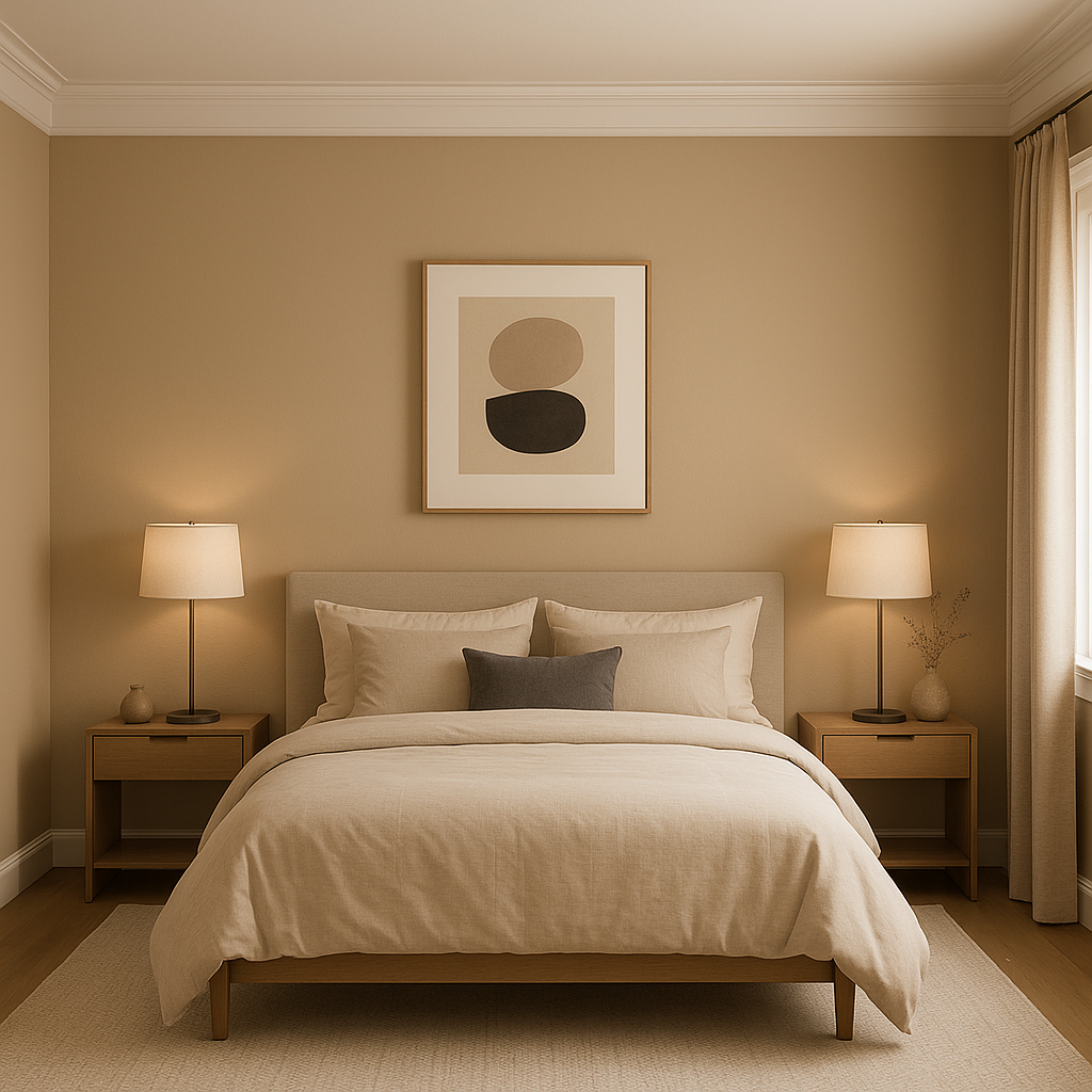
Bedrooms: For a cozy and restful bedroom, Sands of Time’s soft warmth offers a soothing environment. Pair it with plush bedding in soft whites or muted pastels for a serene retreat.
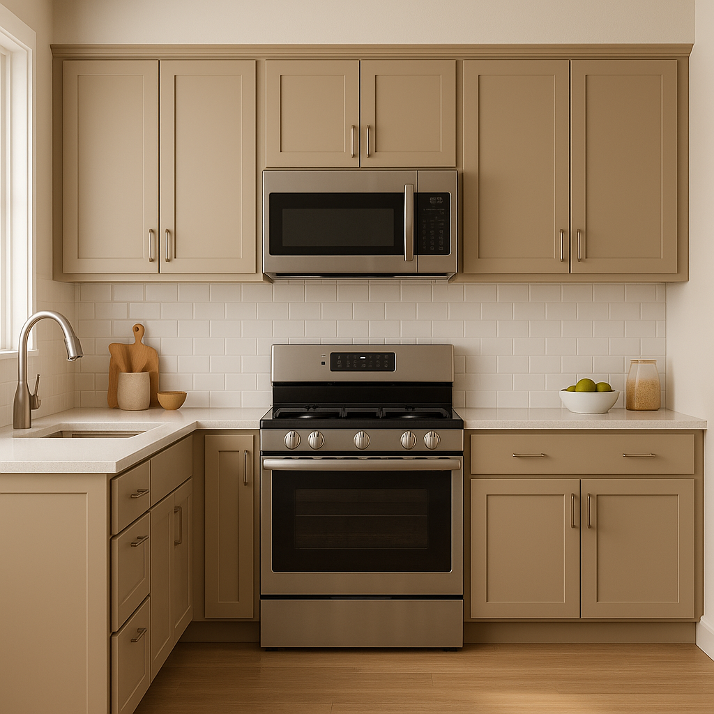
Kitchens and Dining Areas: Sands of Time works beautifully in kitchens and dining spaces, especially when paired with natural wood tones, warm metallic finishes like brushed gold, and creamy white cabinetry.
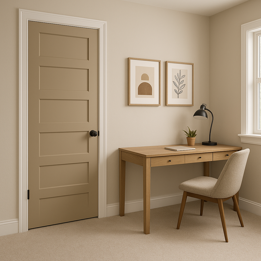
Hallways and Entryways: Make a lasting first impression in your entryway or hallway by using Sands of Time to create a sense of continuity and warmth. It’s a great choice for connecting spaces throughout your home.
Bathrooms: When paired with soft blues or greens, Sands of Time transforms bathrooms into spa-like sanctuaries. Add natural stone or marble accents for a touch of luxury.
Sands of Time (SW 6101) is more than just a neutral; it’s a warm, approachable hue that invites comfort and versatility into any space. Its earthy undertones and compatibility with a variety of color palettes make it a design staple for homeowners and designers alike. Whether you’re refreshing a single room or redesigning your entire home, Sands of Time offers the perfect balance of warmth and neutrality to bring your vision to life.
Note: These images were all generated with AI, there may be inaccurate color results. Please only use a general reference to get a rough idea of what a color may look like, we will continue to generate new images to improve accuracy.
View Colors Only by Brand (No Imagery):
Sherwin-Williams
|
Benjamin-Moore
|
Behr
|
Valspar
Live on the Eastern Slope of Colorado and looking for a local painting professional, check out all our painting services and reach out for a free estimate.
Copyright © 2026 : Wild Fox Painting Inc. : 12435 Mead Way, Littleton, CO 80125


