Sherwin-Williams Portabello (SW 6102) is a sophisticated neutral that combines warm, earthy undertones with a classic appeal, making it a versatile choice for a variety of interior spaces. Its balanced mix of brown and gray gives it a taupe-like quality that can create a grounding yet inviting atmosphere in any room. Whether you're designing a cozy living space or a serene bedroom retreat, Portabello is a color that exudes comfort and understated elegance.
Portabello features subtle undertones of gray and beige, giving it a greige-like complexity. This harmonious blend allows it to adapt beautifully to both warm and cool lighting conditions. In spaces with natural light, Portabello may lean more toward its beige side, showcasing its warmer qualities. In dimmer, cooler lighting, the gray undertones become more prominent, offering a calming and contemporary vibe. This dual nature makes Portabello ideal for transitional spaces and designs that bridge modern and traditional aesthetics.
Sherwin-Williams Portabello pairs seamlessly with a wide range of colors, allowing for effortless coordination and layered designs. Here are some suggestions for complementary hues:
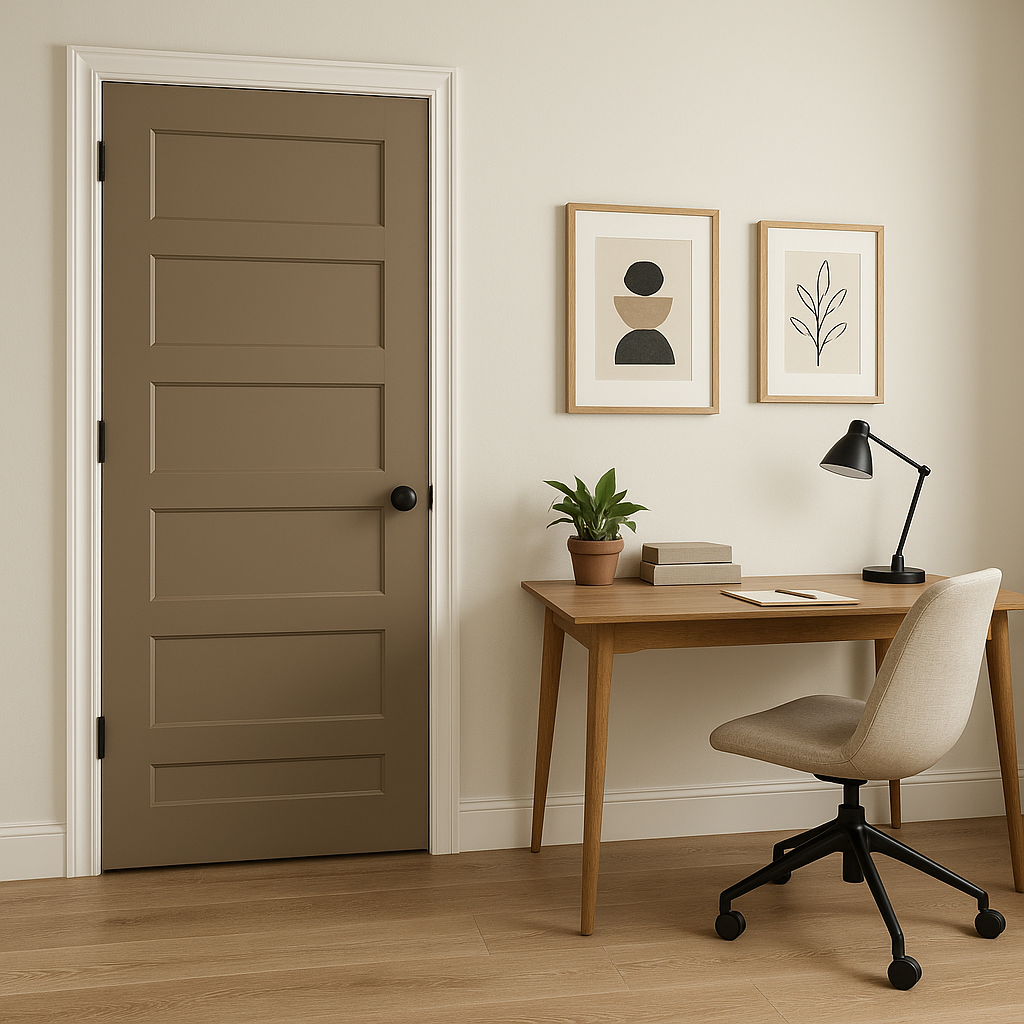
Portabello is a versatile shade that lends itself well to a variety of design styles and applications. Its balanced neutrality makes it equally suited for walls, cabinetry, accent pieces, or even exterior spaces.
Portabello creates a warm and inviting atmosphere, perfect for gathering areas. Pair it with soft textures like linen or velvet upholstery, and layer with accent colors in throw pillows or rugs to complete the look.
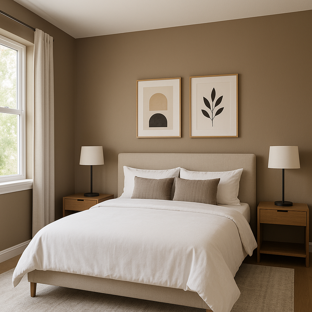
For a serene retreat, use Portabello on the walls and coordinate it with crisp white bedding and muted blue or green accents. Its calming undertones encourage relaxation while maintaining a sophisticated aesthetic.
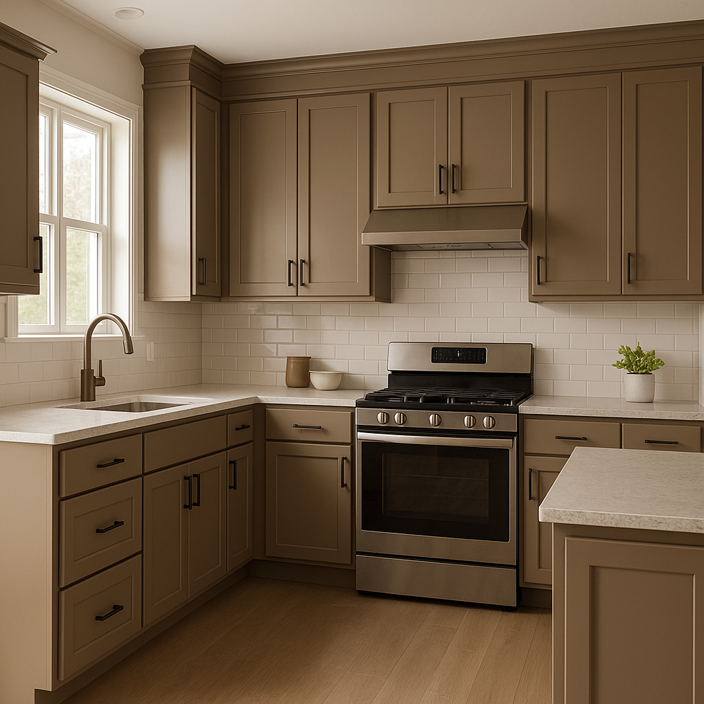
Portabello is a chic choice for kitchen cabinetry, especially when paired with white subway tiles or marble countertops. In bathrooms, it works beautifully as a wall color, adding depth and warmth to the space.
Portabello’s earthy nature translates well to exterior spaces, such as siding or shutters. Pair it with white trim for a classic look or with darker colors like charcoal for a modern twist.
Portabello is a timeless neutral that adapts to a wide variety of styles, from modern farmhouse to urban contemporary. It’s a color that can act as a backdrop or take center stage, depending on how it's styled. Its ability to shift between warm and cool tones makes it a reliable choice for creating cohesive and balanced interiors.
Whether you're refreshing a single room or designing an entire home, Sherwin-Williams Portabello (SW 6102) offers the versatility, depth, and elegance needed to bring your vision to life.
Note: These images were all generated with AI, there may be inaccurate color results. Please only use a general reference to get a rough idea of what a color may look like, we will continue to generate new images to improve accuracy.
View Colors Only by Brand (No Imagery):
Sherwin-Williams
|
Benjamin-Moore
|
Behr
|
Valspar
Live on the Eastern Slope of Colorado and looking for a local painting professional, check out all our painting services and reach out for a free estimate.
Copyright © 2026 : Wild Fox Painting Inc. : 12435 Mead Way, Littleton, CO 80125


