Sherwin-Williams Kaffee SW 6104 is a rich and inviting shade of brown that brings a sense of cozy sophistication to any space. This earthy, medium-toned color is the perfect blend of warmth and depth, making it an excellent choice for both modern and traditional interiors. Its natural elegance and versatility allow it to seamlessly complement a variety of design styles, from rustic farmhouse to sleek contemporary.
Kaffee SW 6104 carries subtle red and orange undertones, which create its warm and welcoming character. These undertones give the color a slightly toasty feel, reminiscent of freshly brewed coffee or warm cocoa. Unlike cooler browns with gray or taupe influences, Kaffee’s undertones add a sense of comfort and liveliness to a space, making it ideal for creating intimate and inviting environments.
To enhance the beauty of Kaffee SW 6104, pair it with coordinating colors that balance its warmth and richness. Here are some excellent options:
These combinations allow you to create a balanced and layered color palette that feels both grounded and visually interesting.
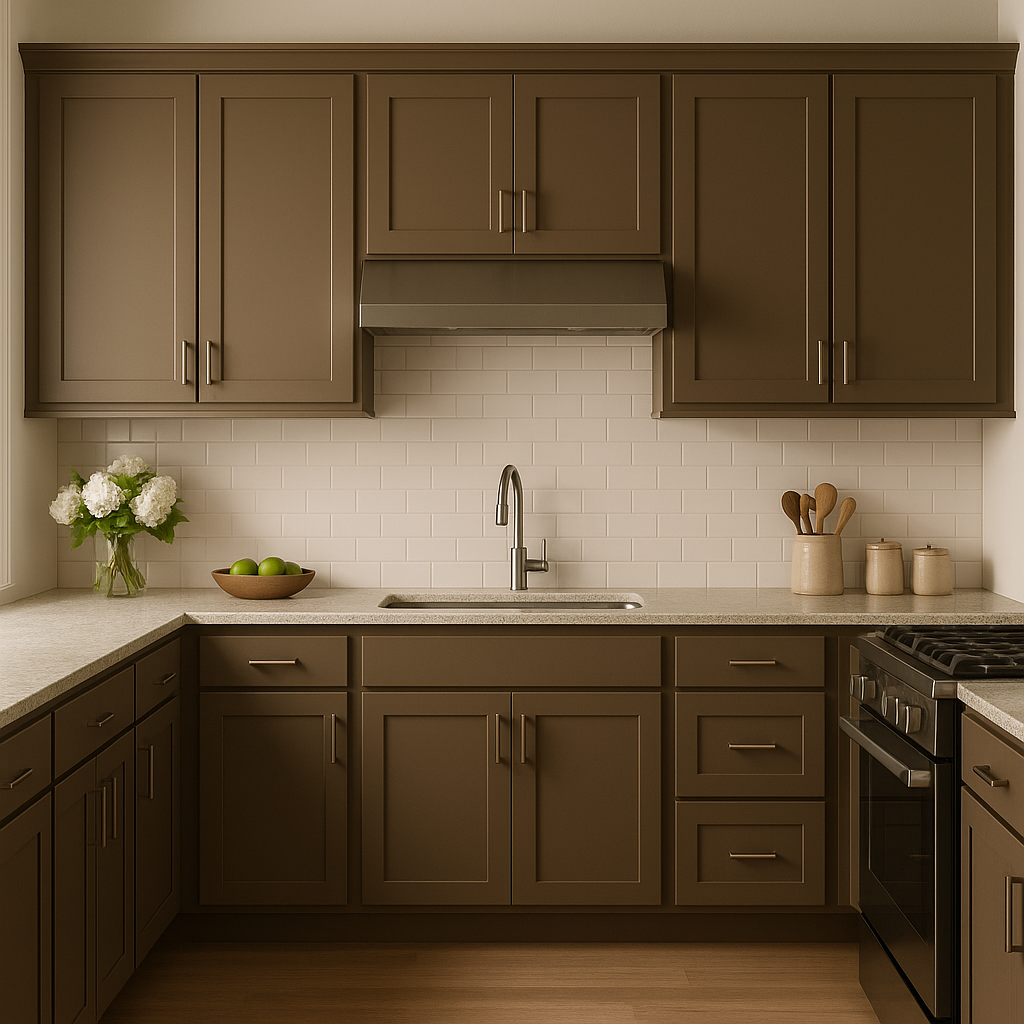
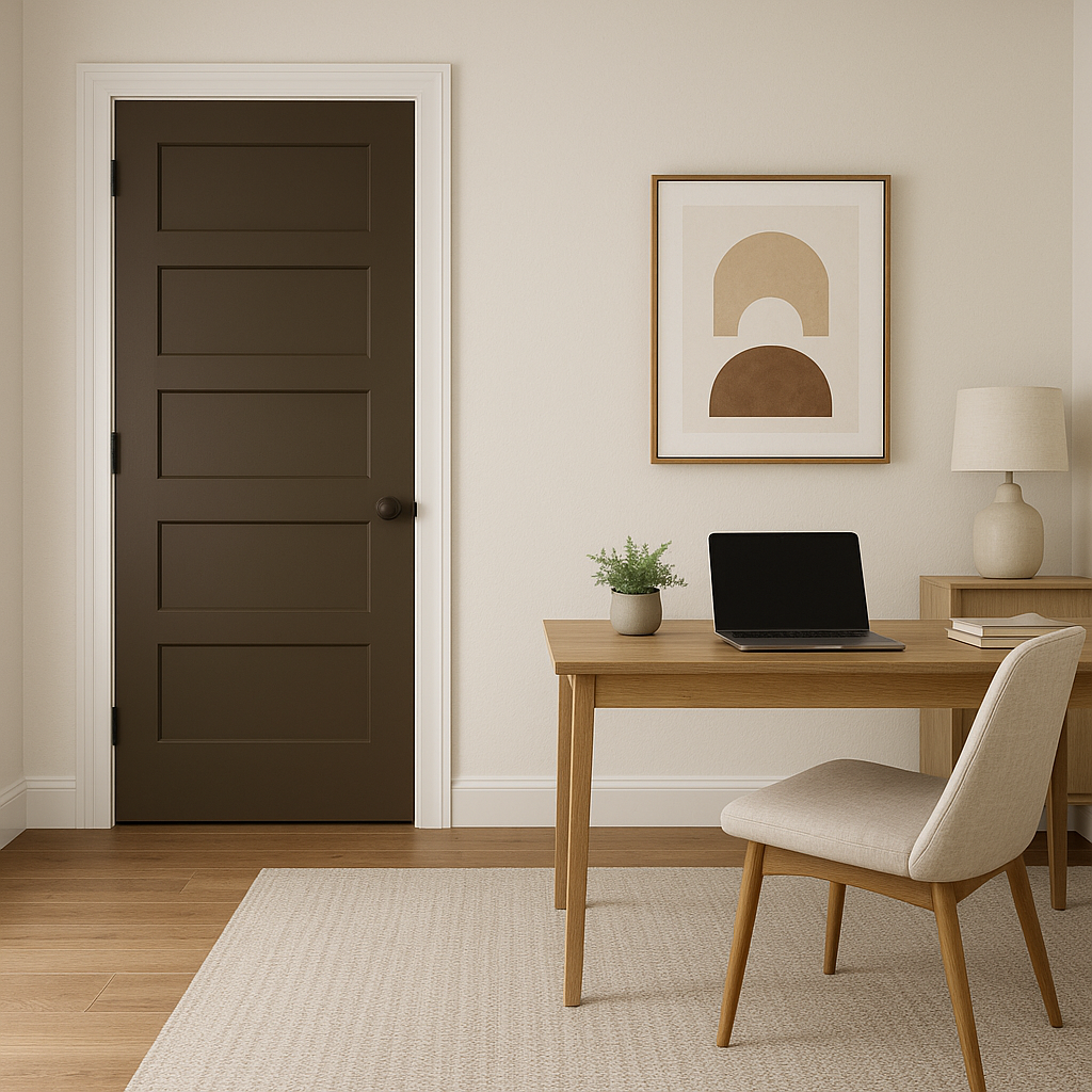
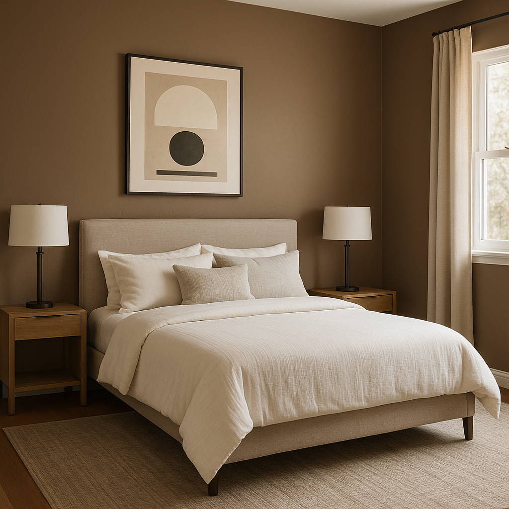
Kaffee’s warmth and versatility make it an excellent choice for a variety of applications. Here are some suggestions for where and how to use this color:
Sherwin-Williams Kaffee SW 6104 is more than just a neutral brown—it’s a color that adds sophistication, warmth, and timeless appeal to any space. Its subtle undertones and versatility make it easy to pair with a variety of colors and textures, ensuring your design feels cohesive and stylish. Whether you’re creating a cozy living area, a refined dining room, or an inviting bedroom, Kaffee brings an element of grounded elegance that’s hard to beat.
Note: These images were all generated with AI, there may be inaccurate color results. Please only use a general reference to get a rough idea of what a color may look like, we will continue to generate new images to improve accuracy.
View Colors Only by Brand (No Imagery):
Sherwin-Williams
|
Benjamin-Moore
|
Behr
|
Valspar
Live on the Eastern Slope of Colorado and looking for a local painting professional, check out all our painting services and reach out for a free estimate.
Copyright © 2026 : Wild Fox Painting Inc. : 12435 Mead Way, Littleton, CO 80125


