Sherwin-Williams Hopsack SW 6109 is a warm, earthy neutral that strikes the perfect balance between sophistication and approachability. This versatile color exudes a grounded, natural vibe that makes it a popular choice for creating cozy yet polished interiors. Its medium tan hue with subtle undertones allows it to adapt beautifully to a variety of design styles, from rustic farmhouse to modern minimalism.
Hopsack is a well-balanced neutral with warm undertones of beige and subtle hints of taupe. These undertones lend the color its inviting warmth without veering into yellow or orange territory. This makes it an excellent choice for spaces where you want to achieve a sense of coziness without overwhelming the room with too much color. The taupe-like undertones also give it a grounding effect, making it a reliable backdrop for both cool and warm accent hues.
To maximize the beauty of Hopsack, it’s essential to pair it with complementary colors that enhance its warmth and balance. Here are some expert recommendations for coordinating colors:
Sherwin-Williams Shoji White SW 7042
A soft, creamy off-white with subtle gray undertones, Shoji White creates a clean and airy contrast when paired with Hopsack. Use it for trim, ceilings, or adjoining rooms to maintain a cohesive flow.
Sherwin-Williams Prairie Grass SW 7546
This muted green with earthy undertones harmonizes beautifully with Hopsack, creating a grounded, nature-inspired palette. Perfect for accent walls, cabinetry, or furniture.
Sherwin-Williams Urbane Bronze SW 7048
A rich, dark bronze-gray, Urbane Bronze adds depth and drama to spaces featuring Hopsack. Use it sparingly for accents like doors, window frames, or statement furniture pieces.
Sherwin-Williams Aesthetic White SW 7035
For a lighter, more monochromatic look, pair Hopsack with Aesthetic White. Its soft, greige tones blend seamlessly with Hopsack, creating a serene and inviting space.
Hopsack’s adaptability makes it a go-to choice for almost any room in the home. Here are some ideas for incorporating this timeless neutral into your interior design:
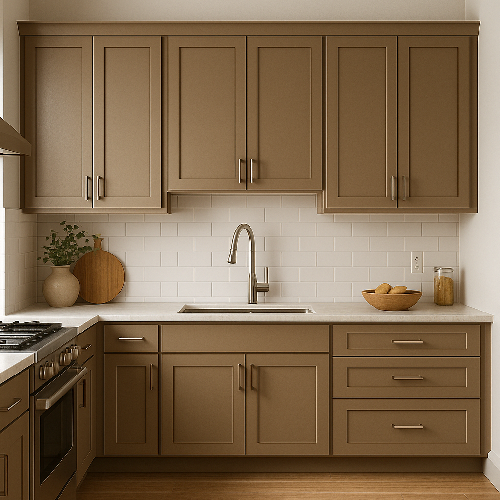
Living Rooms
Hopsack provides the perfect backdrop for a cozy, inviting living space. Pair it with natural wood furniture, soft textiles, and warm metallic accents like brass or copper to create a welcoming atmosphere.
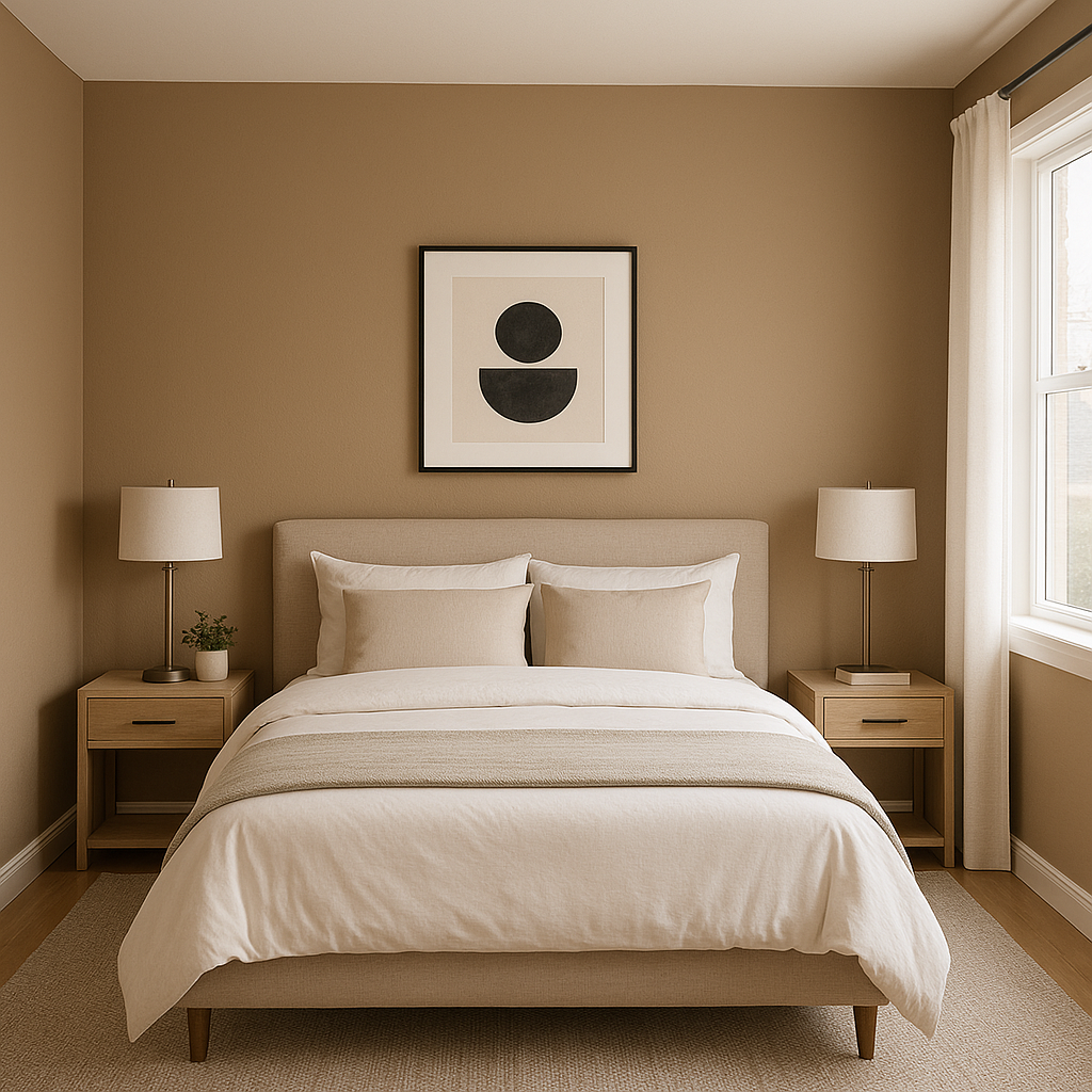
Bedrooms
This warm neutral creates a sense of calm and relaxation, making it ideal for bedrooms. Combine it with soft whites, muted greens, or deep blues for a soothing retreat.
Dining Rooms
Add a touch of understated elegance to your dining room with Hopsack. Pair it with rich wood tones and textured fabrics for a sophisticated yet approachable space.
Offices
Hopsack’s grounded quality makes it an excellent choice for home offices. It encourages focus and productivity while maintaining a warm, comfortable ambiance.
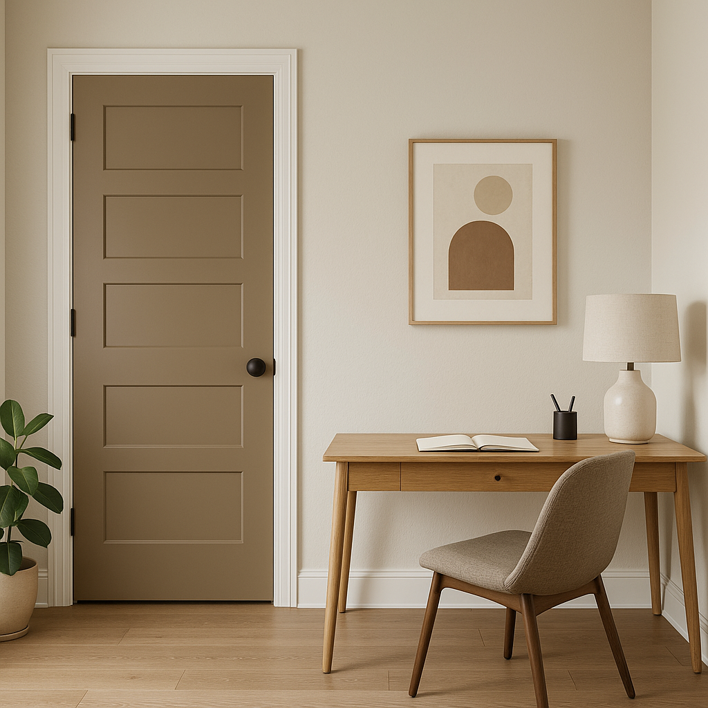
Hallways and Entryways
Hopsack works beautifully in transitional spaces, offering a warm welcome to guests and creating a sense of flow throughout your home.
As with any paint color, Hopsack SW 6109 will appear differently depending on the lighting. In natural light, its beige undertones take center stage, giving it a soft, warm glow. Under artificial lighting, its taupe undertones may become more pronounced, adding depth and richness. Test the color in your space with swatches to ensure it complements your lighting conditions.
Note: These images were all generated with AI, there may be inaccurate color results. Please only use a general reference to get a rough idea of what a color may look like, we will continue to generate new images to improve accuracy.
View Colors Only by Brand (No Imagery):
Sherwin-Williams
|
Benjamin-Moore
|
Behr
|
Valspar
Live on the Eastern Slope of Colorado and looking for a local painting professional, check out all our painting services and reach out for a free estimate.
Copyright © 2026 : Wild Fox Painting Inc. : 12435 Mead Way, Littleton, CO 80125


