Sherwin-Williams Netsuke SW 6134 is a versatile and inviting neutral paint color that strikes a perfect balance between warmth and sophistication. With its soft beige appearance, this hue brings a sense of understated elegance to interiors and exteriors alike, making it a go-to choice for homeowners and designers seeking a harmonious foundation for their spaces.
Netsuke’s undertones lean towards a subtle blend of creamy beige and muted taupe, giving it a warm yet grounded feel. Its undertones are neither overly yellow nor overly gray, making it a neutral that feels balanced and adaptable in various lighting conditions. In natural sunlight, Netsuke reveals its warm, creamy side, while under artificial lighting, it transitions into a more subdued, cozy taupe. This chameleon-like quality ensures the color remains timeless and versatile.
Netsuke pairs beautifully with a variety of colors, making it an ideal choice for cohesive palettes. Whether you’re designing a monochromatic look or layering complementary hues, these shades work seamlessly with Netsuke:
These combinations allow for endless creativity, whether you’re going for a minimalist, modern aesthetic or a cozy, traditional vibe.
Netsuke SW 6134 shines in a variety of applications, making it a versatile choice for any room or exterior setting. Below are some popular ways to incorporate this stunning neutral:
Netsuke’s warm undertones create a welcoming atmosphere in gathering spaces. Pair it with soft textiles and natural materials like wood or linen for a cozy, inviting feel.
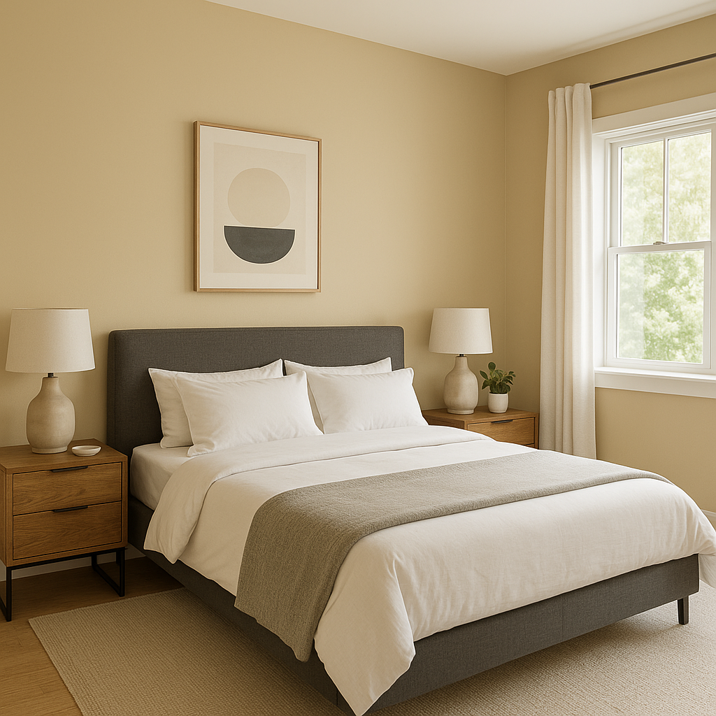
This serene hue works beautifully in bedrooms where relaxation is key. Layer it with soft white bedding and muted accent colors for a tranquil retreat.
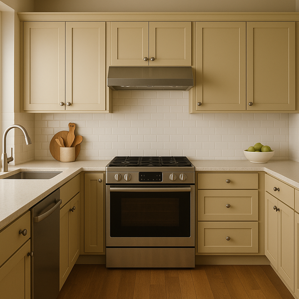
Netsuke’s neutrality makes it an excellent option for kitchens and dining areas. It pairs well with both light and dark cabinetry, offering a perfect backdrop for vibrant decor accents or metallic finishes.
Use Netsuke to create a spa-like ambiance in bathrooms. Coordinate it with white or cream tiles and subtle metallic fixtures for a clean, polished look.
On exteriors, Netsuke delivers a warm and approachable curb appeal. Pair it with darker trim colors like Urbane Bronze or Pure White for a timeless and sophisticated look.
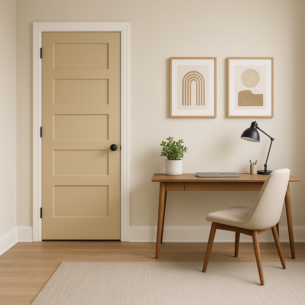
Netsuke’s calming and neutral qualities make it an excellent choice for home offices. It promotes focus and creativity without feeling overwhelming.
As with most neutrals, lighting plays a significant role in how Netsuke SW 6134 appears in your space. In rooms with ample natural light, the color feels airy and warm, while in darker spaces, its taupe undertones become more pronounced. To ensure it’s the right fit for your environment, test it using swatches or sample paint in different areas of your home.
Sherwin-Williams Netsuke SW 6134 is a masterfully balanced neutral that offers flexibility,
Note: These images were all generated with AI, there may be inaccurate color results. Please only use a general reference to get a rough idea of what a color may look like, we will continue to generate new images to improve accuracy.
View Colors Only by Brand (No Imagery):
Sherwin-Williams
|
Benjamin-Moore
|
Behr
|
Valspar
Live on the Eastern Slope of Colorado and looking for a local painting professional, check out all our painting services and reach out for a free estimate.
Copyright © 2026 : Wild Fox Painting Inc. : 12435 Mead Way, Littleton, CO 80125


