Sherwin-Williams Ecru (SW 6135) is a versatile and elegant neutral that effortlessly elevates interiors with its warm, earthy charm. This sophisticated hue belongs to the beige family but carries subtle undertones that make it a unique and timeless choice for a wide range of design styles. Whether you're looking to create a cozy retreat, a refined living room, or a harmonious backdrop for bold decor, Ecru provides the perfect balance of warmth and neutrality.
Ecru features soft golden and creamy undertones, which give it a warm, inviting character. These undertones prevent the color from feeling flat or stark, making it an excellent choice for spaces that need a touch of warmth without veering into overly yellow or orange territory. Its muted nature ensures it works beautifully in both natural and artificial lighting, subtly adapting to the light conditions throughout the day.
Because of its golden undertones, Ecru pairs well with other warm shades while maintaining a sense of balance and sophistication. However, it also has the versatility to complement cool tones, depending on the pairing.
Sherwin-Williams Ecru is part of the Living Well - Recharge palette, making it a natural choice for spaces meant to inspire relaxation and rejuvenation. Here are a few coordinating colors to consider:
Sherwin-Williams Ecru is a versatile paint option that can be used across a variety of spaces and design styles. Here are some ideas for incorporating this timeless neutral into your home or office:
Ecru works beautifully as a primary wall color in living rooms, creating a warm and inviting atmosphere. Pair it with soft beige furniture, wooden accents, and cozy textiles for a classic look, or introduce metallic finishes and bold artwork for a modern twist.
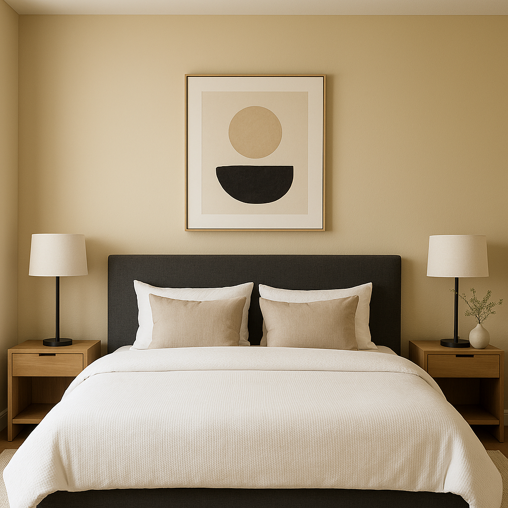
The soothing warmth of Ecru makes it an ideal choice for bedrooms. Use it as a backdrop for crisp white bedding and natural textures like linen or jute to create a tranquil retreat. For added depth, incorporate a darker accent wall in Latte or Navy.
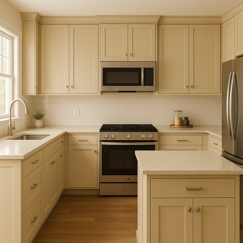
Ecru pairs wonderfully with wooden cabinetry or marble countertops, making it a great option for kitchens. In dining rooms, it sets the stage for elegant meals when combined with warm lighting and gold or brass accents.
Transform your bathroom into a spa-like sanctuary by using Ecru on the walls or cabinetry. Pair it with Rainwashed or Silver Strand for a refreshing, coastal-inspired palette, or with Casa Blanca for a clean and timeless look.
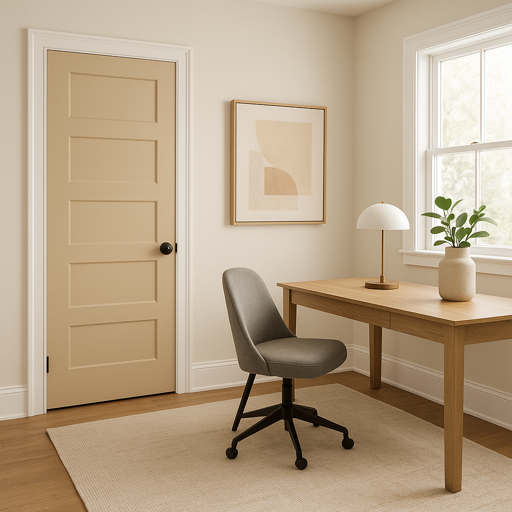
Ecru’s understated elegance makes it a great choice for home offices or study areas. Combine it with Tricorn Black furniture for a chic, professional vibe, or softer tones like Accessible Beige for a calming work environment.
Ecru can also be used on exterior walls to achieve a classic and welcoming facade. Pair it with white trim for a crisp, traditional look, or with deep brown accents for a rustic aesthetic.
Sherwin-Williams Ecru is more than just a neutral—it’s a versatile canvas that invites creativity while fostering warmth and sophistication. Its subtle golden undertones make it adaptable to various lighting conditions and color schemes, ensuring it complements both contemporary and traditional designs. Whether used as a main color or a complementary shade, Ecru’s timeless appeal makes it a go-to choice for homeowners and designers alike.
Transform your space with Sherwin-Williams Ecru and experience the beauty of understated elegance that never goes out of style.
Note: These images were all generated with AI, there may be inaccurate color results. Please only use a general reference to get a rough idea of what a color may look like, we will continue to generate new images to improve accuracy.
View Colors Only by Brand (No Imagery):
Sherwin-Williams
|
Benjamin-Moore
|
Behr
|
Valspar
Live on the Eastern Slope of Colorado and looking for a local painting professional, check out all our painting services and reach out for a free estimate.
Copyright © 2026 : Wild Fox Painting Inc. : 12435 Mead Way, Littleton, CO 80125


