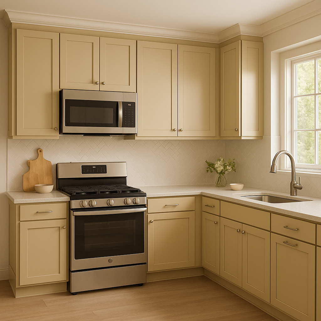
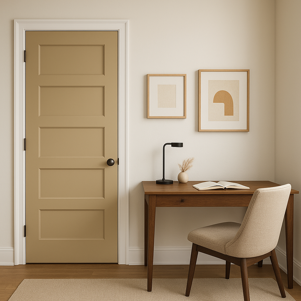
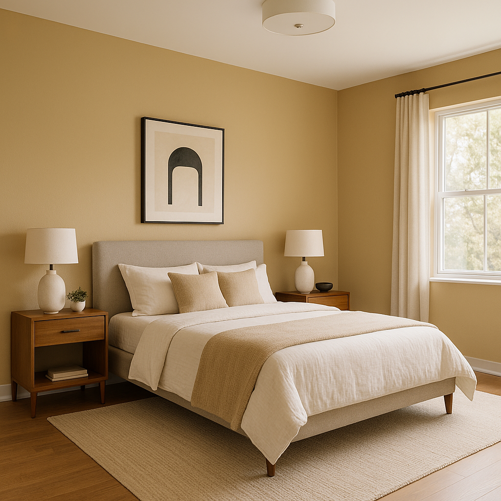
Sherwin-Williams Harmonic Tan (SW 6136) is a warm and versatile paint color that effortlessly blends sophistication with comfort. This medium-light beige hue is an excellent choice for creating inviting interiors that radiate a sense of balance and harmony. Whether you're designing a cozy living space or a serene bedroom retreat, Harmonic Tan provides a neutral foundation that complements a variety of styles and aesthetics.
Harmonic Tan has subtle golden undertones that bring warmth to the color. These undertones prevent it from feeling too stark or cool, making it a great option for spaces that you want to feel welcoming and grounded. The golden notes in this tan shade allow it to pair beautifully with both earthy palettes and brighter accents, ensuring it works well throughout different rooms and lighting conditions.
If your space receives ample natural light, Harmonic Tan may appear slightly brighter and more golden. In lower light conditions, the color deepens and leans toward a richer beige. Its dynamic undertones make it an adaptable choice for homes with varied lighting environments.
Sherwin-Williams Harmonic Tan is highly versatile and pairs beautifully with a wide range of complementary colors. Here are some coordinating suggestions to help you create a cohesive palette:
Trim Colors
For a crisp, clean contrast, pair Harmonic Tan with classic whites like Sherwin-Williams Pure White (SW 7005) or Extra White (SW 7006) for trim, crown molding, and ceilings. This combination adds a fresh and polished finish to any room.
Neutral Accents
To maintain a soft, monochromatic look, pair Harmonic Tan with deeper neutrals such as Sherwin-Williams Warm Stone (SW 7032) or Accessible Beige (SW 7036). These complementary shades enhance the warmth of Harmonic Tan without stealing the spotlight.
Bold Accents
If you're looking to introduce pops of color, Harmonic Tan works well with rich greens like Sherwin-Williams Rosemary (SW 6187) or muted blues such as Rainwashed (SW 6211). These hues add personality to your space while maintaining a sense of tranquility.
Earthy Tones
For a natural and organic feel, consider pairing Harmonic Tan with deep browns like Sherwin-Williams Turkish Coffee (SW 6076) or soft terracottas such as Cavern Clay (SW 7701). These earthy tones create a grounded and cohesive look that feels timeless.
Harmonic Tan’s versatility makes it suitable for a wide range of applications throughout your home. Here are some ideas for where this shade shines:
Living Rooms
Use Harmonic Tan as the primary wall color to create a warm and inviting atmosphere. Pair it with plush textiles and natural wood furniture for a cozy yet elegant look.
Bedrooms
Its soothing golden undertones make Harmonic Tan an excellent choice for bedrooms. Combine it with soft linens and muted accent colors to craft a peaceful retreat that encourages relaxation.
Dining Rooms
Elevate your dining space by using Harmonic Tan on the walls, complemented by darker wood furniture and metallic accents for a sophisticated yet approachable ambiance.
Hallways and Entryways
Harmonic Tan’s neutral character works beautifully in transitional spaces like hallways and entryways. Add depth by incorporating mirrors or artwork framed in darker tones for a polished effect.
Open Floor Plans
If your home features an open-concept layout, Harmonic Tan serves as a unifying backdrop that seamlessly ties together different areas. Its warm undertones ensure your space feels cohesive and inviting.
Sherwin-Williams Harmonic Tan is more than just a neutral paint color—it's a design tool that brings balance and warmth to your home. Its adaptable undertones, wide range of coordinating color options, and suitability for diverse spaces make it a perfect choice for homeowners and designers alike. Whether you’re crafting a cozy sanctuary or a sophisticated entertaining area, Harmonic Tan offers the visual harmony you need to make your space extraordinary.
Note: These images were all generated with AI, there may be inaccurate color results. Please only use a general reference to get a rough idea of what a color may look like, we will continue to generate new images to improve accuracy.
View Colors Only by Brand (No Imagery):
Sherwin-Williams
|
Benjamin-Moore
|
Behr
|
Valspar
Live on the Eastern Slope of Colorado and looking for a local painting professional, check out all our painting services and reach out for a free estimate.
Copyright © 2026 : Wild Fox Painting Inc. : 12435 Mead Way, Littleton, CO 80125


