Sherwin-Williams Burlap (SW 6137) is a warm, earthy beige that effortlessly blends sophistication with comfort. This versatile neutral has a distinct ability to anchor a space while complementing a broad array of design styles. Whether you're curating a cozy farmhouse aesthetic or elevating a modern, minimalist interior, Burlap offers an inviting canvas that exudes elegance.
Burlap is characterized by its golden beige undertones, which imbue the paint color with warmth and depth. Unlike cooler neutrals that lean toward gray or taupe, Burlap carries subtle yellow and tan notes, creating a soft, sunlit appearance. These undertones make it a fantastic choice for spaces that lack natural light, as it can brighten and enrich the atmosphere without becoming overpowering.
Its warm qualities also ensure it avoids feeling stark or sterile, making it ideal for areas where comfort and coziness are paramount—such as living rooms, bedrooms, or family gathering spaces.
Sherwin-Williams Burlap pairs harmoniously with a variety of other paint colors, allowing you to build an intentional and cohesive palette. Here are a few suggestions for coordinating hues:
These combinations offer endless possibilities for creating a personalized look. Burlap’s adaptable nature ensures it plays well with everything from soft pastels to bold, moody hues.
Burlap’s warm and inviting qualities make it a go-to choice for nearly every room in the home. Here are a few ideas for using this versatile color:
In living spaces, Burlap provides a comforting backdrop for both traditional and contemporary furnishings. Pair it with natural wood tones, textured fabrics, and metallic accents to create a cozy yet refined atmosphere.
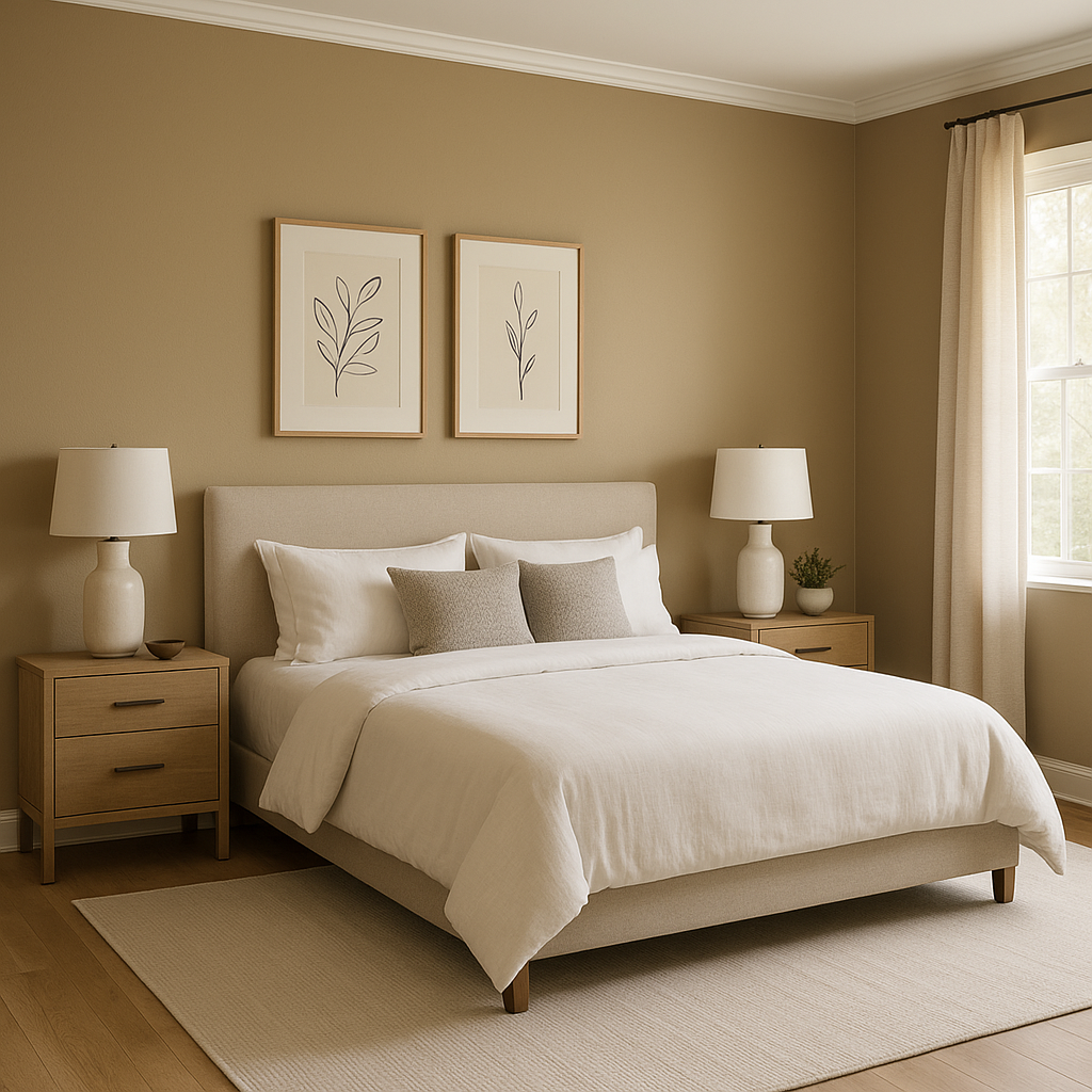
For bedrooms, Burlap sets a soothing tone that promotes relaxation. Consider pairing it with soft whites and muted blues for a restful retreat or darker accent colors for a more dramatic look.
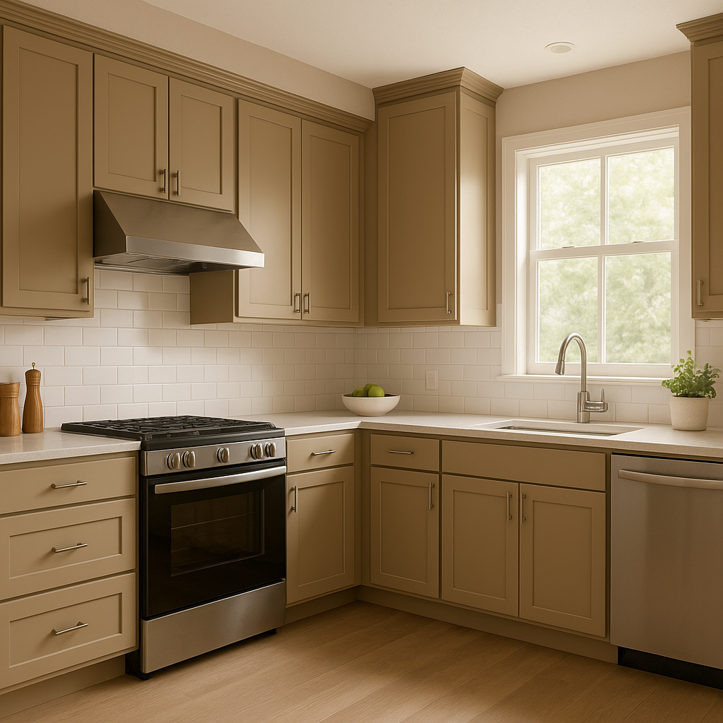
Burlap can warm up kitchens and dining spaces without overwhelming them. Pair it with white cabinetry, brushed brass hardware, and natural stone countertops to evoke a timeless, welcoming vibe.
Transform transitional spaces like hallways and entryways into inviting areas with Burlap. Its neutral tone works seamlessly with gallery walls, decorative mirrors, and wood accents, ensuring a polished and cohesive look.
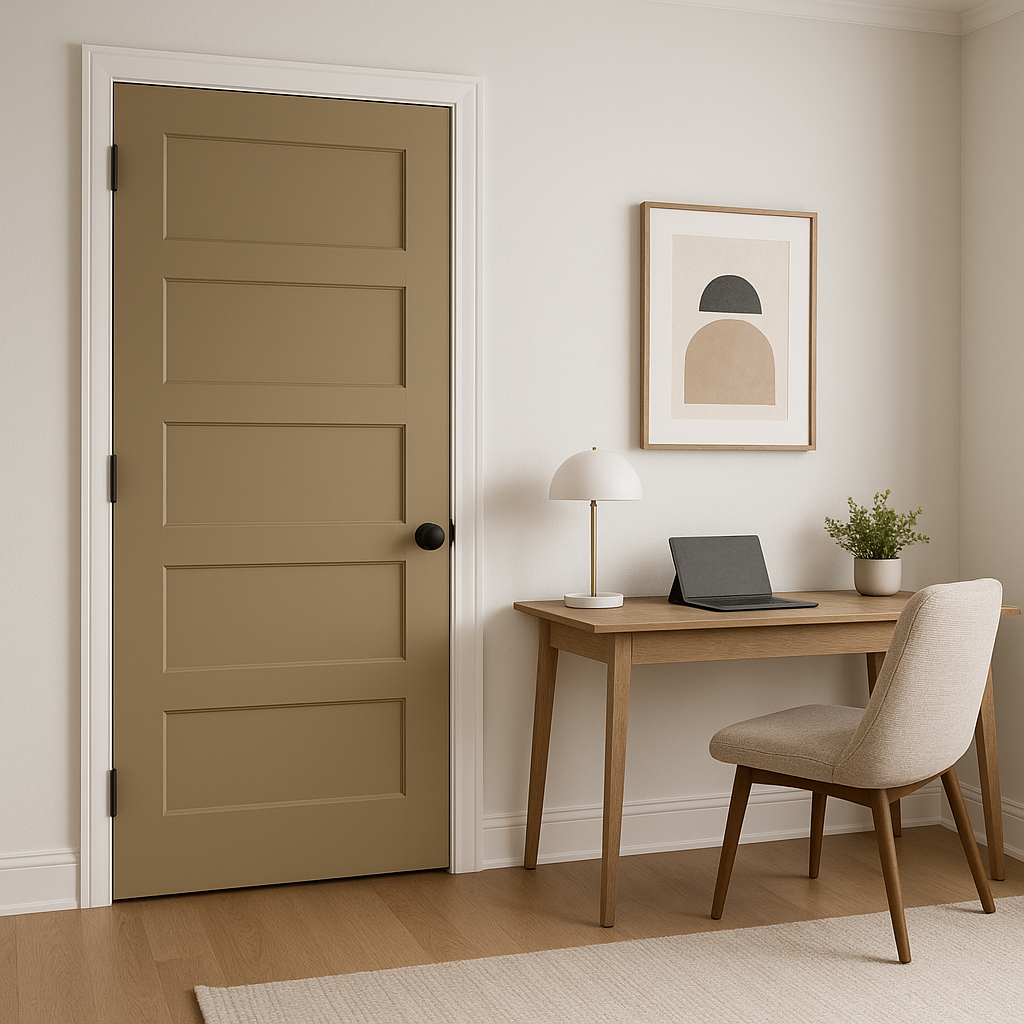
In a home office or workspace, Burlap offers a calming and focused environment. Pair it with darker accent colors like Urbane Bronze or deep greens for a sophisticated palette that encourages productivity.
Sherwin-Williams Burlap (SW 6137) is the epitome of understated elegance. Its warm beige hue with golden undertones offers versatility for a wide range of interior design styles. Burlap brings character to spaces without demanding attention, making it a reliable choice for homeowners seeking comfort, sophistication, and adaptability in their color palette.
Whether you’re refreshing a single room or planning a complete home makeover, Burlap provides the perfect foundation for creating spaces that feel timeless, welcoming, and effortlessly chic.
Note: These images were all generated with AI, there may be inaccurate color results. Please only use a general reference to get a rough idea of what a color may look like, we will continue to generate new images to improve accuracy.
View Colors Only by Brand (No Imagery):
Sherwin-Williams
|
Benjamin-Moore
|
Behr
|
Valspar
Live on the Eastern Slope of Colorado and looking for a local painting professional, check out all our painting services and reach out for a free estimate.
Copyright © 2026 : Wild Fox Painting Inc. : 12435 Mead Way, Littleton, CO 80125


