Sherwin-Williams Panda White (SW 6147) is a versatile and inviting paint color that effortlessly balances warmth and subtle sophistication. This soft, creamy off-white is part of Sherwin-Williams’ timeless palette, making it an excellent choice for those seeking a neutral hue that exudes comfort and style. With its understated charm, Panda White serves as a perfect backdrop for a wide range of interior design aesthetics, from modern minimalism to classic traditional decor.
Panda White is a warm off-white with subtle beige undertones, creating a cozy and welcoming feel without appearing overly yellow or stark. The beige undertones give it a slightly creamy appearance, making it softer and more approachable than cooler whites or true neutrals. These warm undertones lend themselves beautifully to spaces where you want to achieve a tranquil, harmonious ambiance.
Its undertones work well in areas with both natural and artificial lighting, though the exact feel of the color may shift slightly depending on the light source. In rooms with ample sunlight, Panda White appears brighter and more neutral, while in spaces with warmer artificial lighting, its creamy warmth becomes more pronounced. This adaptability makes Panda White a highly reliable choice across various rooms and design styles.
Sherwin-Williams Panda White pairs seamlessly with a variety of complementary hues, allowing you to create a cohesive and well-rounded color palette. Some ideal coordinating colors include:
Panda White’s adaptability makes it suitable for virtually any room or design purpose. Here are some of the best ways to incorporate this balanced neutral into your home:
As a warm and neutral base, Panda White is perfect for living rooms and shared spaces where you want to create a welcoming atmosphere. Pair it with natural wood furniture or textured accents like woven baskets and linen upholstery for a cozy, lived-in feel.
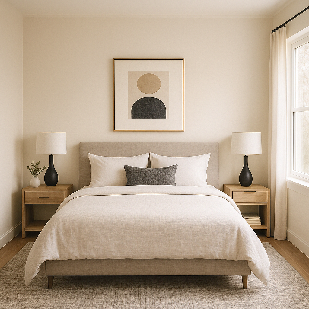
Panda White’s creamy undertones lend themselves beautifully to bedrooms, where relaxation is key. Use it on walls for a serene backdrop, and layer soft tones like blush pinks or muted greens for a restful retreat.
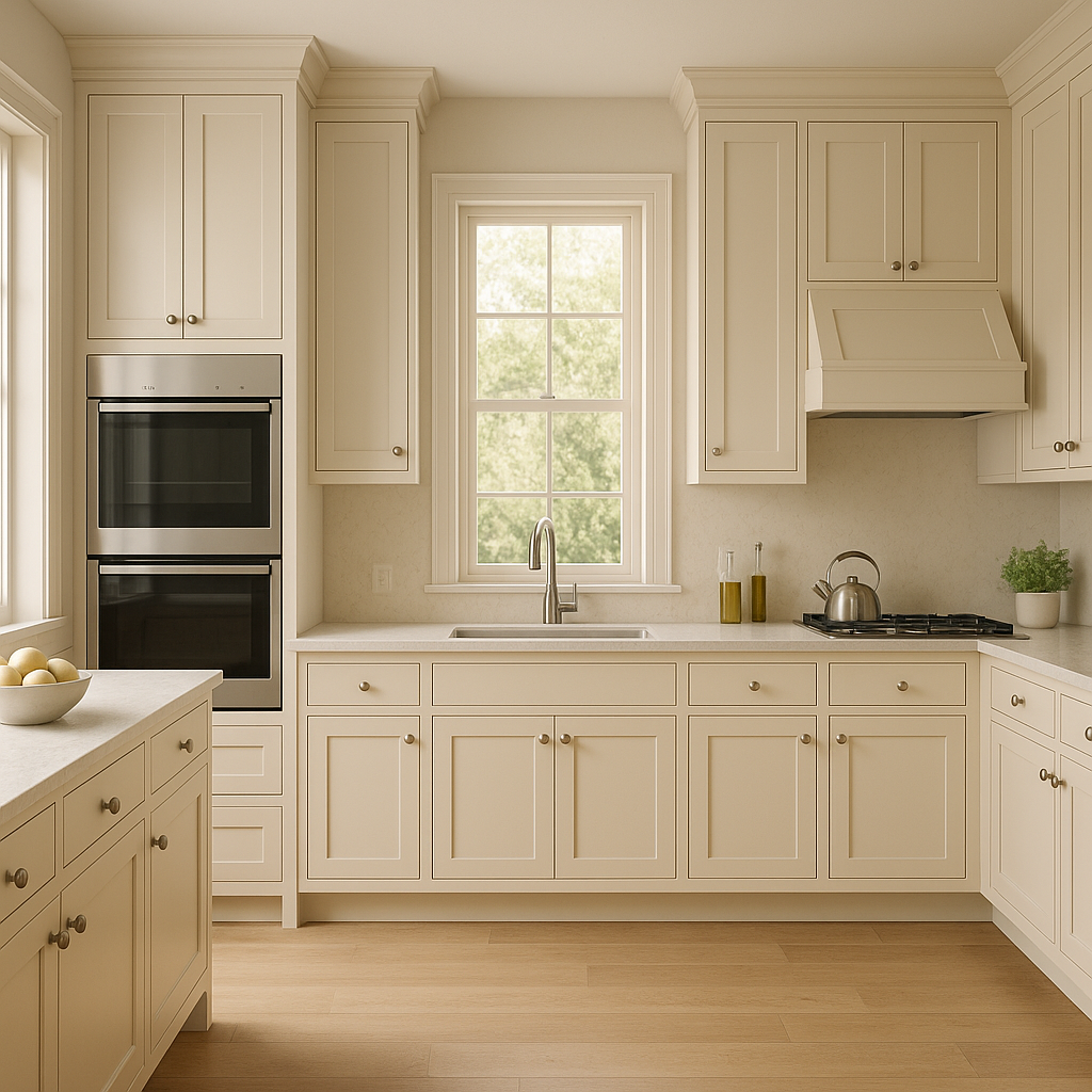
This warm off-white works wonders in kitchens, especially when combined with white cabinetry and brushed brass hardware. It creates an airy yet inviting environment that feels fresh and timeless.
In bathrooms, Panda White can transform the space into a spa-like oasis. Pair it with marble countertops, chrome fixtures, and soft gray accents for a clean yet warm aesthetic.
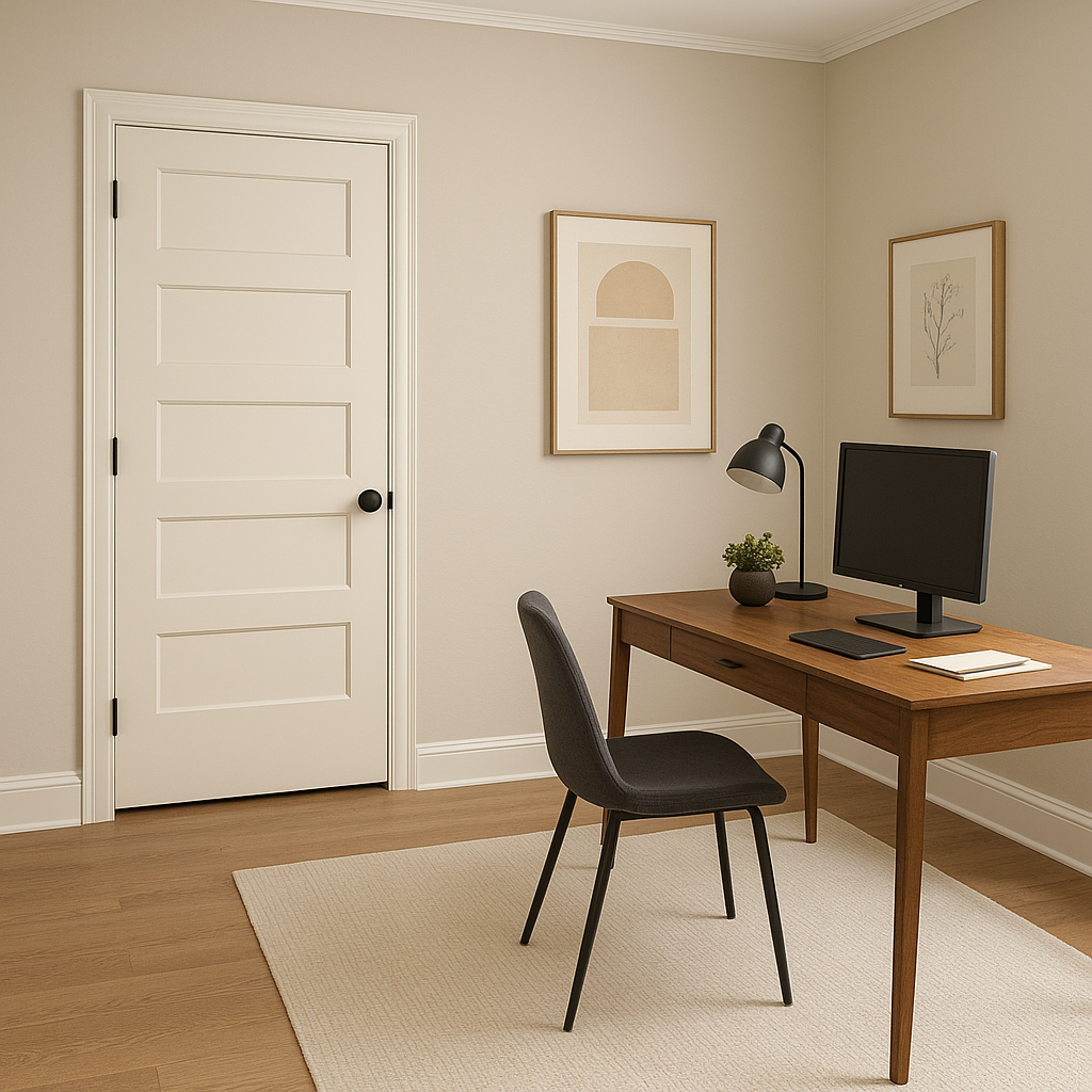
Panda White can also be used for ceilings and trim to subtly warm up a room while maintaining a classic look. Its understated elegance ensures it won’t compete with bolder wall colors or accent pieces.
Sherwin-Williams Panda White (SW 6147) is a masterful balance of warmth and versatility, making it a go-to choice for creating spaces that feel both timeless and inviting. Whether you’re designing a modern sanctuary or a classic family home, Panda White offers the perfect foundation for endless possibilities.
Note: These images were all generated with AI, there may be inaccurate color results. Please only use a general reference to get a rough idea of what a color may look like, we will continue to generate new images to improve accuracy.
View Colors Only by Brand (No Imagery):
Sherwin-Williams
|
Benjamin-Moore
|
Behr
|
Valspar
Live on the Eastern Slope of Colorado and looking for a local painting professional, check out all our painting services and reach out for a free estimate.
Copyright © 2026 : Wild Fox Painting Inc. : 12435 Mead Way, Littleton, CO 80125


