Sherwin-Williams Eclipse (6166) is a rich and refined medium-gray paint color that brings a sense of understated elegance to any space. Perfectly balancing warmth and coolness, this hue offers versatility across various design styles, from modern minimalism to cozy traditional interiors. Its depth and complexity make it a favorite for creating moody, sophisticated atmospheres without feeling overly dark or heavy.
Eclipse (6166) features subtle green undertones that provide a slight earthy quality. These undertones make it unique among grays, giving it a natural and grounded appeal that works beautifully in spaces with ample light or areas where you want to create a serene ambiance. The green undertones are soft and subdued, ensuring Eclipse doesn’t veer into overly cool or stark territory. Instead, it maintains a balanced neutrality, making it a versatile choice for a wide range of applications.
Eclipse pairs seamlessly with a variety of colors, allowing you to craft a harmonious and cohesive design palette. Here are some thoughtfully chosen coordinating colors:
These coordinating colors allow you to develop schemes ranging from neutral and serene to bold and dramatic, making Eclipse a versatile anchor for your design vision.
Sherwin-Williams Eclipse (6166) shines in a variety of applications, lending itself well to both residential and commercial spaces.
Transform your living room into an inviting retreat with Eclipse as the primary wall color. Its medium-gray tone creates a cozy yet sophisticated backdrop for furniture and decor, especially when paired with lighter accents like Extra White or Sea Salt.
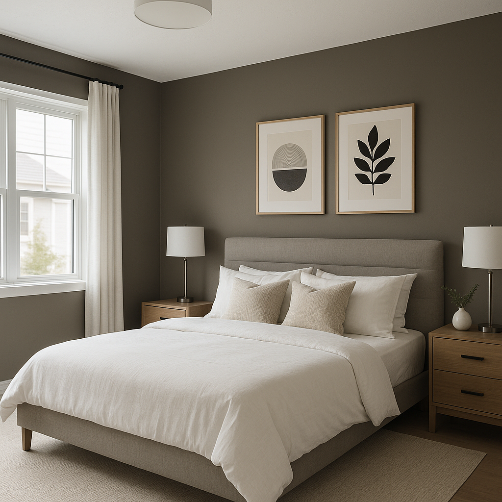
Eclipse’s calming presence is ideal for bedrooms, where subtle green undertones promote relaxation. Pair it with soft textiles and warm lighting to create a serene sanctuary.
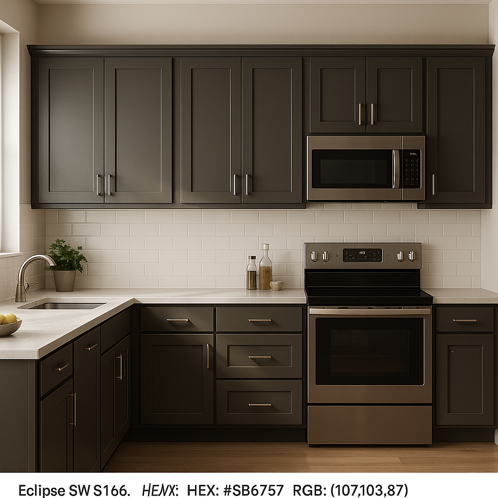
In modern or transitional kitchens, Eclipse works beautifully on cabinets or walls, offering a sleek alternative to traditional whites or lighter grays. Pair it with brushed nickel or matte black hardware for a polished look.
For bathrooms, Eclipse evokes a spa-like atmosphere when paired with light tiles, white trim, and natural wood accents. Its earthy undertones harmonize effortlessly with organic materials.
Use Eclipse for an accent wall to add depth and drama to a room. It pairs wonderfully with lighter neutral shades or even bold jewel tones for an eye-catching contrast.
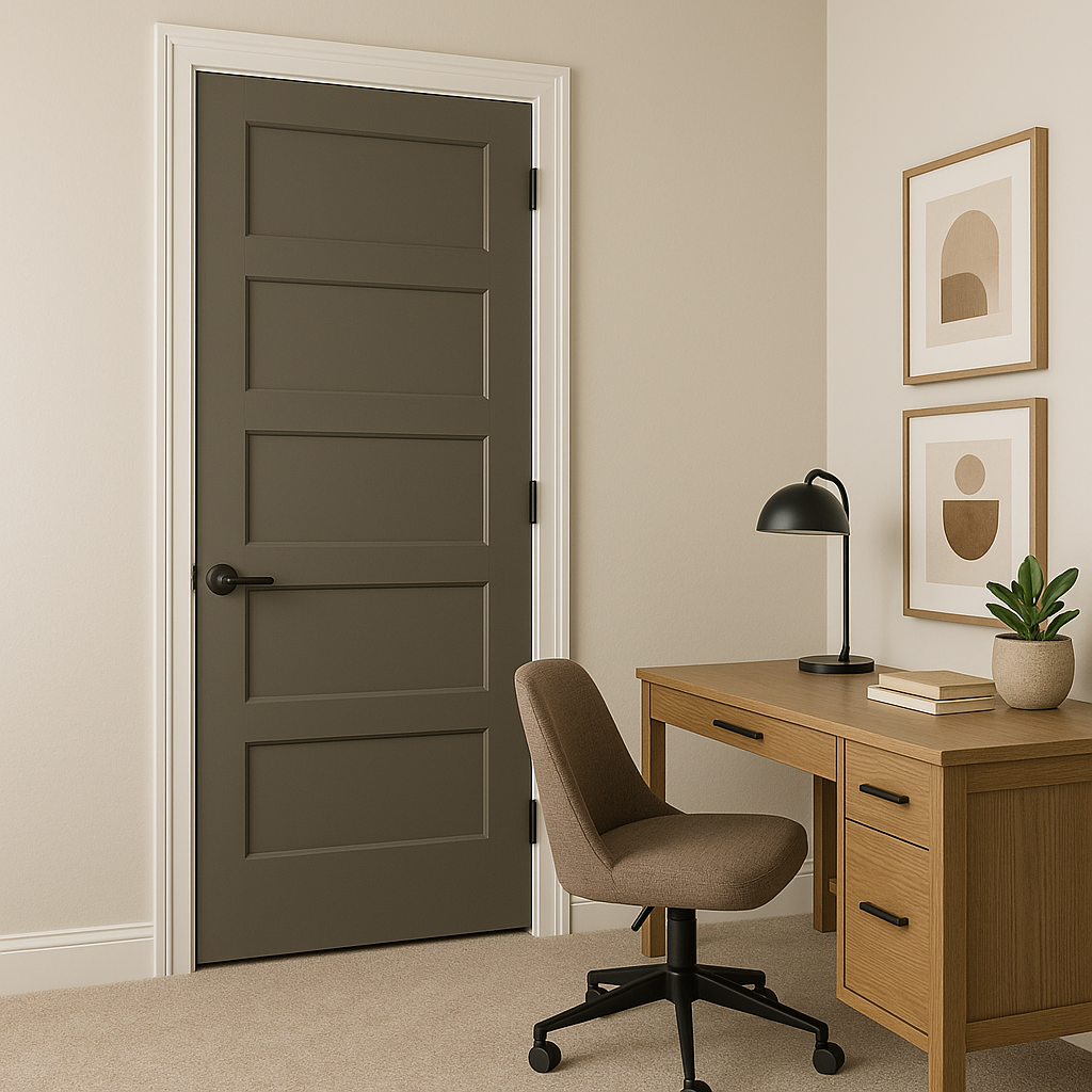
Eclipse’s grounding qualities make it an excellent choice for home offices or professional workspaces. It fosters focus and productivity while maintaining a sophisticated aesthetic.
The appearance of Sherwin-Williams Eclipse (6166) can shift depending on lighting conditions. In spaces with ample natural light, its green undertones may become slightly more pronounced, adding a subtle organic feel. In dimmer settings, Eclipse takes on a deeper, more dramatic tone, perfect for creating intimate or moody environments. To fully appreciate its versatility, sample Eclipse in your space at different times of day to see how it interacts with light.
Sherwin-Williams Eclipse (6166) is the epitome of a timeless, versatile gray. Its balanced undertones, compatibility with a wide range of colors, and adaptability to various spaces make it an exceptional choice for homeowners and designers alike. Whether you’re creating a cozy retreat or a modern masterpiece, Eclipse delivers sophistication and style with ease.
Note: These images were all generated with AI, there may be inaccurate color results. Please only use a general reference to get a rough idea of what a color may look like, we will continue to generate new images to improve accuracy.
View Colors Only by Brand (No Imagery):
Sherwin-Williams
|
Benjamin-Moore
|
Behr
|
Valspar
Live on the Eastern Slope of Colorado and looking for a local painting professional, check out all our painting services and reach out for a free estimate.
Copyright © 2026 : Wild Fox Painting Inc. : 12435 Mead Way, Littleton, CO 80125


